Kitchen Creative Contrast
Design Elements
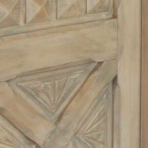
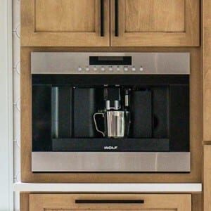
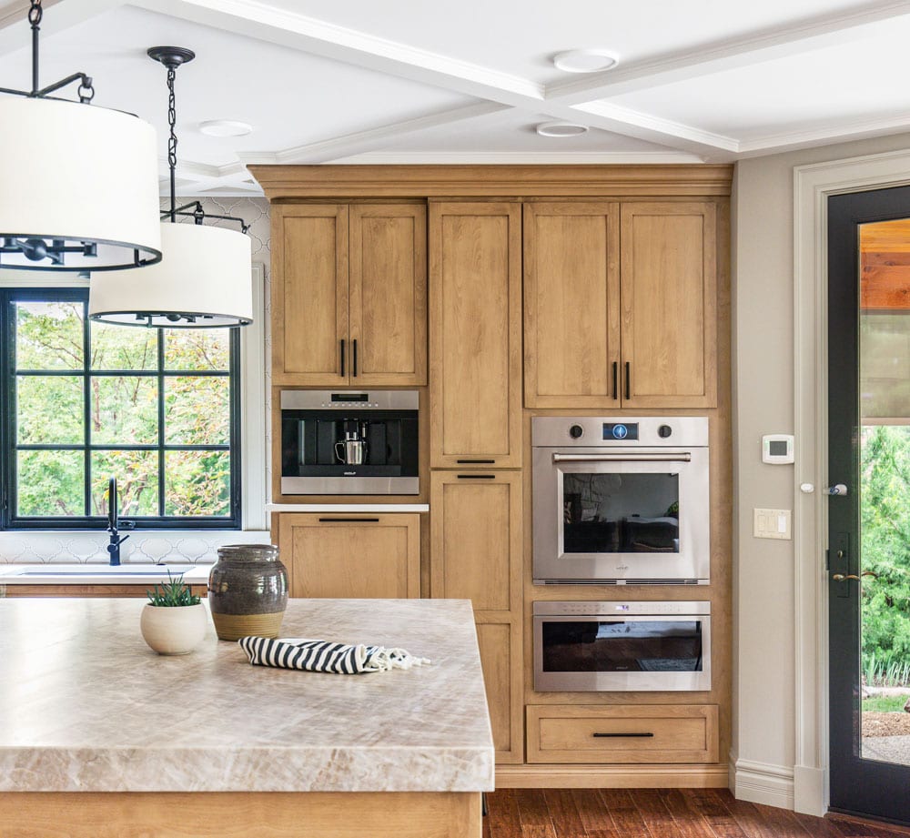
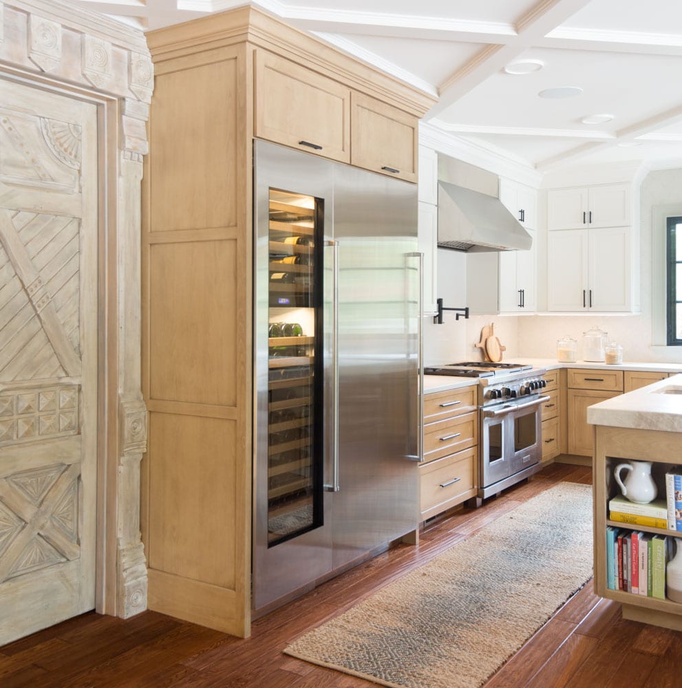
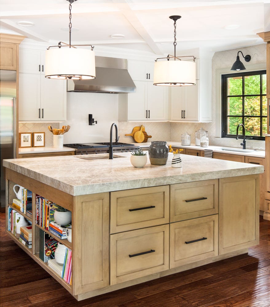
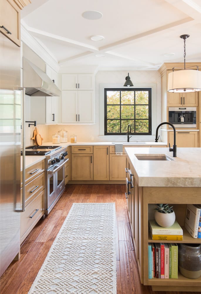
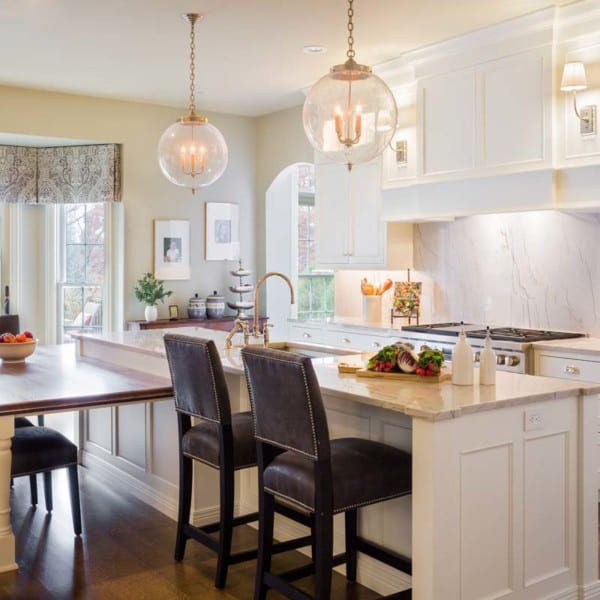
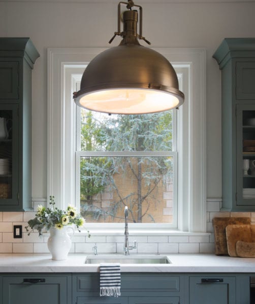
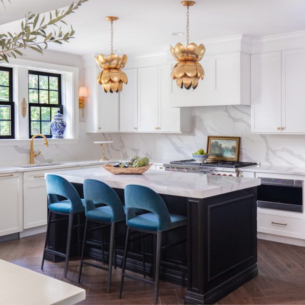
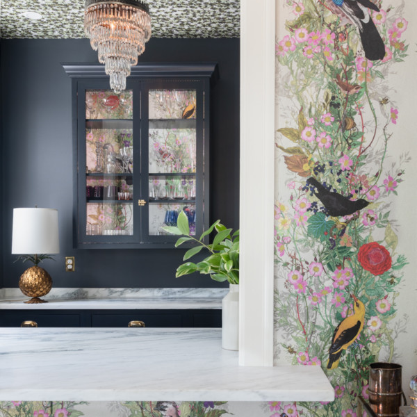
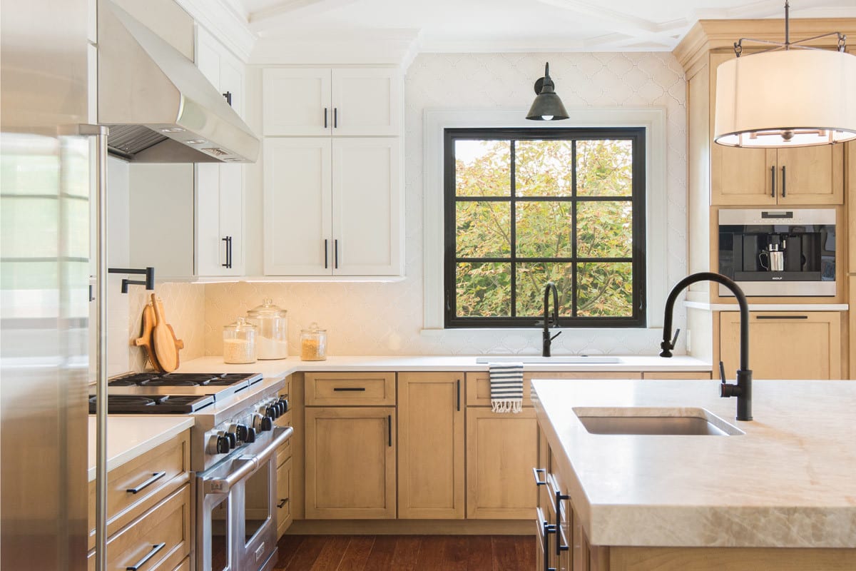
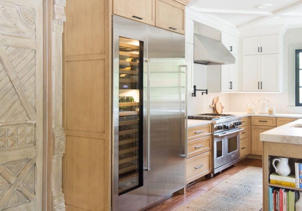
Before the remodel, this kitchen was best described as awkward. With a piano shaped island, the space felt inconvenient. The home owners were never happy with it, so when the built-in fridge was on the last legs of its life, they decided it was time for change. Not only were they envisioning a new kitchen, but they were also looking to upgrade the laundry room, pantry area, and office. Since all of it was meant to fit in the existing space, many drawings were done. The end result, as you can see, turned out to be more than beautiful. Now, everything fits perfectly together. The built-in appliances create a seamless flow between other kitchen elements. The most enchanting door makes the adjoining office space fit right in. Lastly, the matte black hardware pulls in other aspects of the space which helps create depth in contrast.
2021 - Kitchens of the Year: Gold: 300-390 square feet
St. Louis Homes and Lifestyles
watch the full renovation story
Subscribe to the Karr Bick YouTube channel for more before & after stories
If you’d like to start on your own transformation journey, use our plan now tool and visit our virtual showroom. We also have a blog with a step-by-step checklist to help you on your design adventure.

