Dark and Dreamy
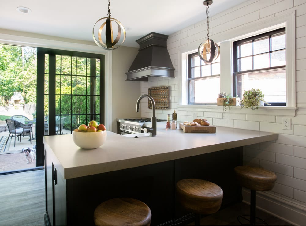
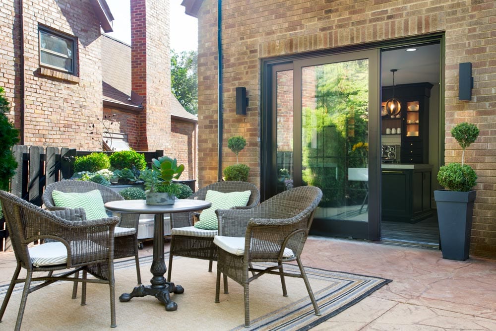
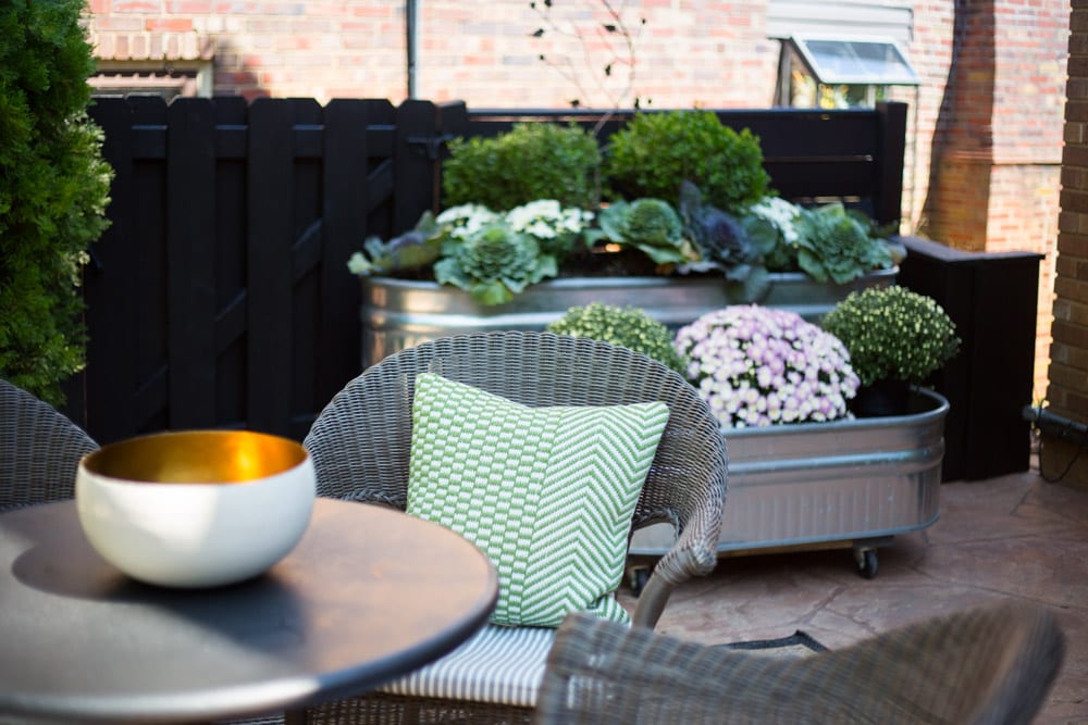
Sometimes when you are pushed by limitations and break all the “rules”, magical things happen in a space. The space in this adorable (detail-packed) Tudor home started with a small kitchen that had seven doorways, 4 windows, several closets and a poorly functioning powder room crammed under a stairwell. The space was re-imagined to open the kitchen out onto a precious manicured backyard to create an indoor/ outdoor kitchen and also give room to add a full bathroom to service an aging-in-place parent.
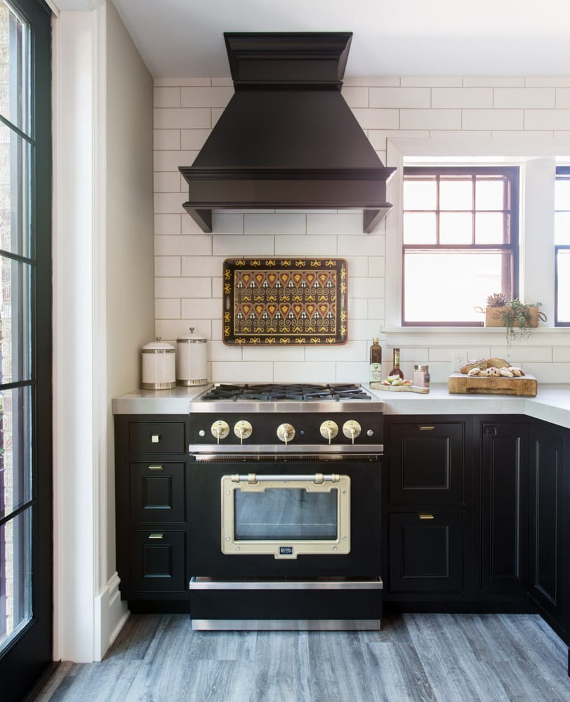
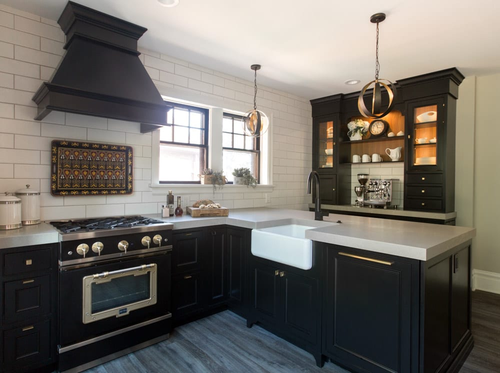
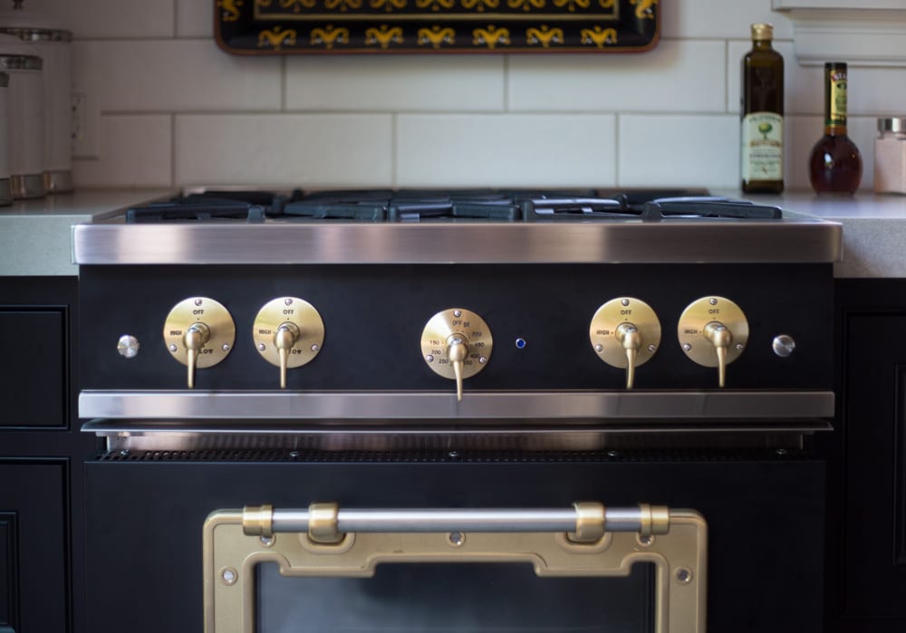
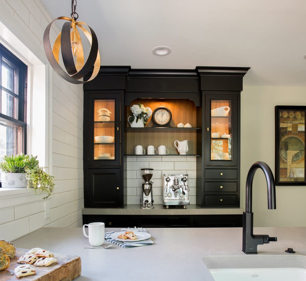
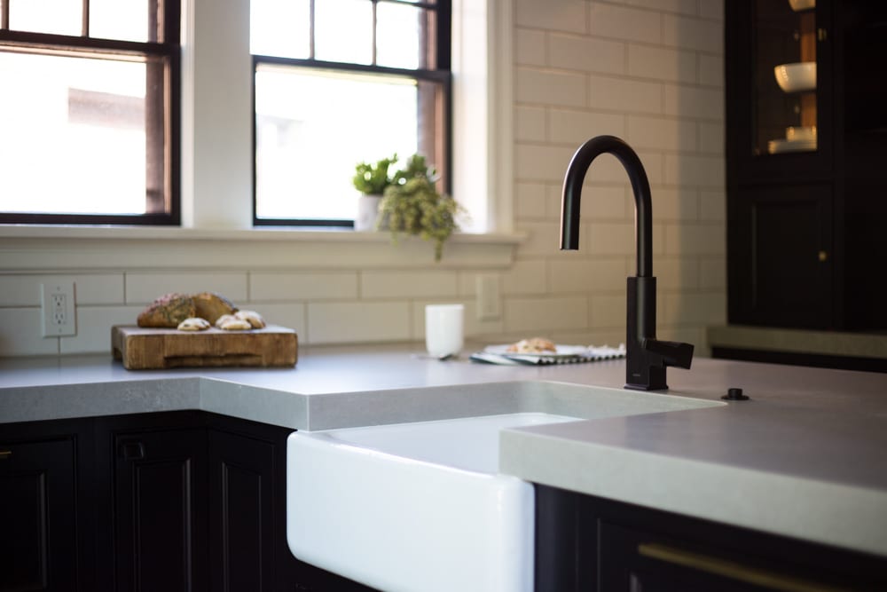
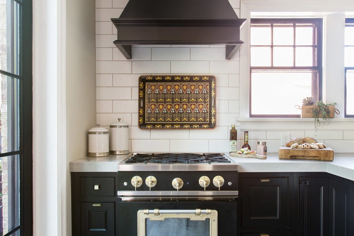
The first “rule” thrown out the window was in the use of color. You will hear to only use light monochromatic color schemes to make the space look larger. To the contrary, the use of Mouser Ebony black cabinetry and Big Chill black appliances with bold Brushed Brass trims was chosen and creates interest and charm in what could have been a bland and uninteresting room. The space was packed with textures in the white wall tile, wood tones brought in through the hardwood floors, bar stools and insides of glass fronted wall cabinets. Diresco Concrete-look countertops with chunky mitered apron edges add an aged, yet modern look to the space. Contrasting this with brass light fixtures and hardware adds the glimmer off of these dark and matte surfaces.
The 2nd “rule” broken was to cover existing windows or to eliminate closet space. People are afraid that losing a window or doorway may make the space dark or feel closed off and that they cannot lose storage space. We chose to make 2 of the windows a focal point on one wall and remove the standard single back door and turn it into an 8’ tall, full wall sliding door that opened the back yard into the kitchen space. It gives the sense that the kitchen goes on forever. Instead of painting the trims white, they were made bold and black to feature these details instead of asking them to disappear into the background. The refrigerator was tucked into the nook under the stairway and trimmed with brass and a whole new bathroom space was carved out. While the storage space is limited, it covers all the needs and functions quite well for this family.
The 3rd rule is really about throwing out what is “expected” and to just do what makes your home Your Home. The layout or selections may not be conventional or to the rules and standards, but it about what works for You. Magical things happen when creativity is allowed to blossom and create a space as individual as the home and homeowner deserves.
Subscribe to the Karr Bick YouTube channel for more before & after stories
If you’d like to start on your own transformation journey, use our plan now tool and visit our virtual showroom. We also have a blog with a step-by-step checklist to help you on your design adventure.

