A Designer’s Dream
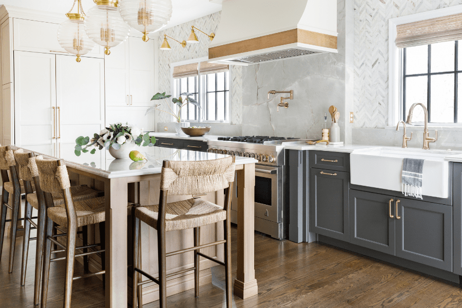
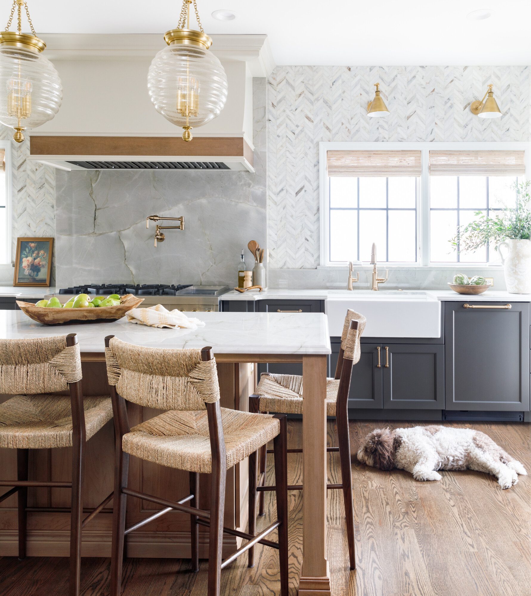
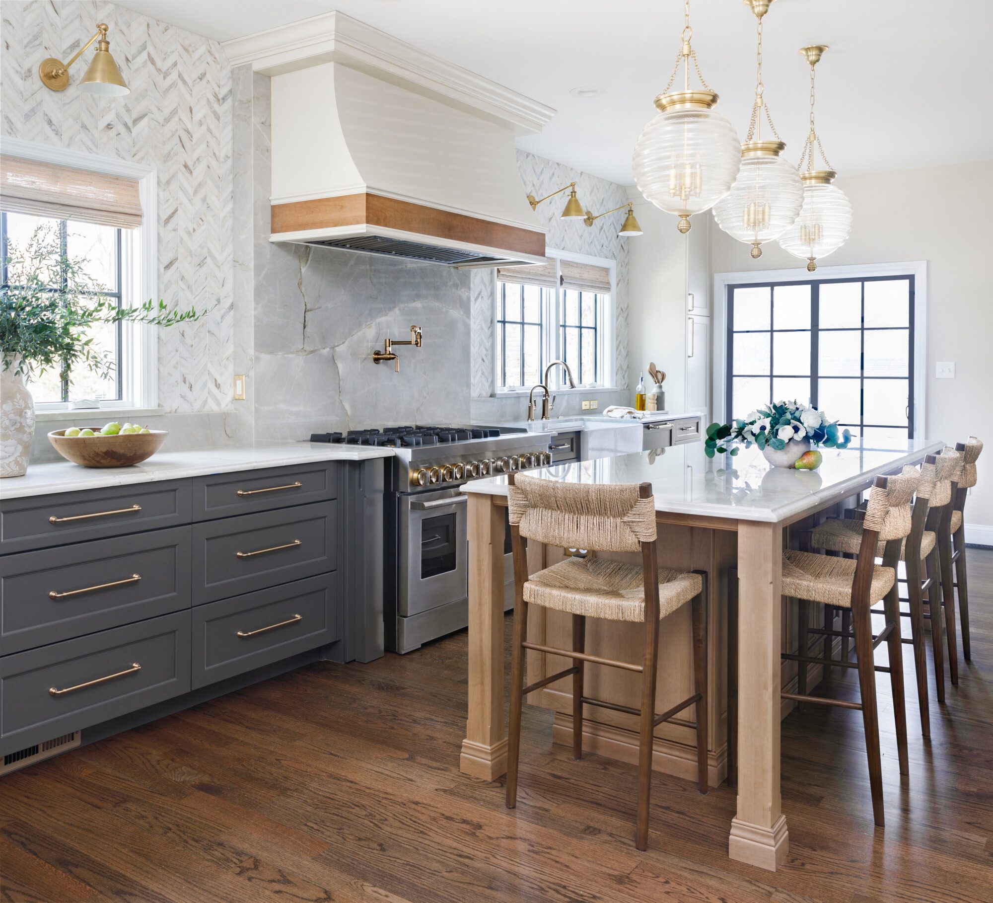
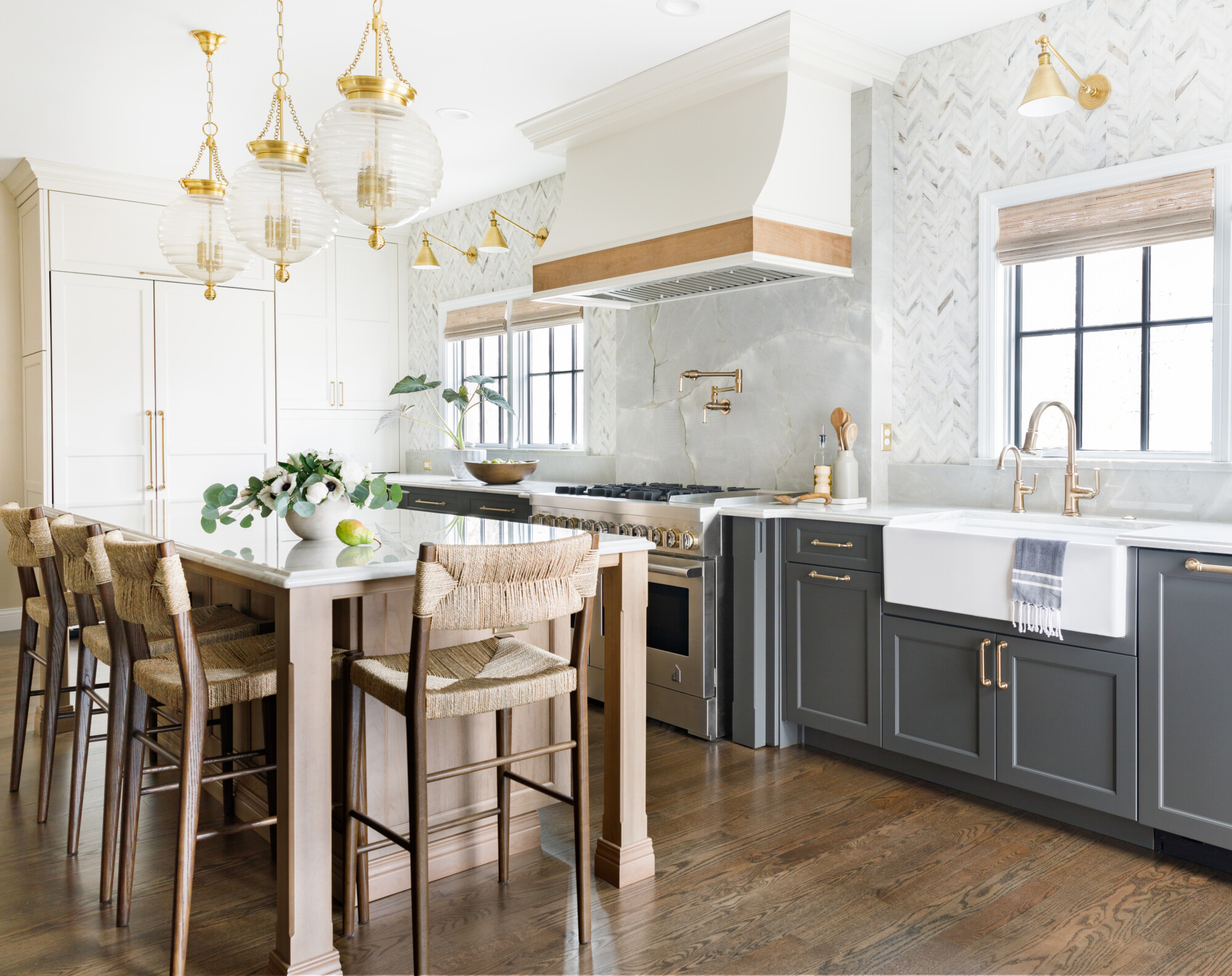
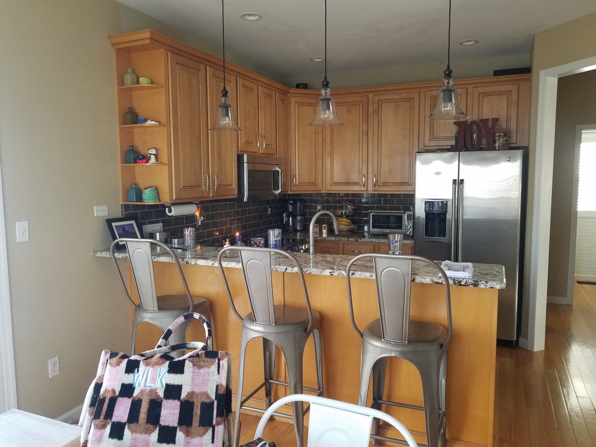
One look at this beautiful kitchen and you’ll be hooked. Our clients wanted to maximize their square footage, and really create a haven to cook and entertain, as well as making it highly functional for day to day living for their family.
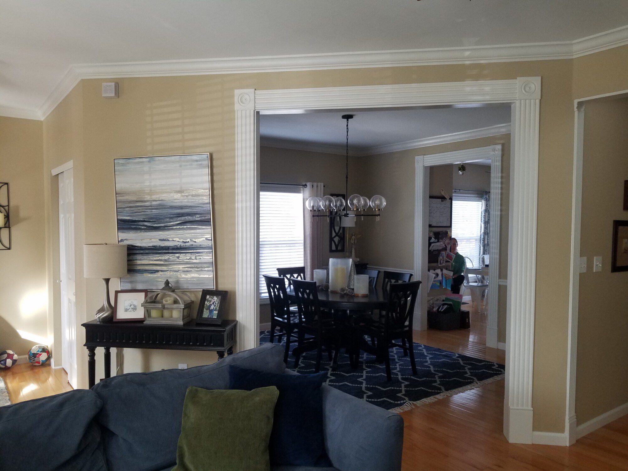
We began by combining two smaller rooms. This was a strategic move to maximize space and create a more open and inviting environment. This involved structural changes and careful planning to ensure seamless integration.
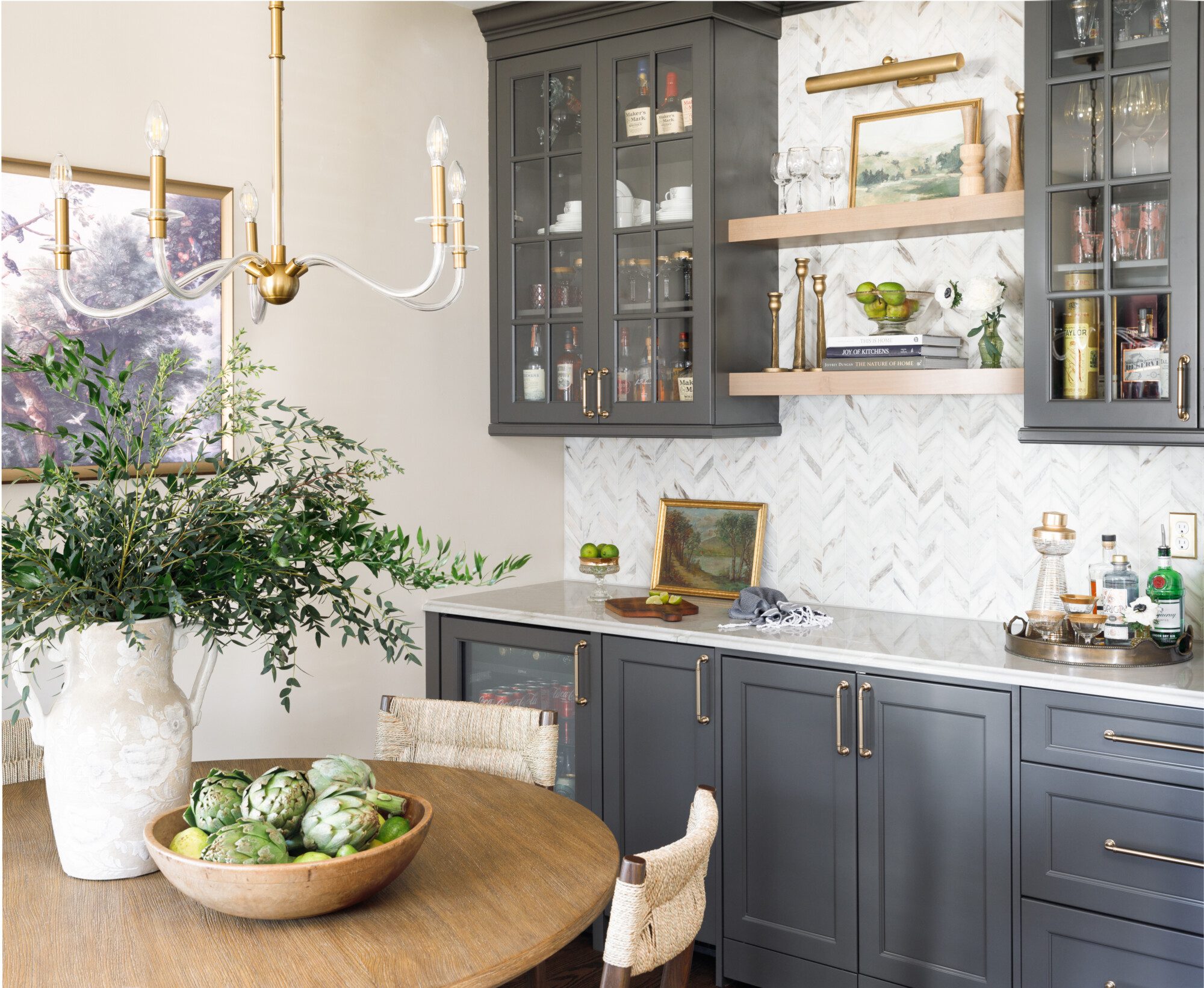
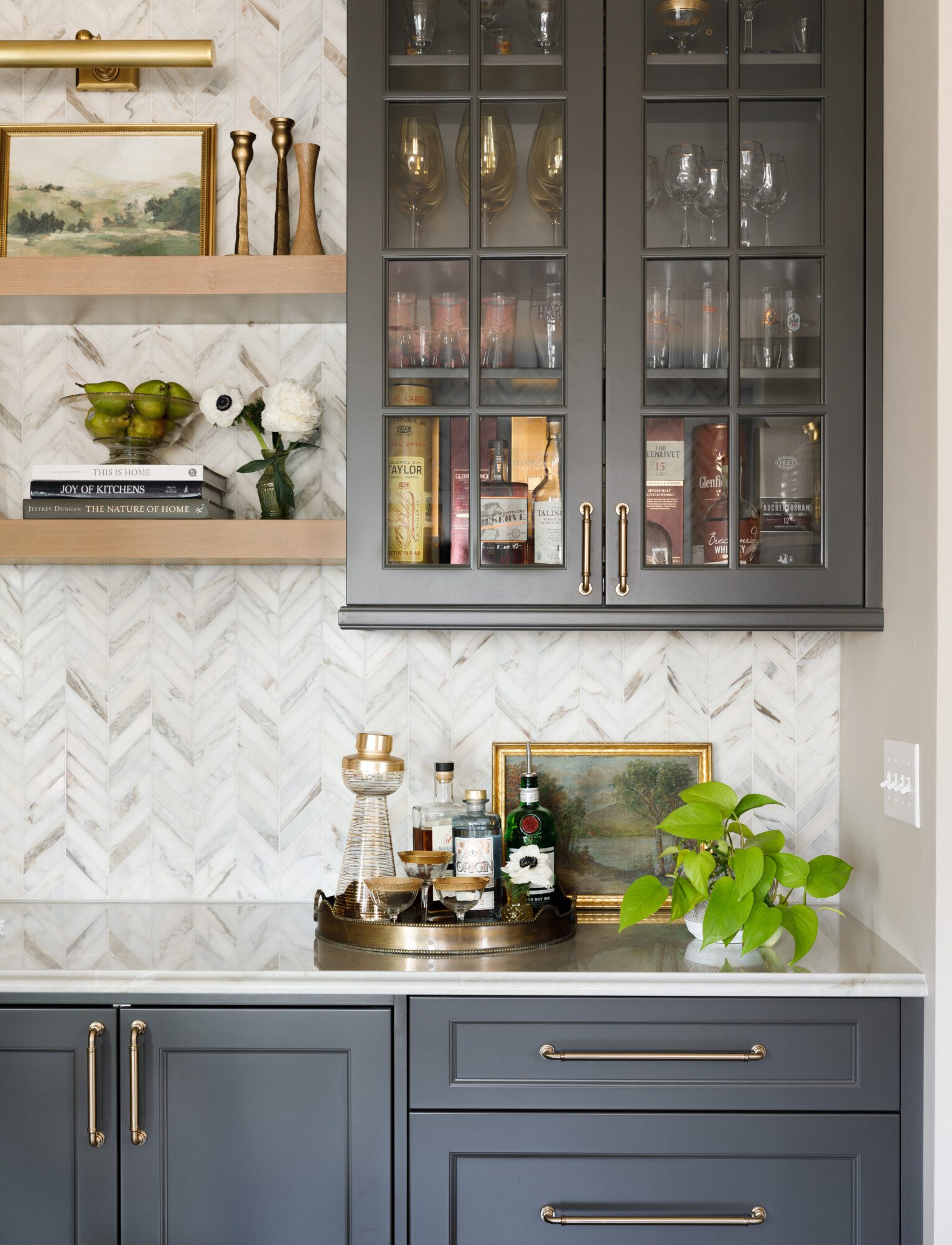
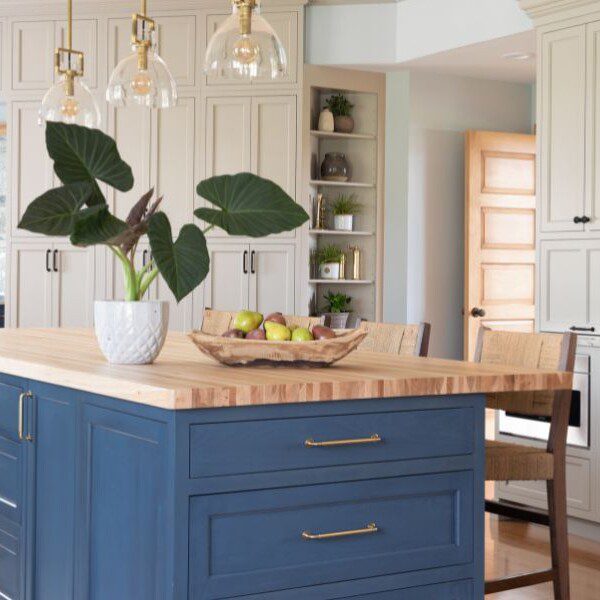
Choosing gray for the lower cabinets provides a modern and sophisticated contrast to the white tall cabinets and adds depth and dimension. The white cabinets also help to keep the space bright and airy, balancing the darker tones of the lower cabinets and other elements. It was all brought together with the wood island and floors to add a sense of warmth and coziness to the space, anchoring the overall aesthetic.
One of the obvious stars of the show is the backsplash tile and the stunning stone that creates an incredible focal point for the range adding visual interest and drama. These elements contribute to the overall wow factor of the kitchen.
In this space, we had the added benefit of the homeowner being a designer, as well her impeccable taste. Her involvement contributed to the success of the project, ensuring attention to detail and a cohesive vision throughout. From the floor to the ceiling, we can’t decide what our favorite part is.
Subscribe to the Karr Bick YouTube channel for more before & after stories
If you’d like to start on your own transformation journey, use our plan now tool and visit our virtual showroom. We also have a blog with a step-by-step checklist to help you on your design adventure.

