Embracing Color this Spring
April 1, 2025
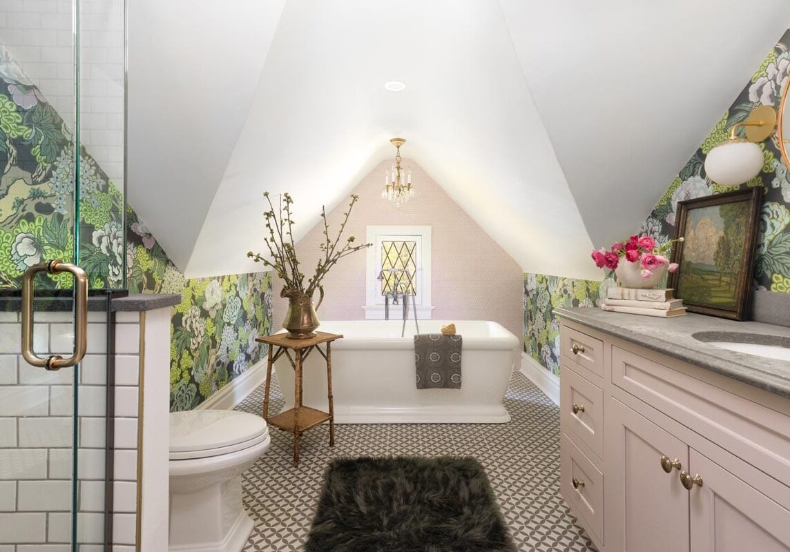
Embracing Color in Design: How to Add Personality and Vibrance to Your Home
Since Spring has fully sprung in our neck of the woods, we thought that we would dive deep into one of our favorite subjects and that is color in design. Color has the power to completely transform a space, evoke emotion, and show off some serious personality. Yet, many people hesitate to incorporate bold shades into their homes, fearing it may be overwhelming or too trendy.
The truth is, embracing color in design doesn’t mean every wall needs to be bright or every piece of furniture has to make a statement. Instead, it’s about using color intentionally to create balance, warmth, and depth in your space. It is also about making your space personal to you. After all it is your home, let it show off who you are. Here are some examples of what we will be getting into below.
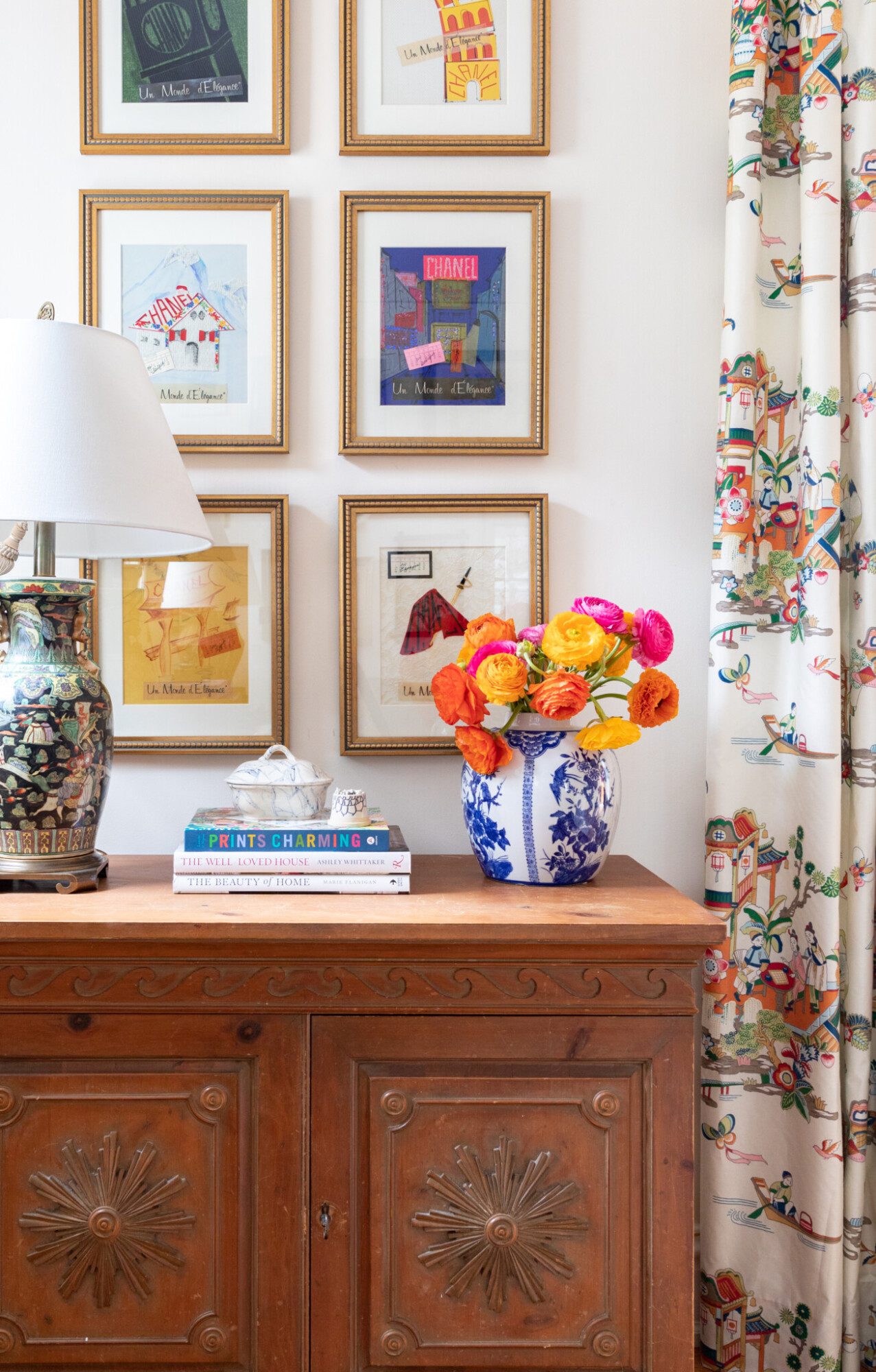
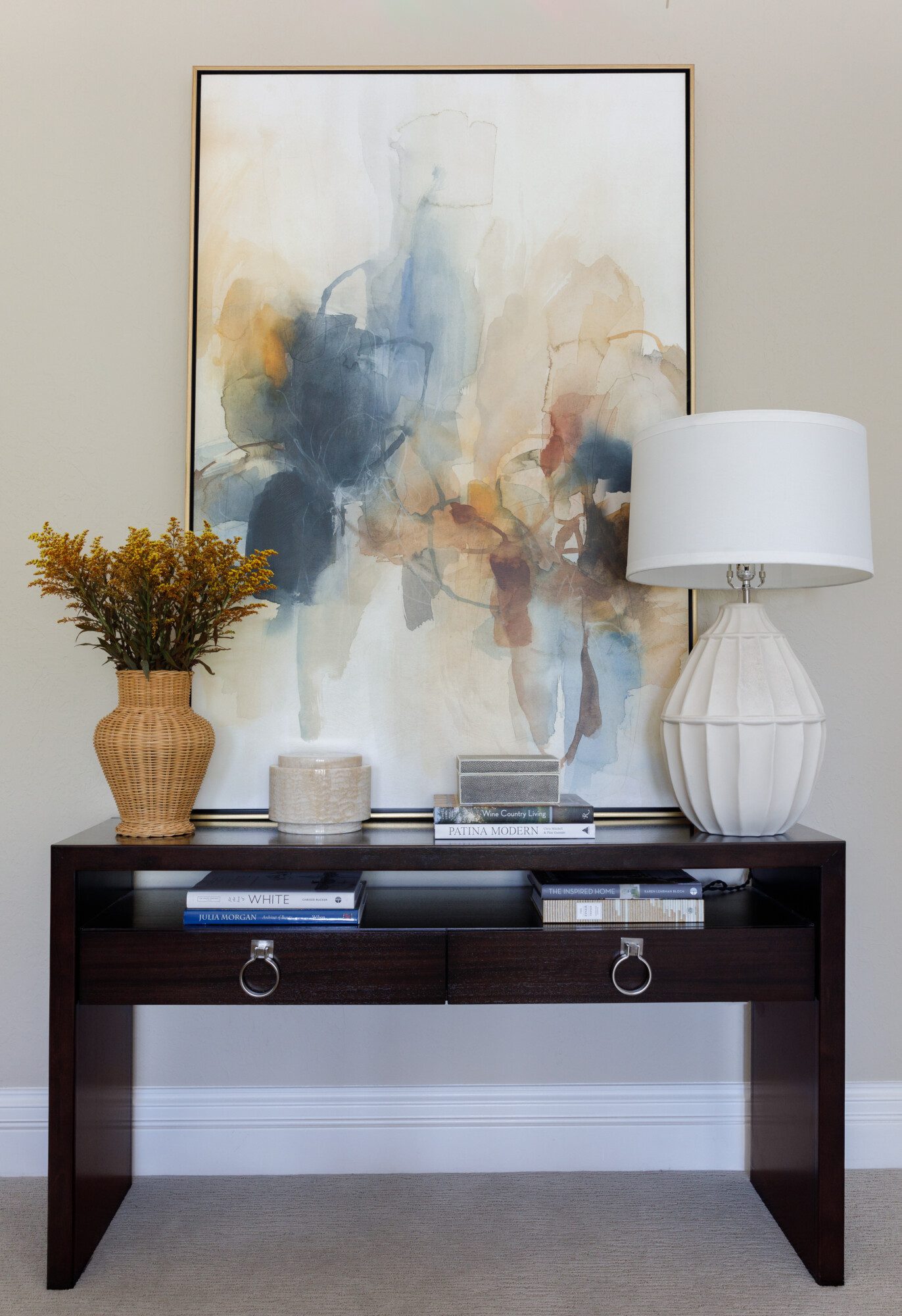
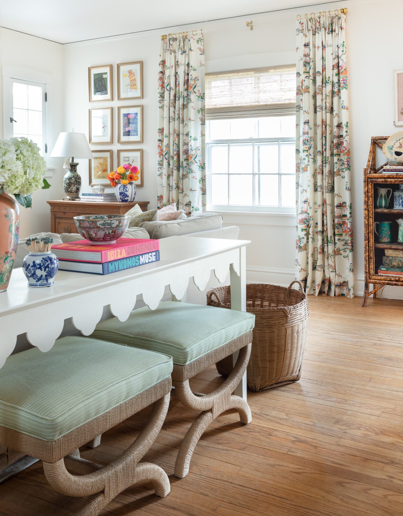
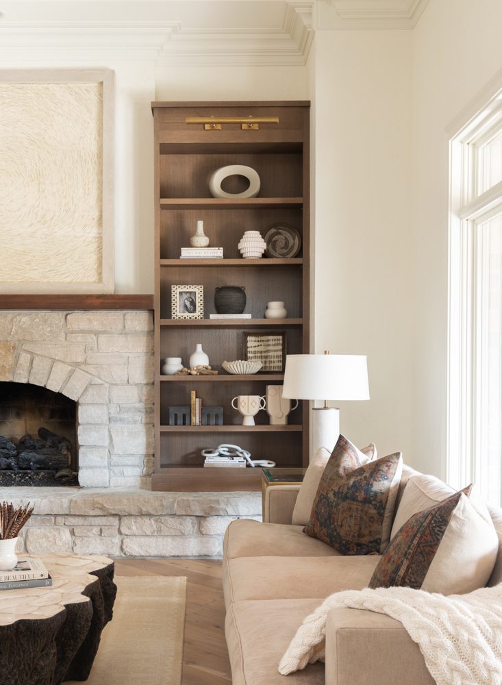
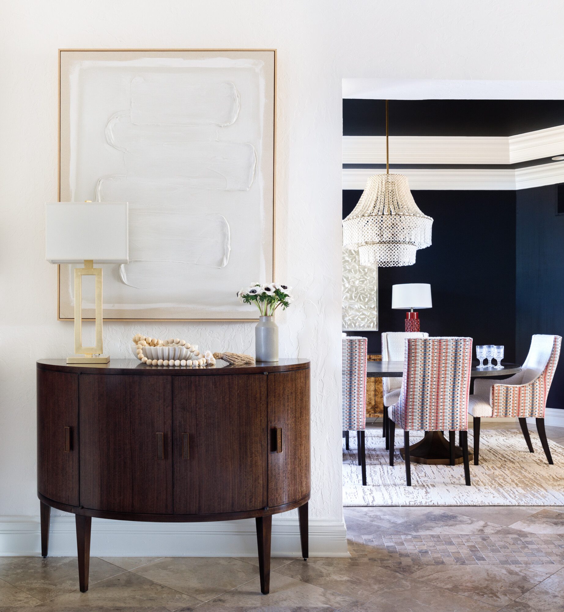
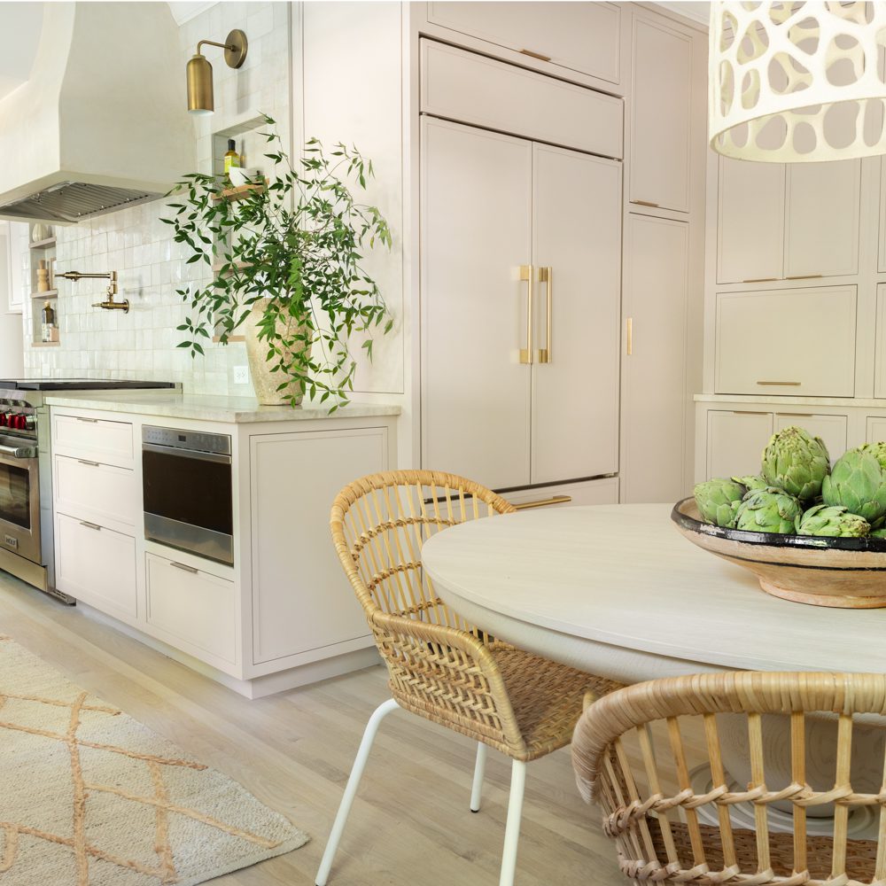
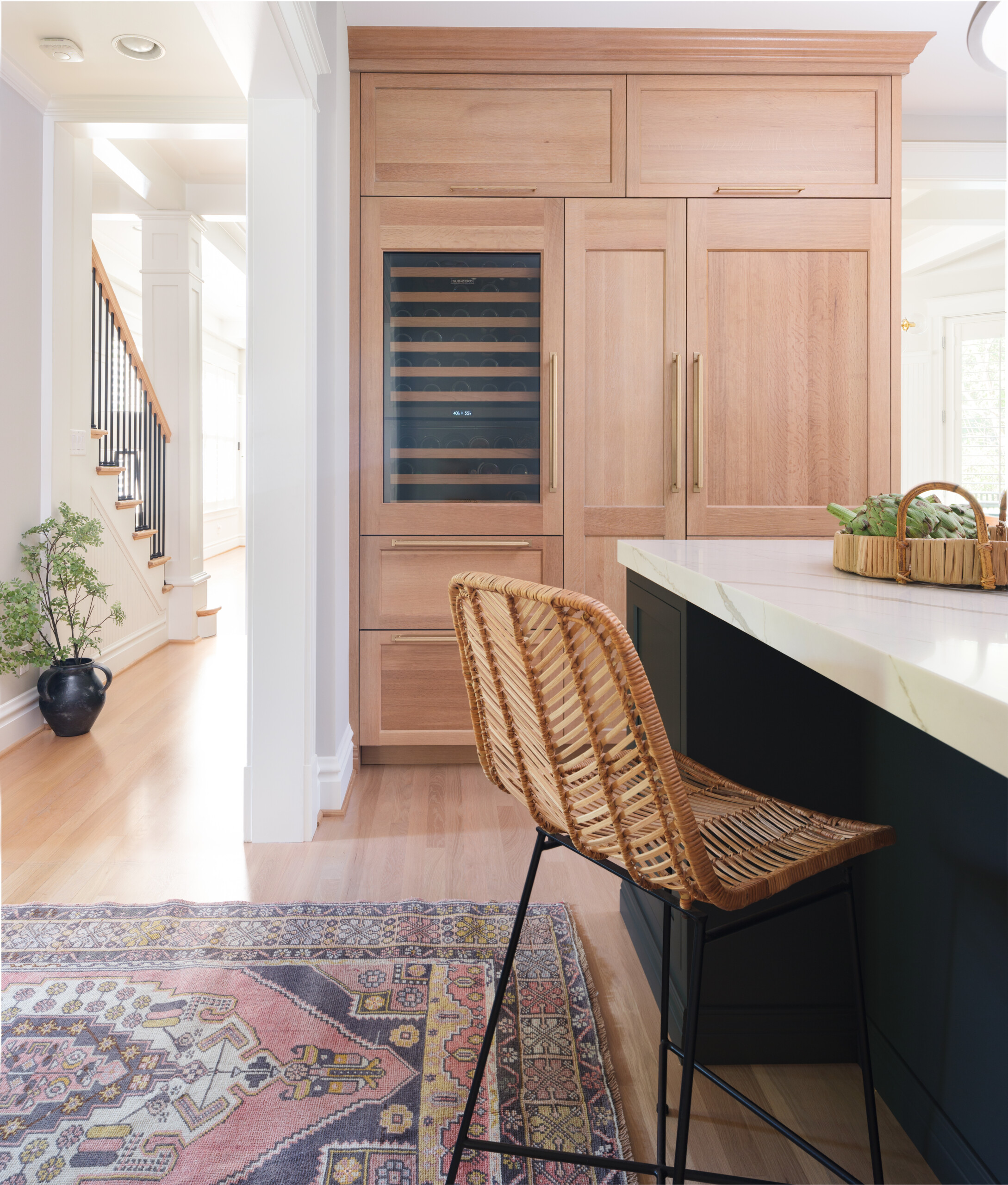
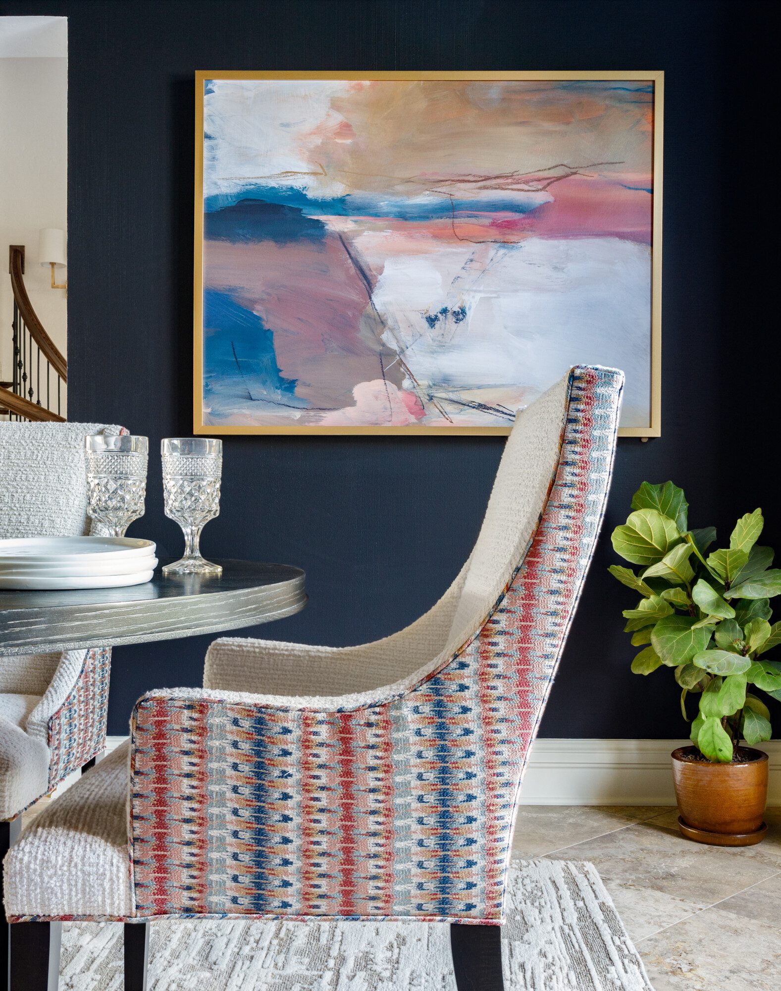
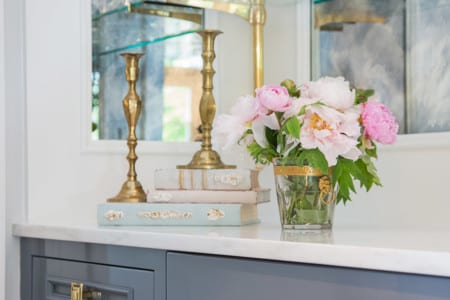
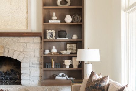
- Mostly Neutral with colorful art and fabric
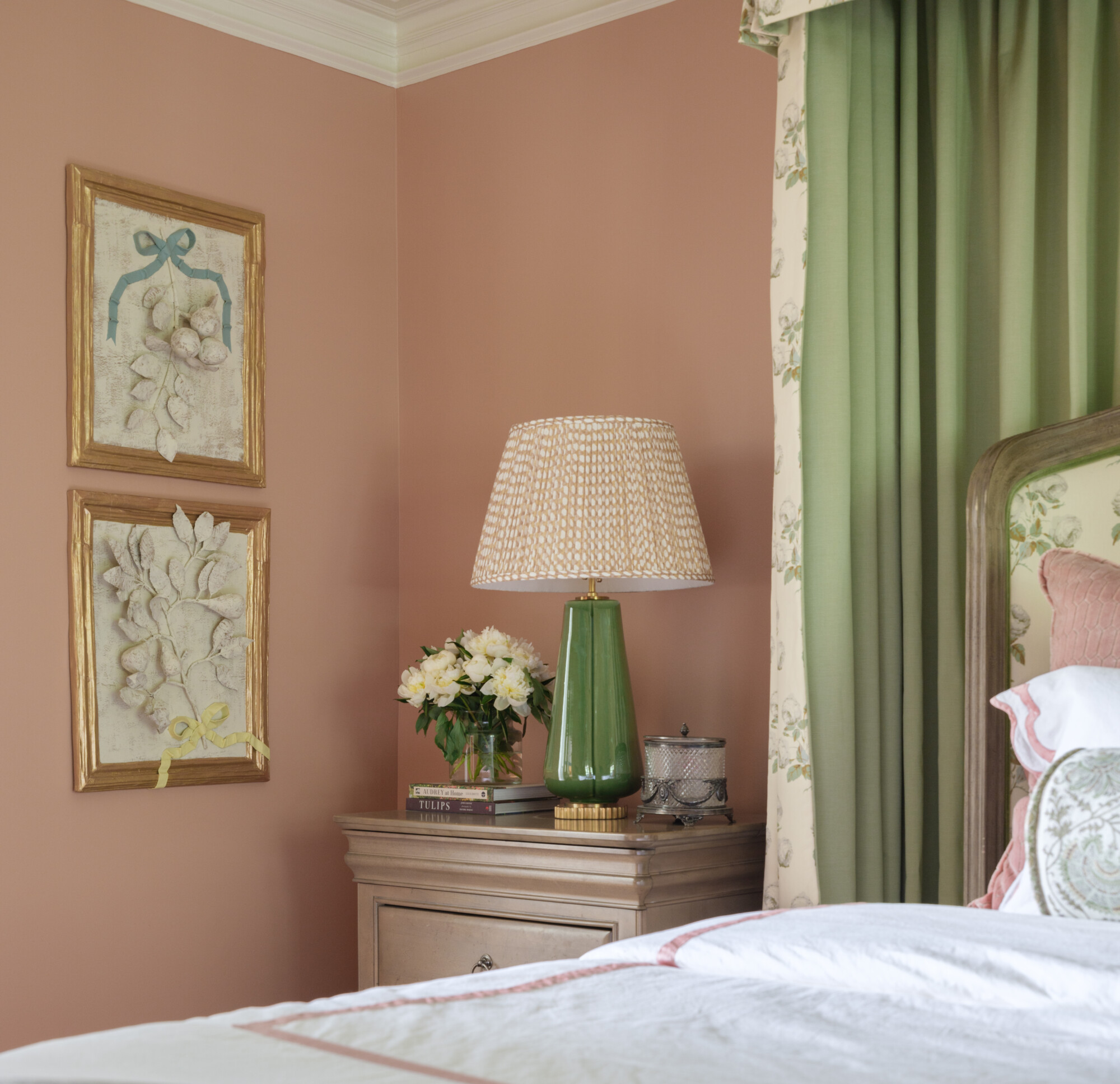
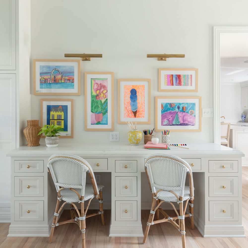
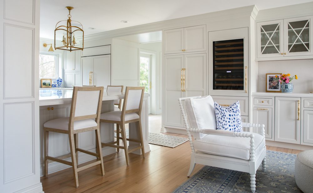
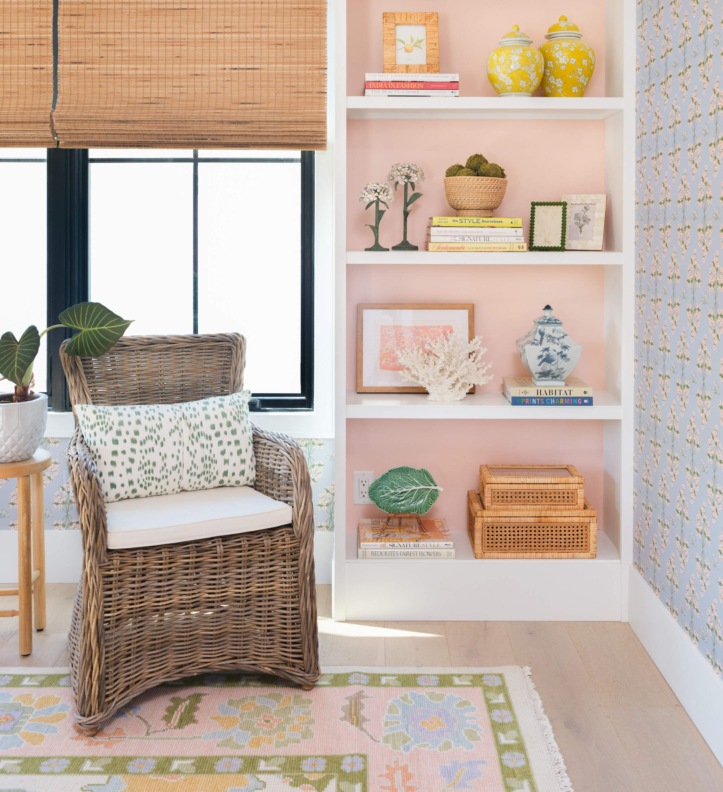
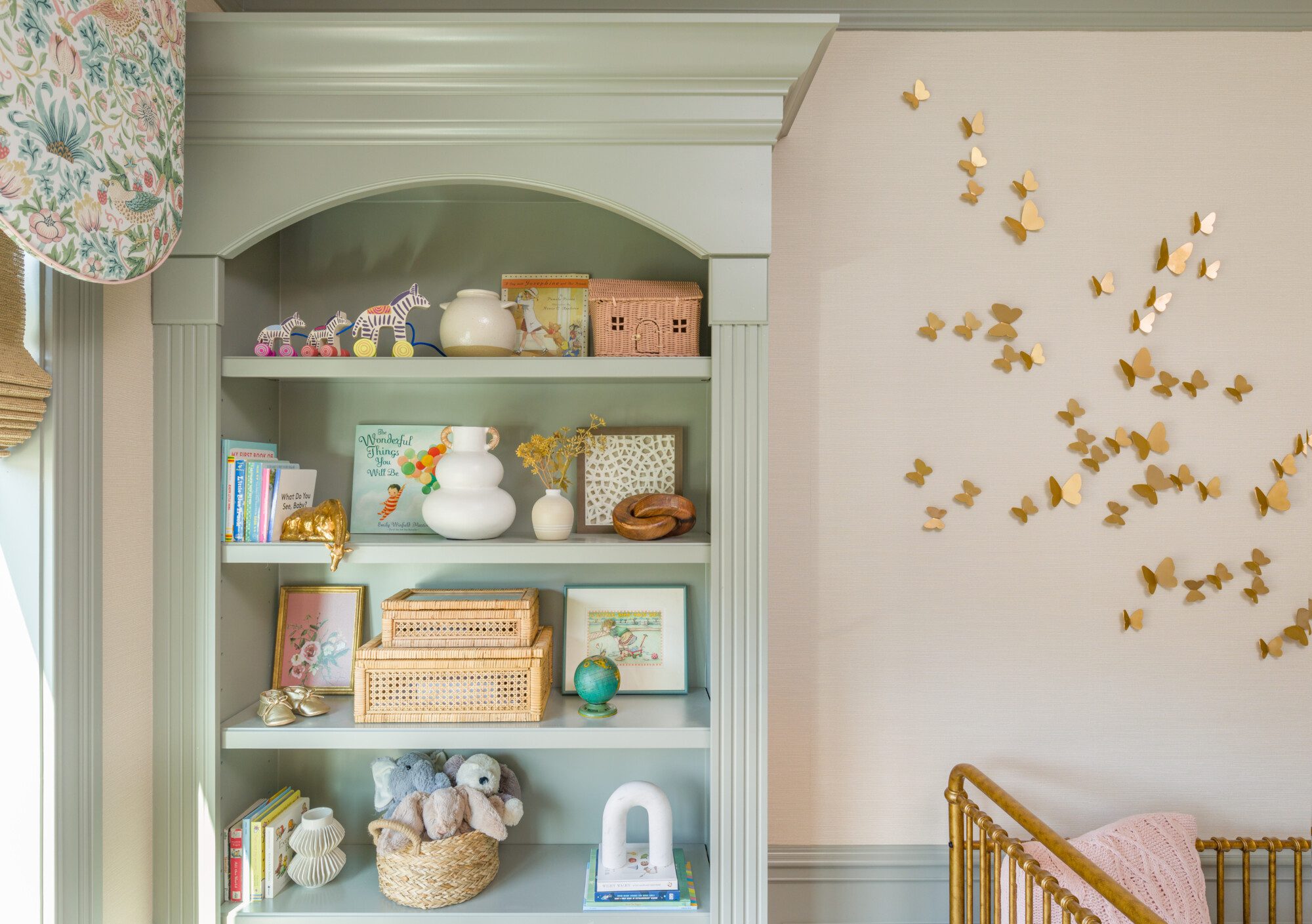
- Soft pastels and fabrics
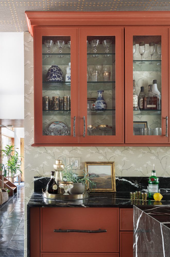
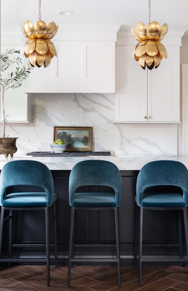
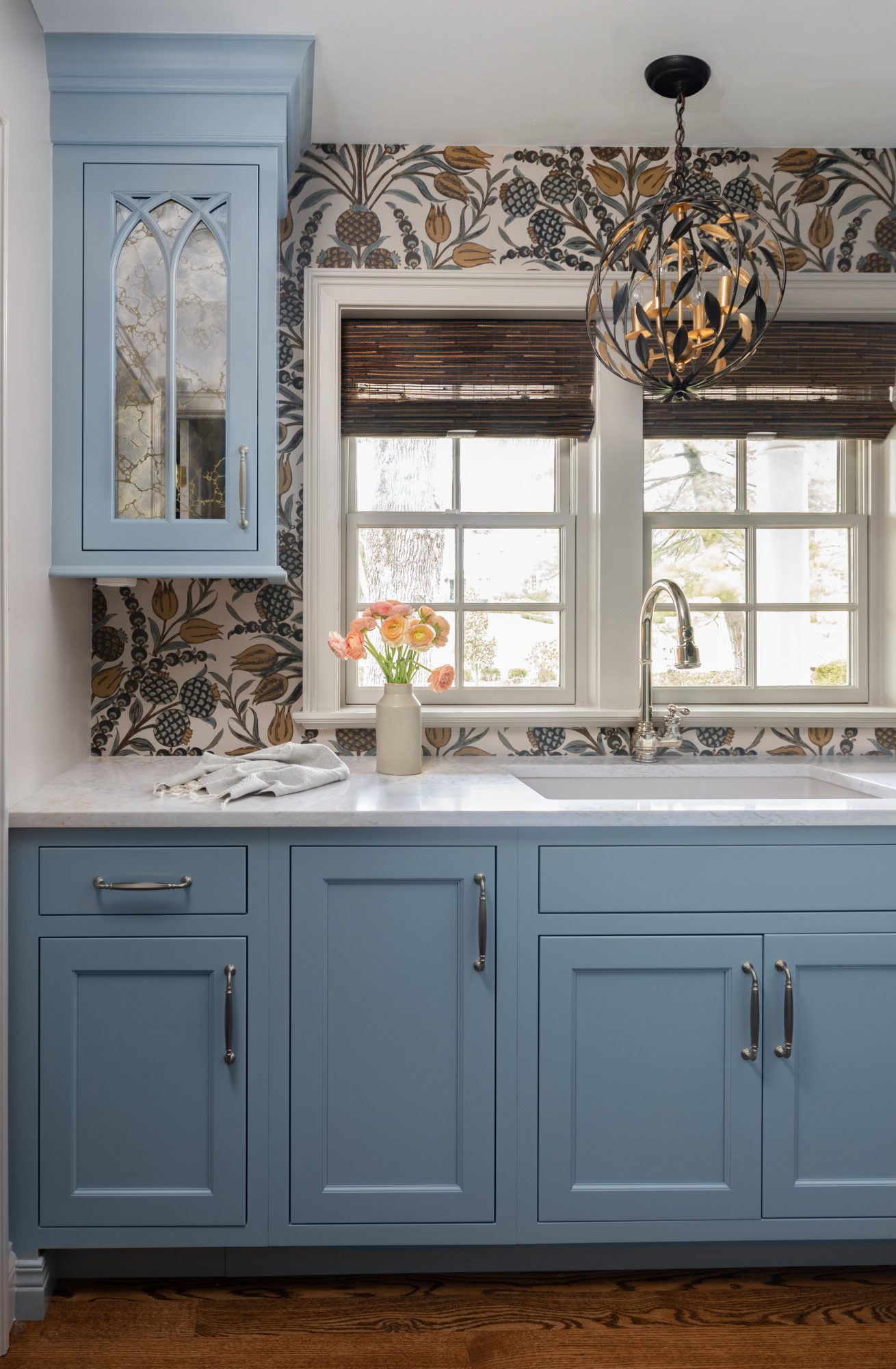
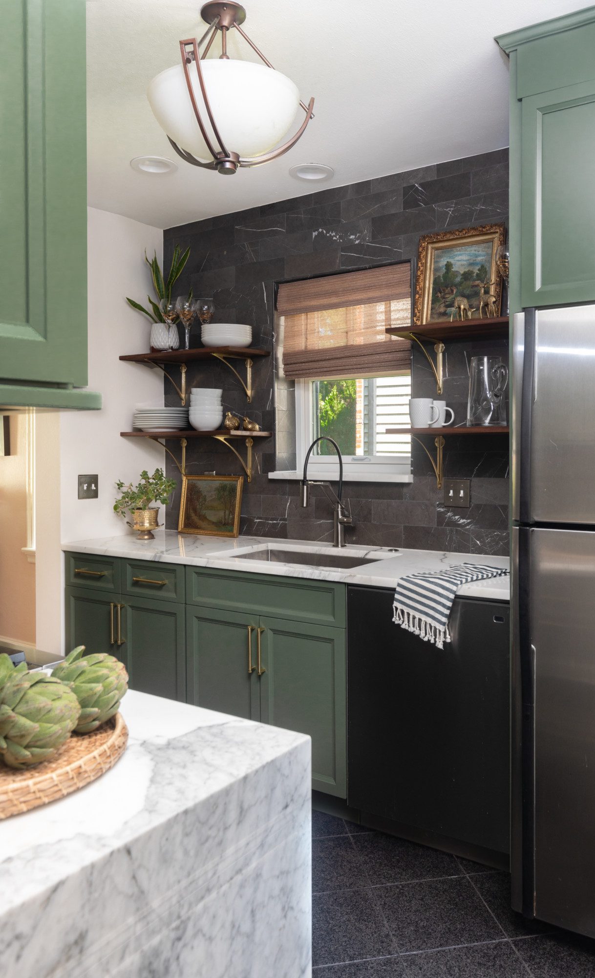
- Colorful cabinetry
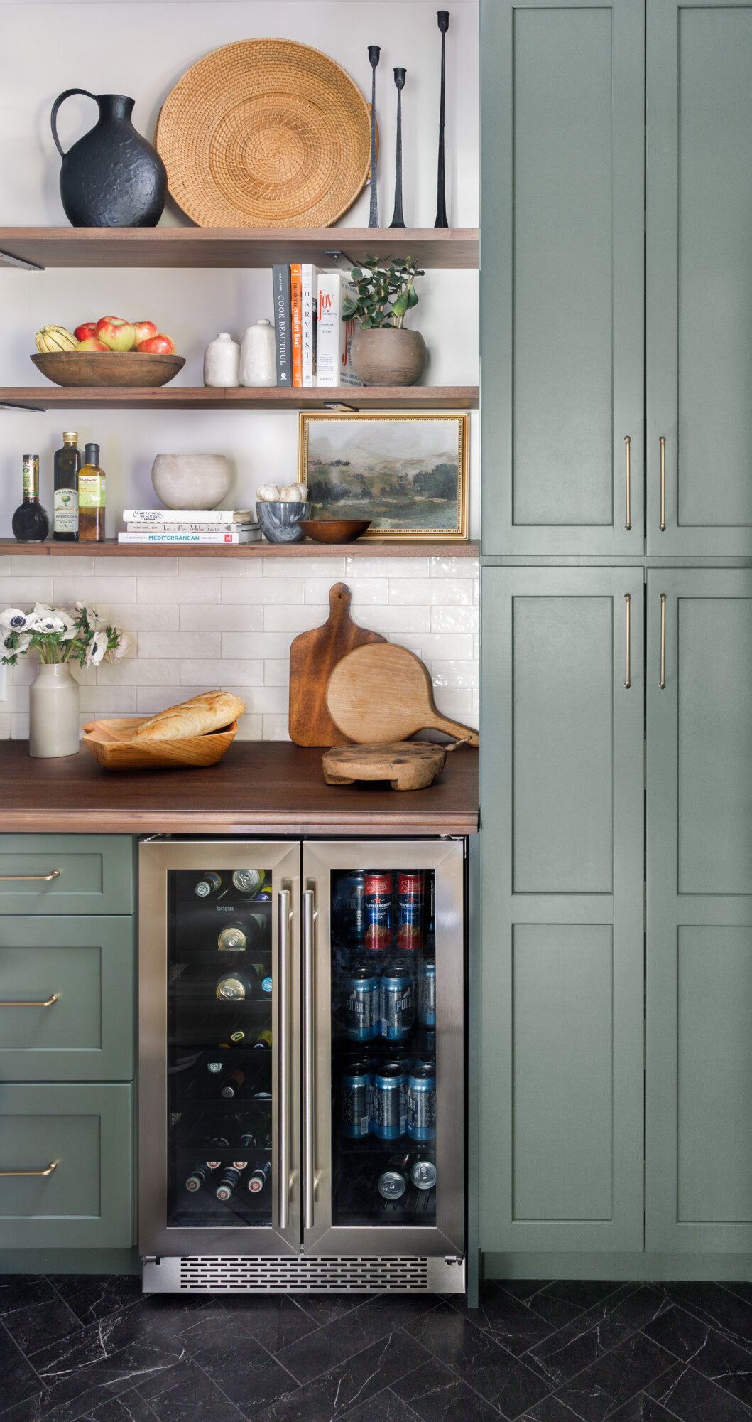
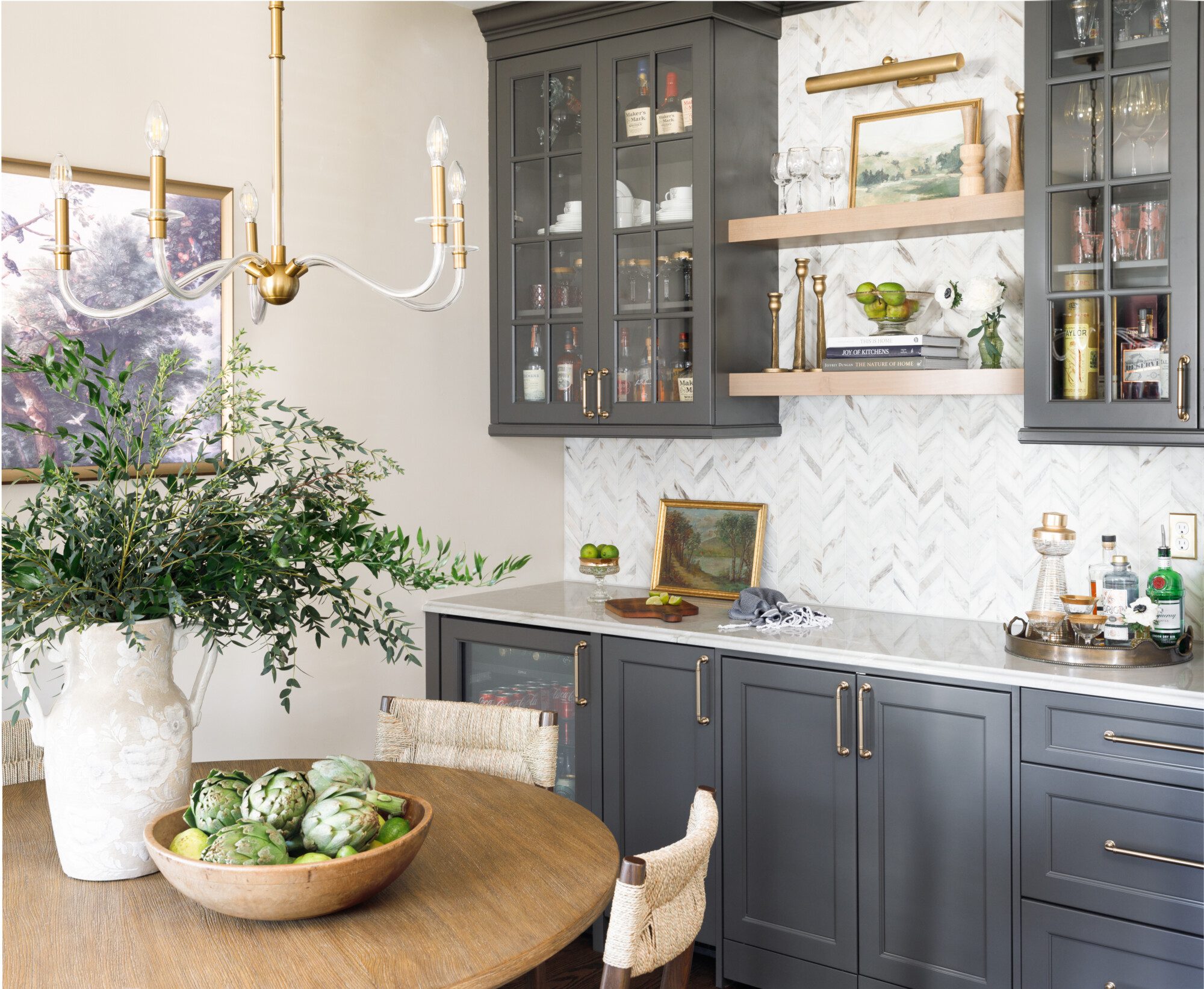
- Cabinetry and wood combination
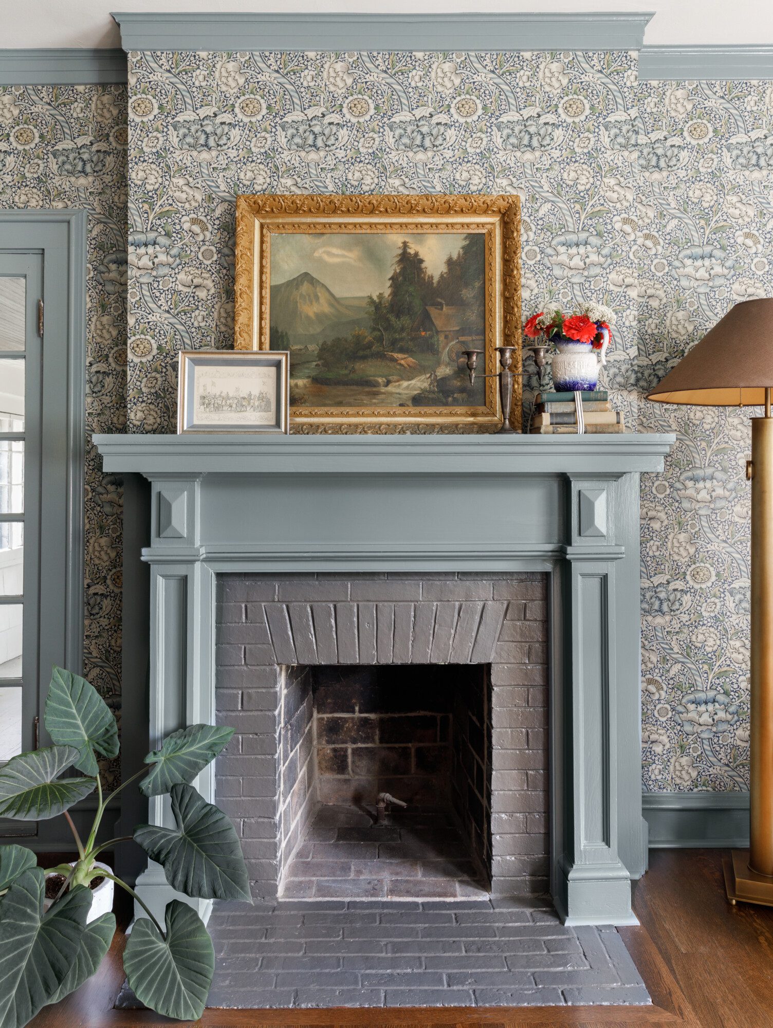
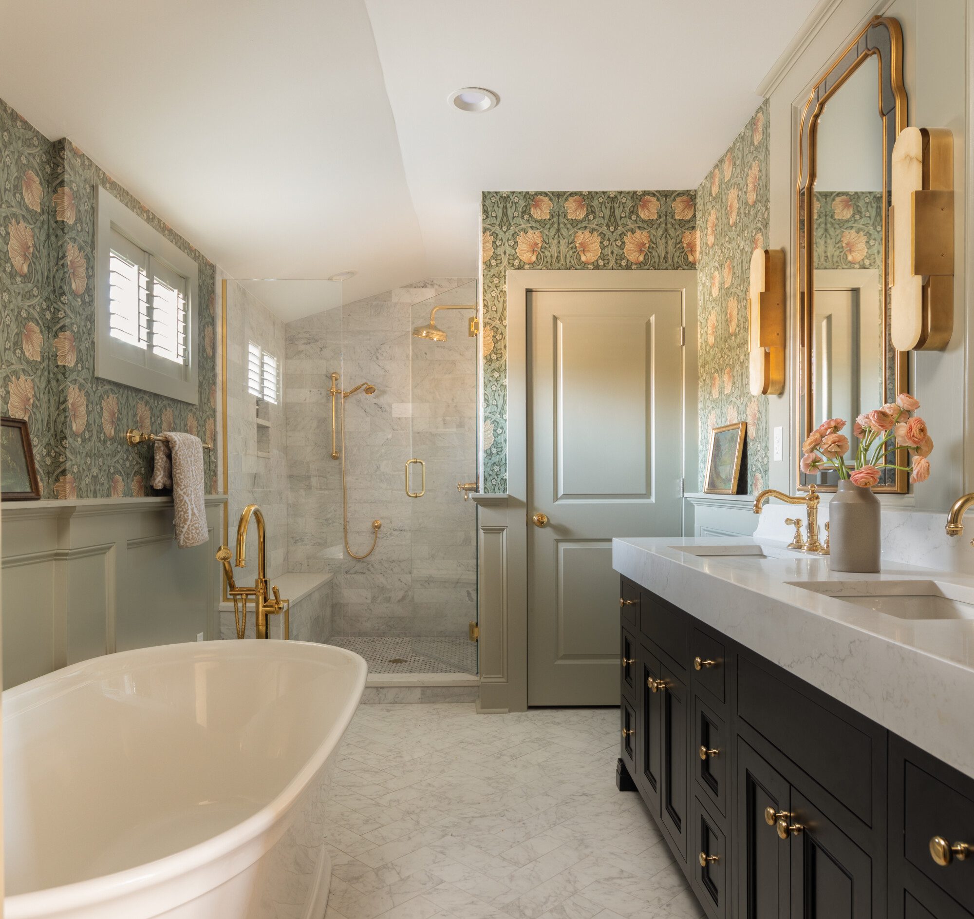
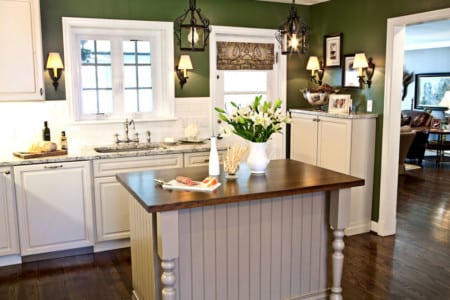
- Cozy paint and wallpaper
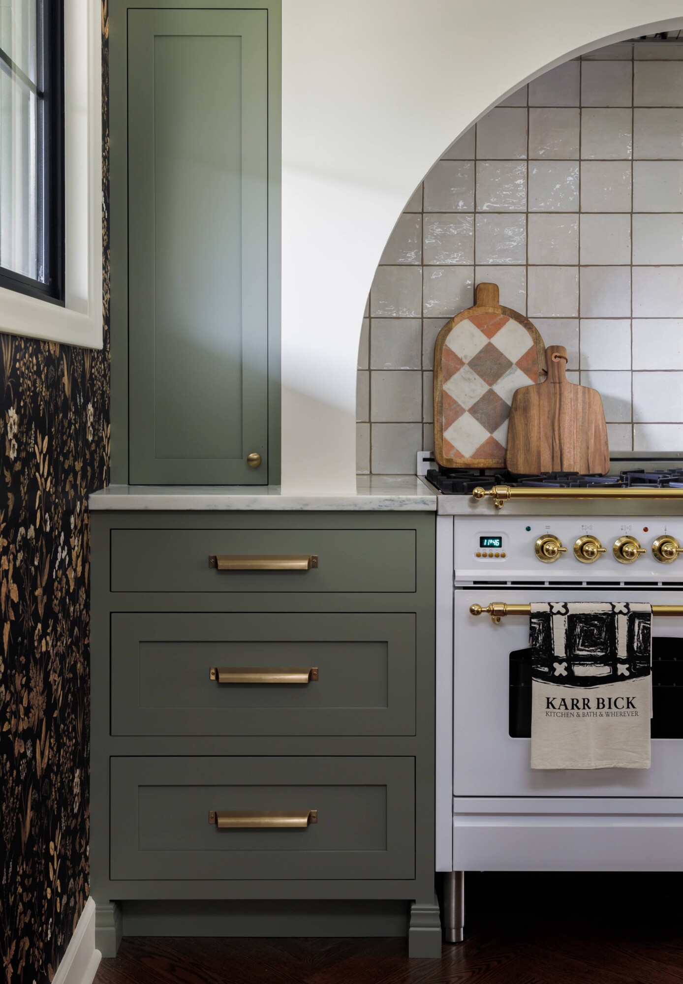
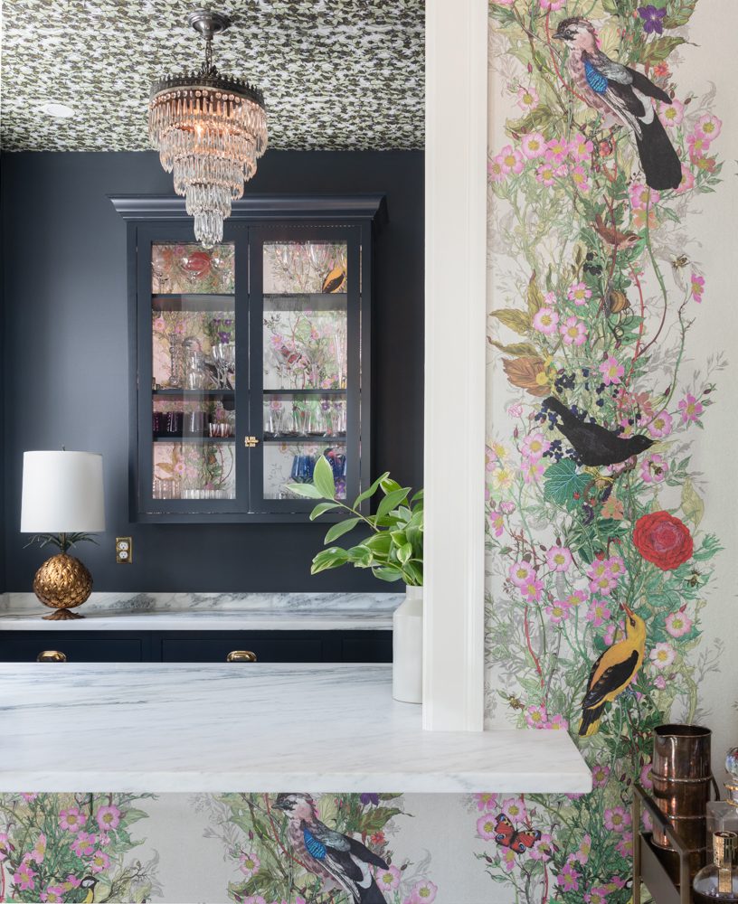
- Deep cabinetry and wallpaper
Why Color Matters in Interior Design
Color plays a significant role in how a space feels and functions. It can make a room feel larger or cozier, more vibrant or more serene. Whether you gravitate toward earthy naturals, jewel tones, or soft pastels, color has the ability to shape the mood and atmosphere of a space. It can truly alter and elevate how we feel, both positively and negatively.
I remember seeing a “transformation” on HGTV. The colors were harsh red and yellow. All I could think of was ketchup and mustard. It was like they just designed a McDonalds for the client. The colors made me physically agitated. This type of bold color is what we are trying to avoid. On the flip side, I remember going on a historic home tour and the walls were saturated in the most stunning shades of blues and greens. I never wanted to leave. This is the type of feeling that we want to evoke in your space.
Ways to Incorporate Color into Your Home
So how do we tackle this topic when there are so many colors to choose from. How do we know what is right for us as the homeowner or client? If we are not used to color and still have a bit of fear, we begin with baby steps.
1. Start Small with Accents
If you’re hesitant to commit to bold colors, start small. Incorporate colorful pillows, artwork, rugs, or decorative accessories to bring in personality without overwhelming you or your home.
- Color added with art
- All light but bold artwork
- Adding color with pillows
- Adding subtle color with pillows
- Small pop with a pillow
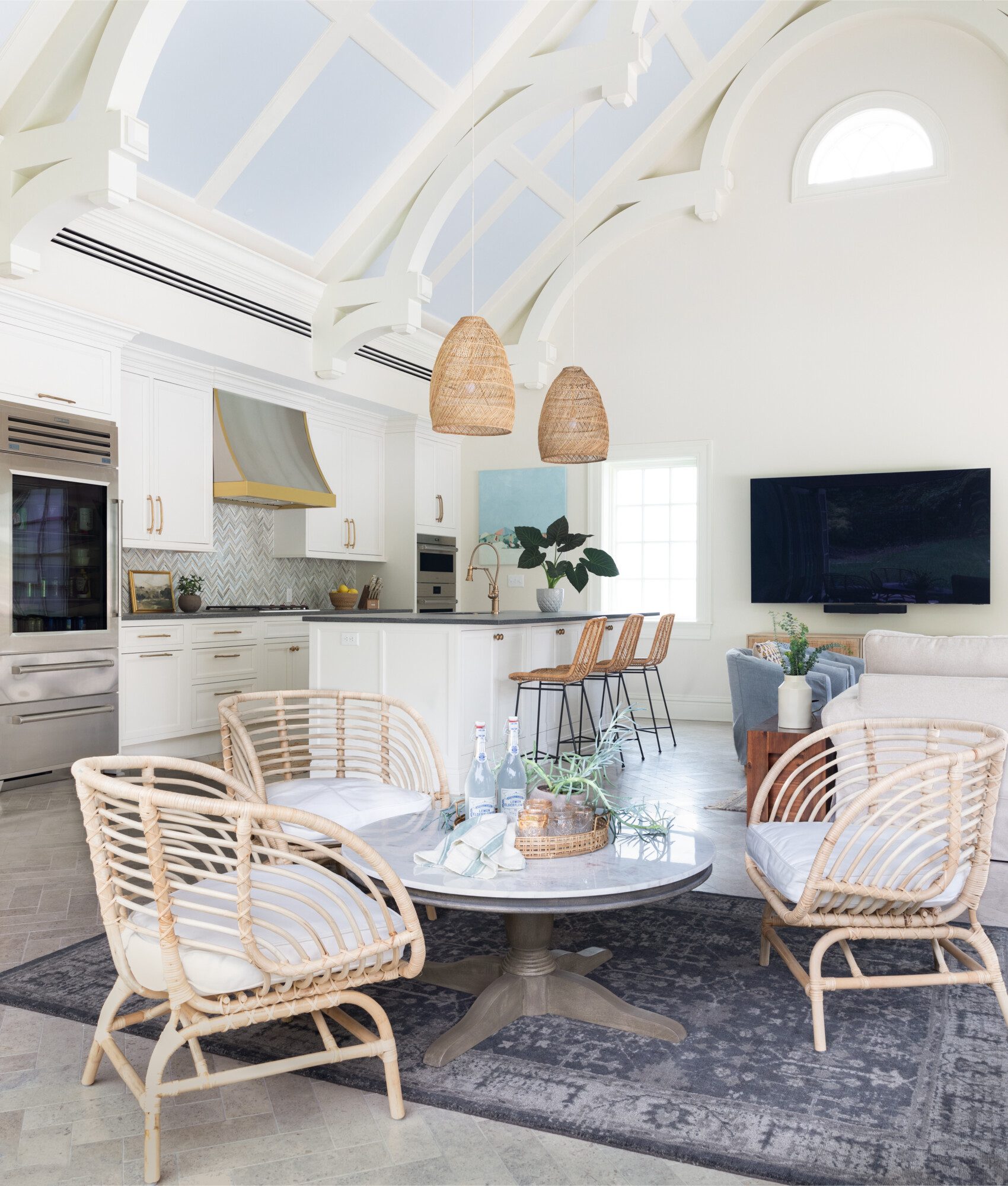
- Adding color with barstools
2. Create a Statement with Walls or Ceilings
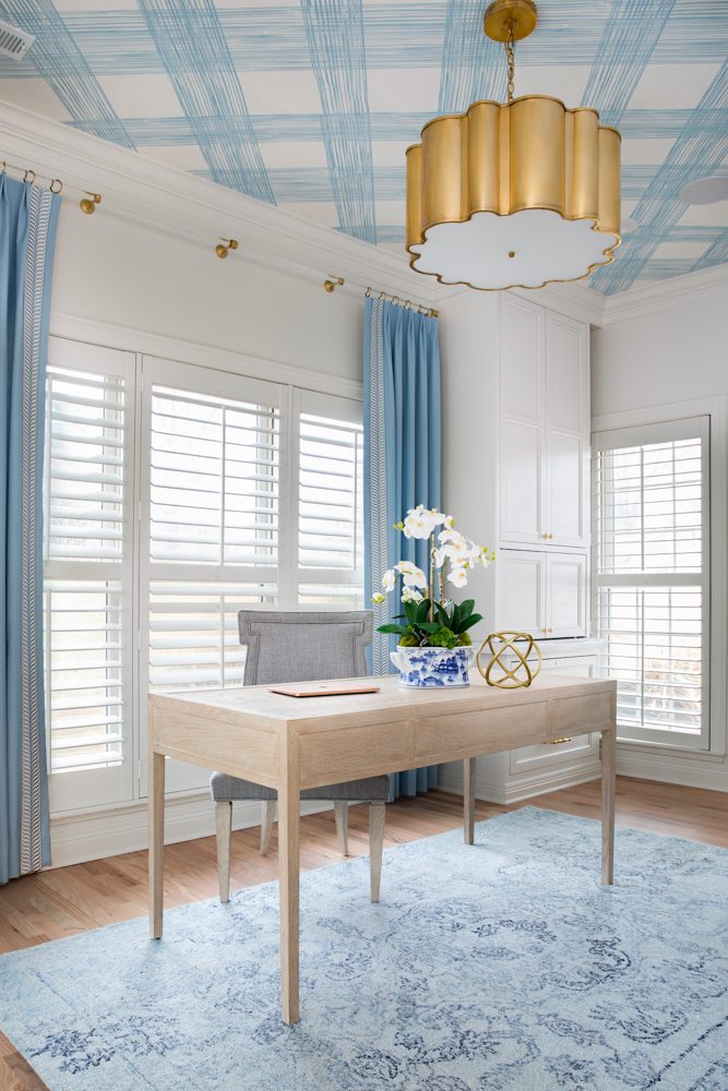
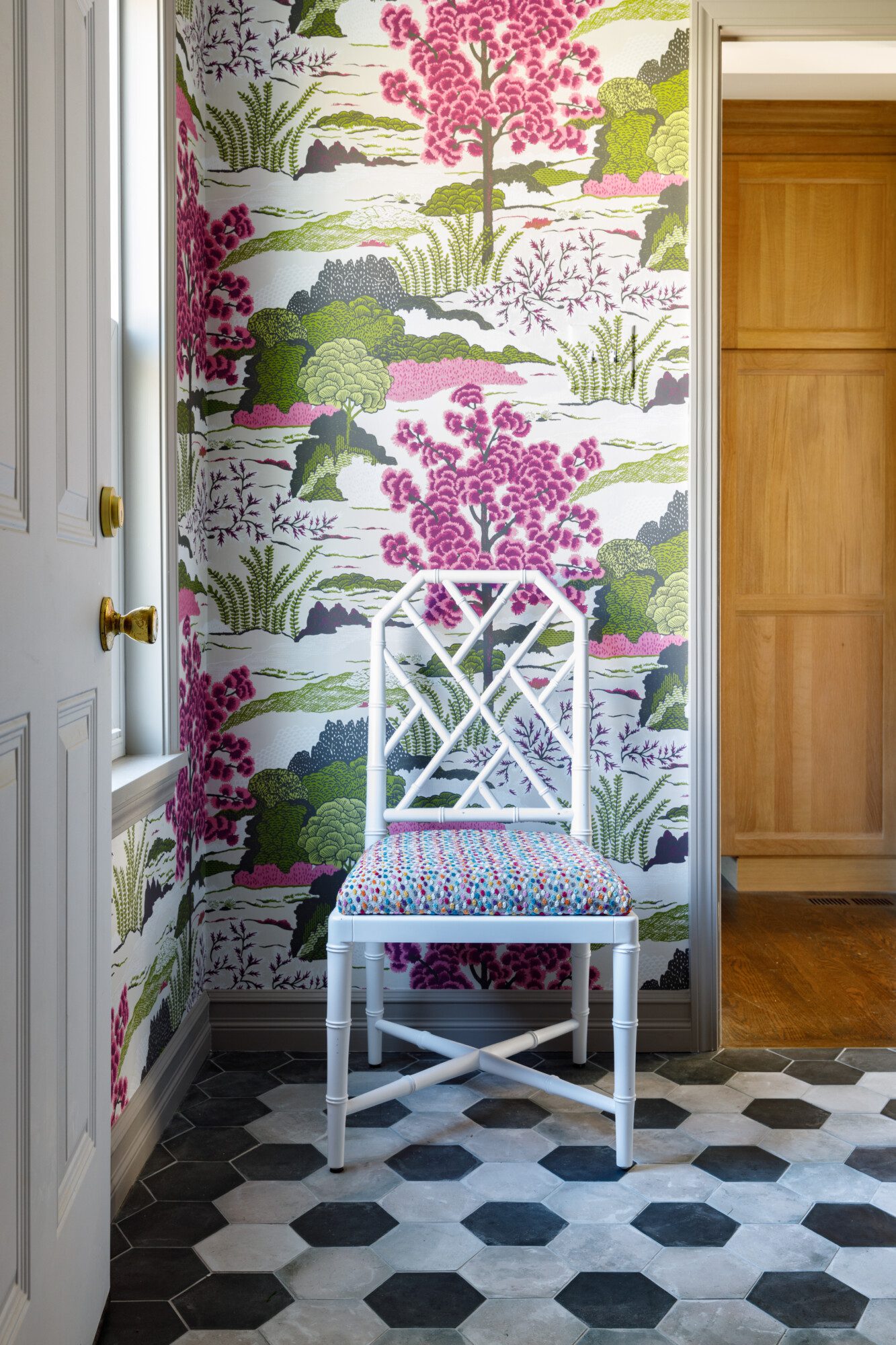
One of the most impactful ways to embrace color is through paint or wallpaper. A feature wall or a bold ceiling can make a striking impression while still allowing the rest of the space to remain neutral. We especially love wallpaper on a ceiling. It makes a huge impact and creates an amazing focal point. Check out these amazing spaces and how we used color to make them really pop.
- Deep accent wall
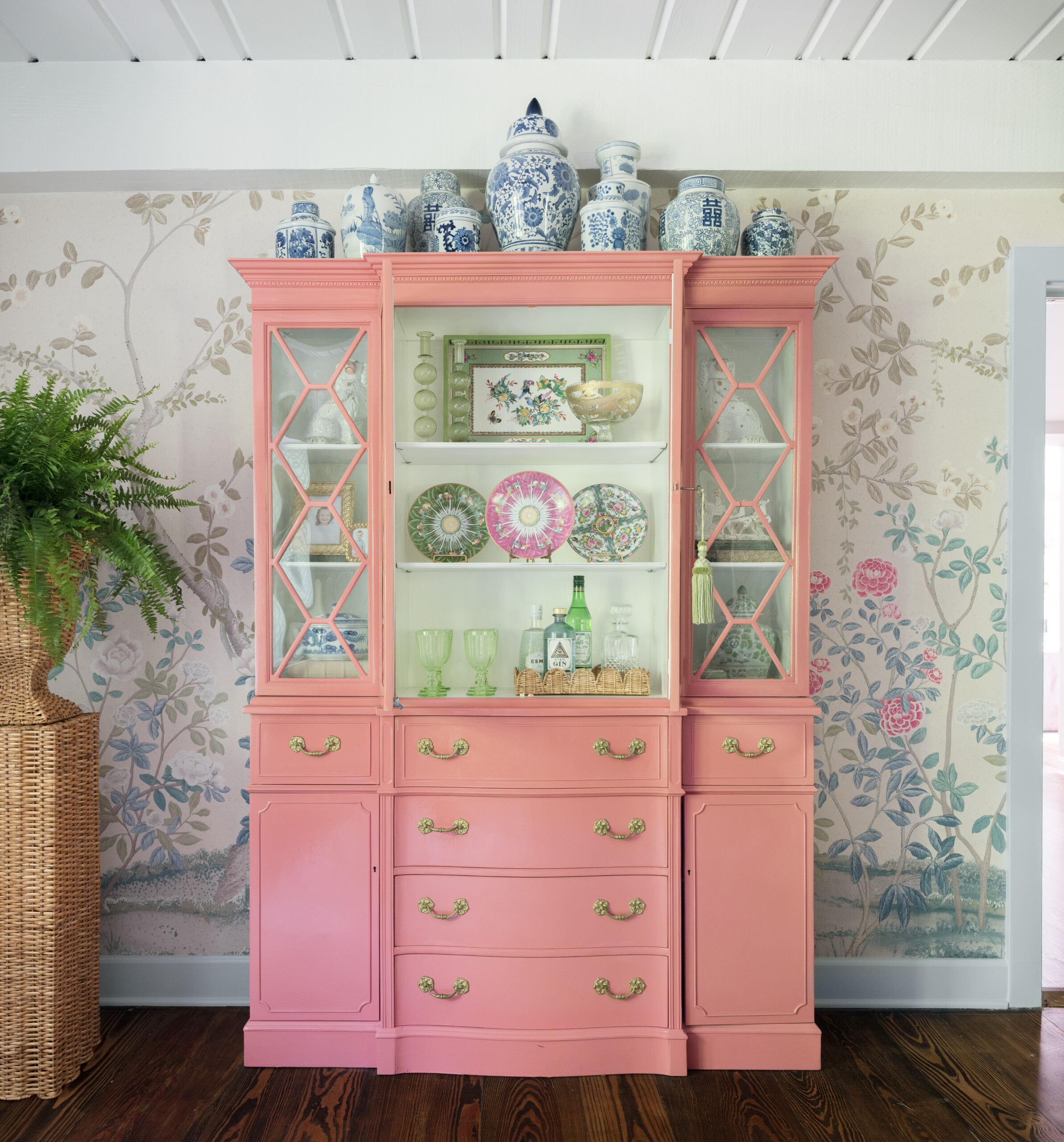
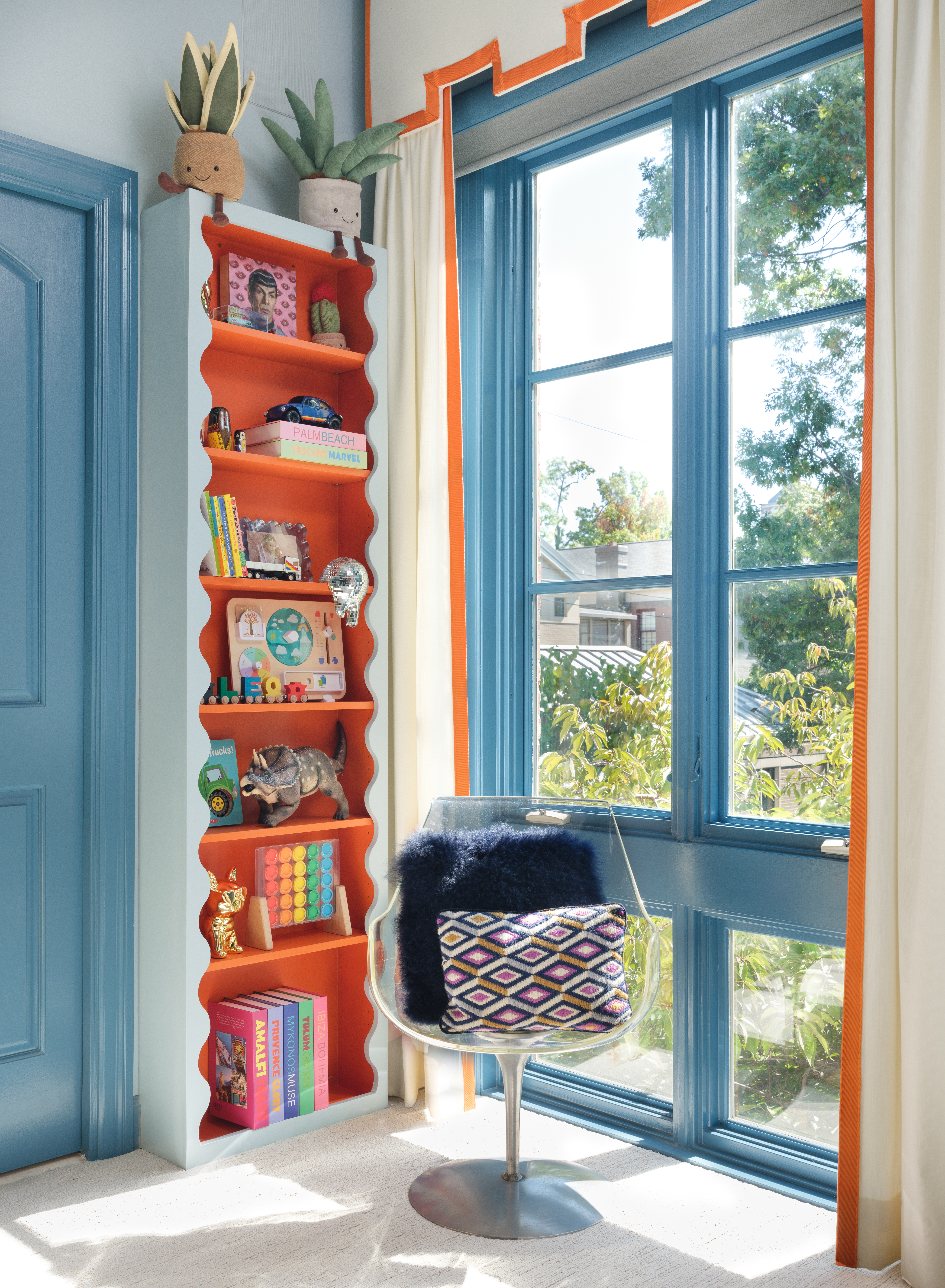
- Painting the shelf interior
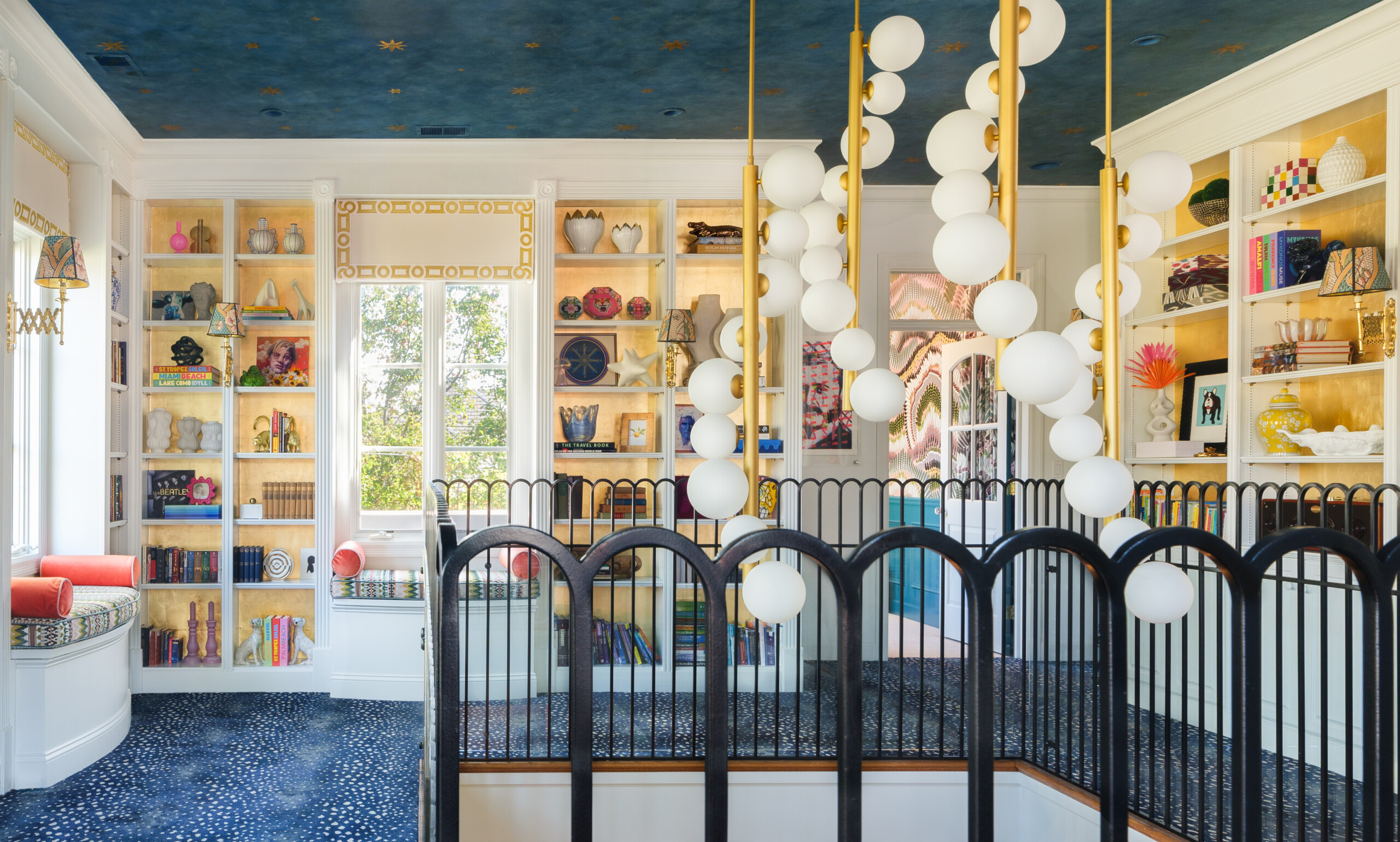
- Ceiling paper is impactful
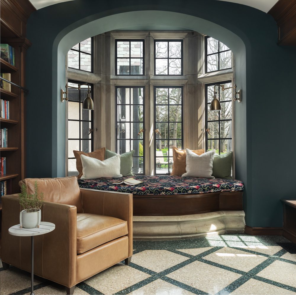
- Nook saturated in color
- Color in the adjacent dining Area
- Light color on the ceiling panels
- Trim and shelves in color
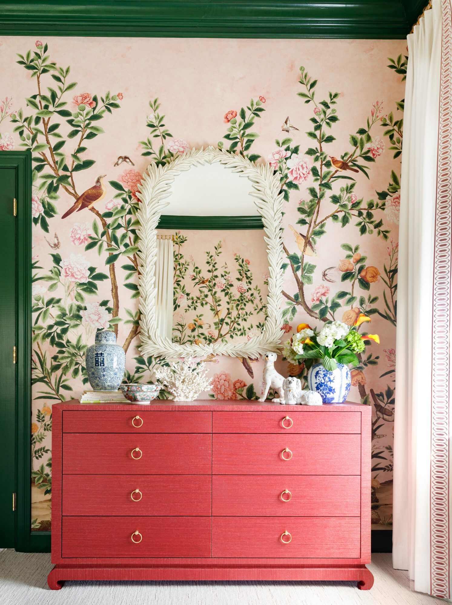
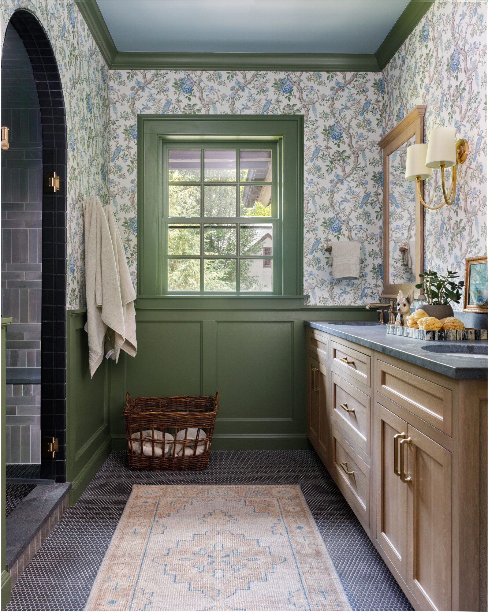
- Colorful trim
3. Experiment with Cabinetry and Built-Ins
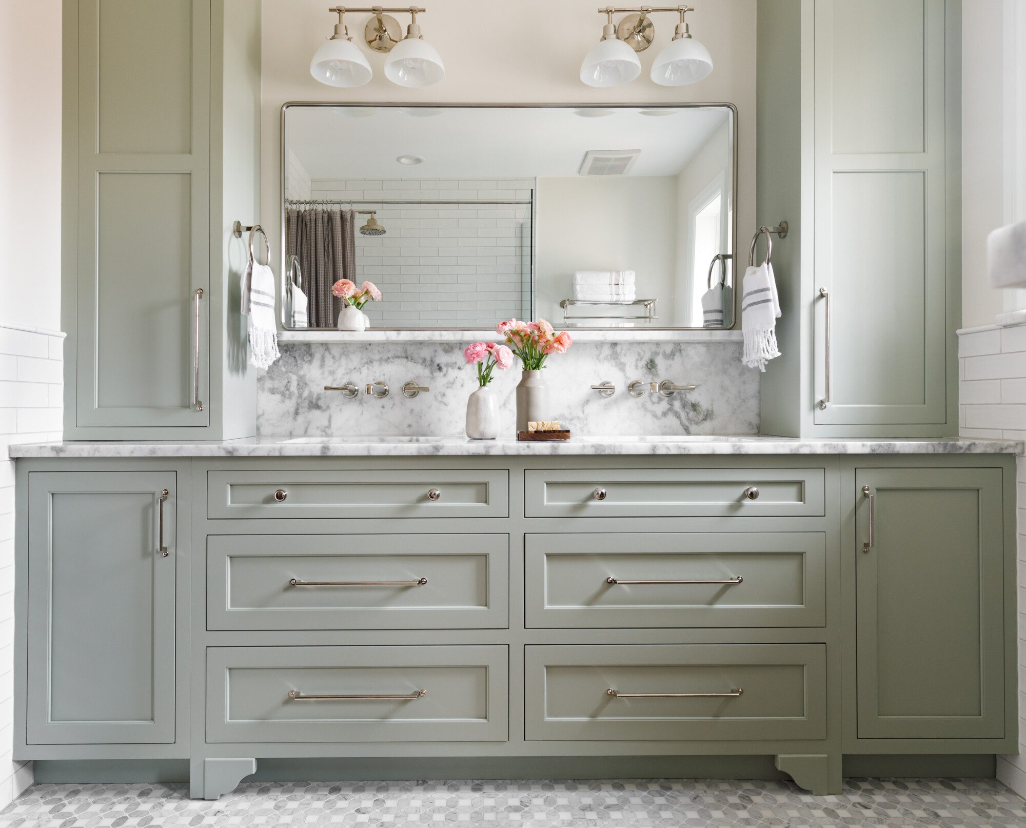
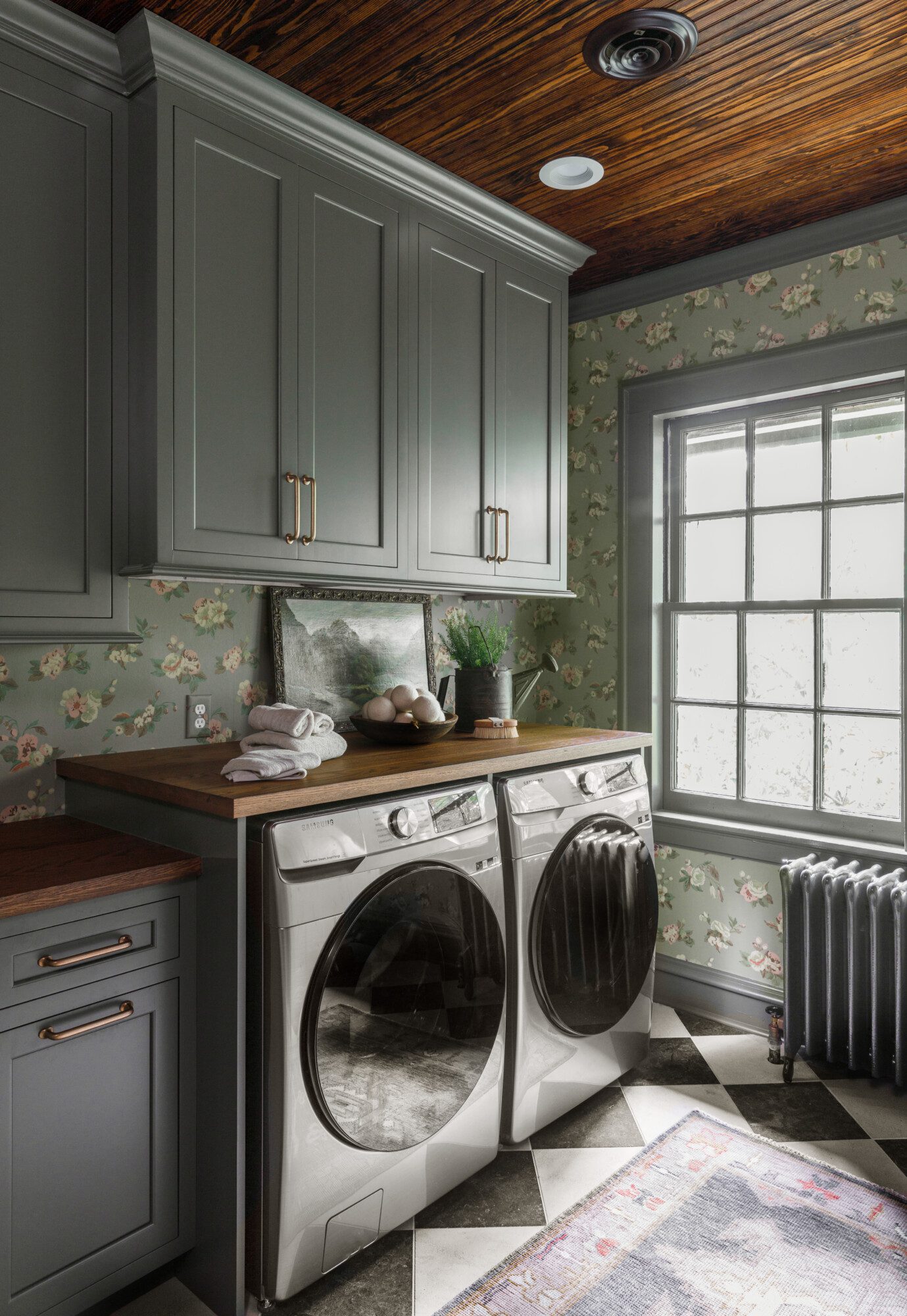
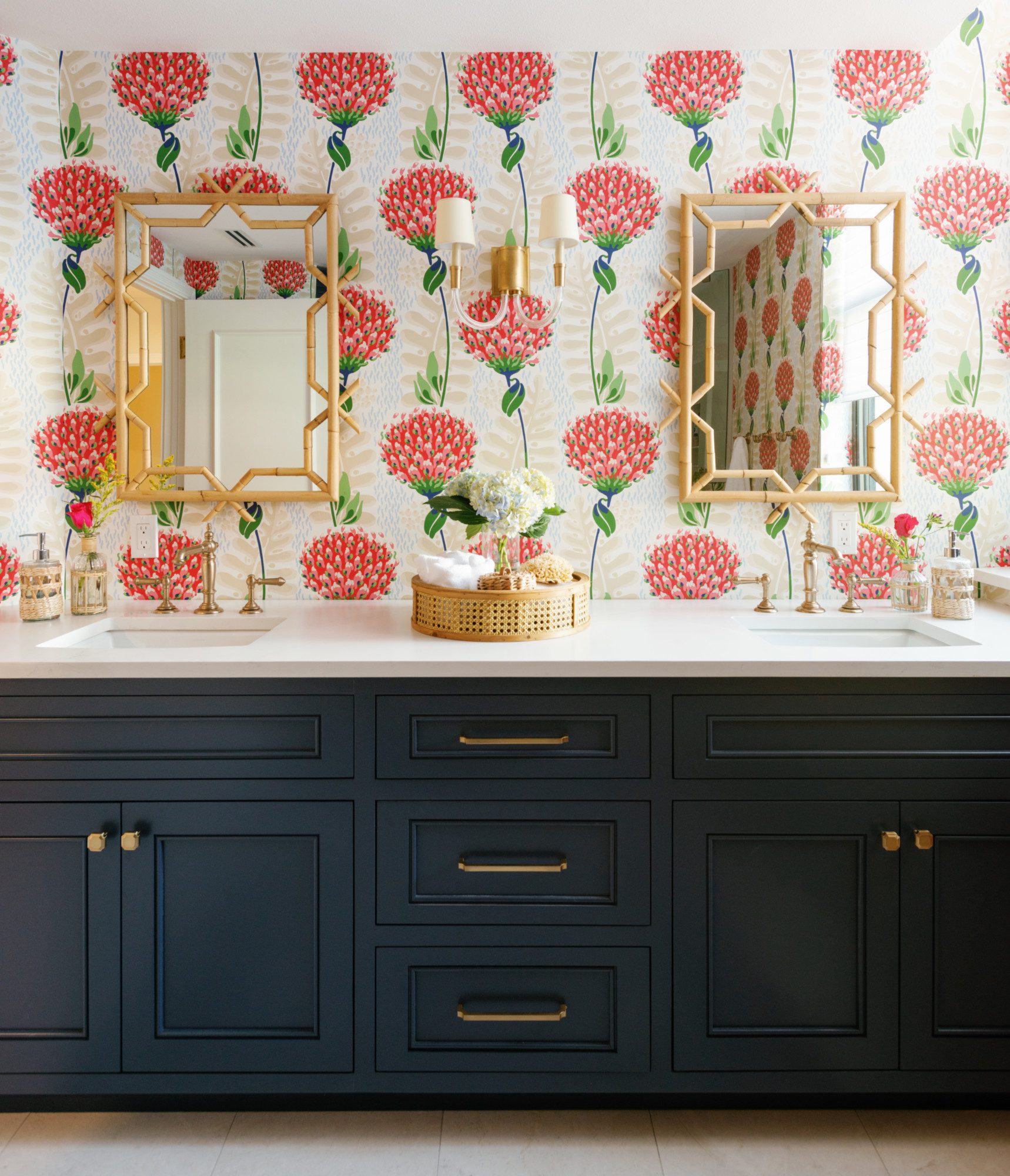
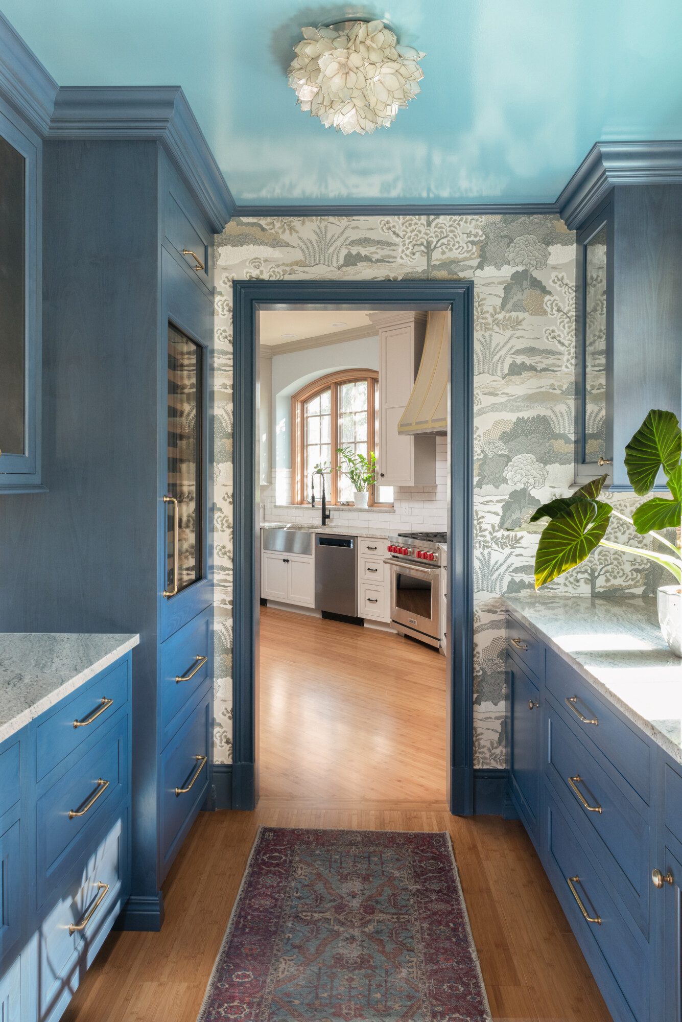
Kitchen cabinets, bathroom vanities, or custom built-ins are excellent opportunities to add color in a sophisticated and lasting way. Deep blues, sage greens, and warm terracotta tones can add richness and depth to any space. Even if you keep the walls neutral, add a pop of color with a powder room vanity, or go bold in your butler’s pantry. It’s a great way to experiment with color but might not scare you as much. Here are some great examples of colorful cabinetry enhancing a space.
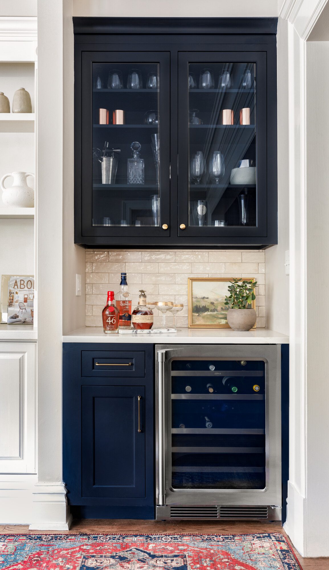
- Navy blue built-in bar
- Blue pantry with wallpaper
- Pretty kitchen in pink
- Gorgeous green in the kitchen
- Blue gray built-ins in the kitchen
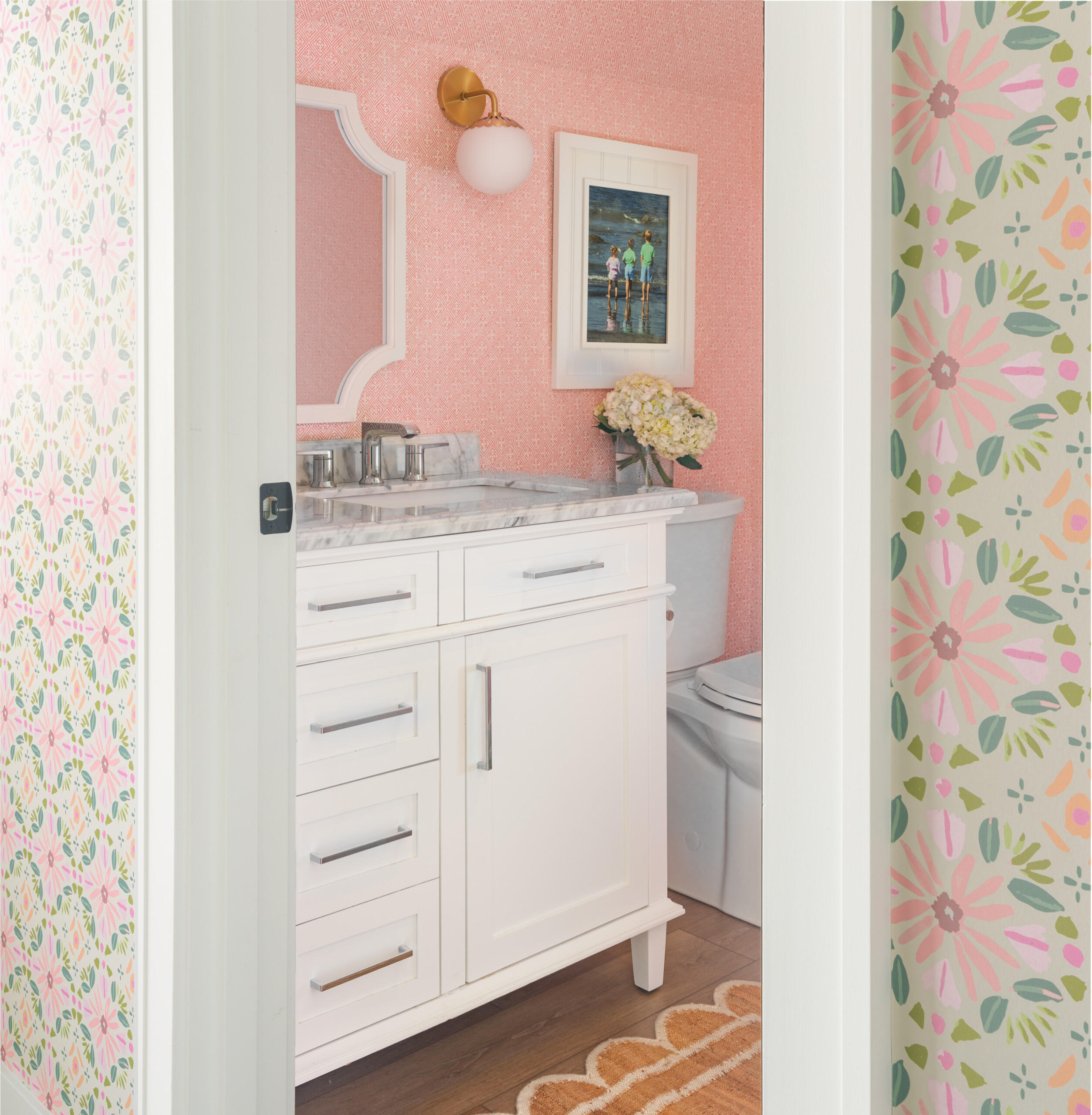
- Pink in the bathroom
- Pastel primary bath
- Dark laundry room
4. Balance Bold Choices with Neutrals
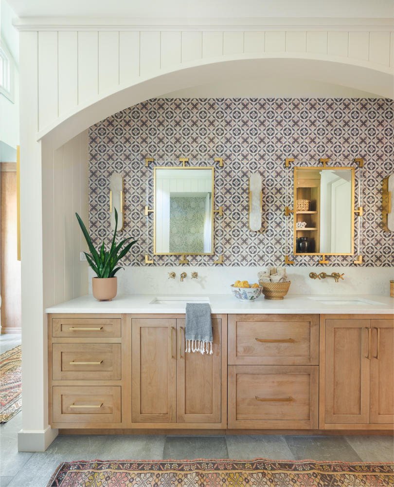
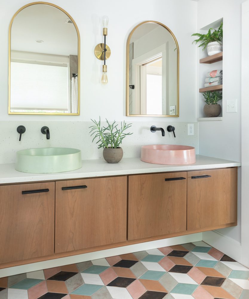
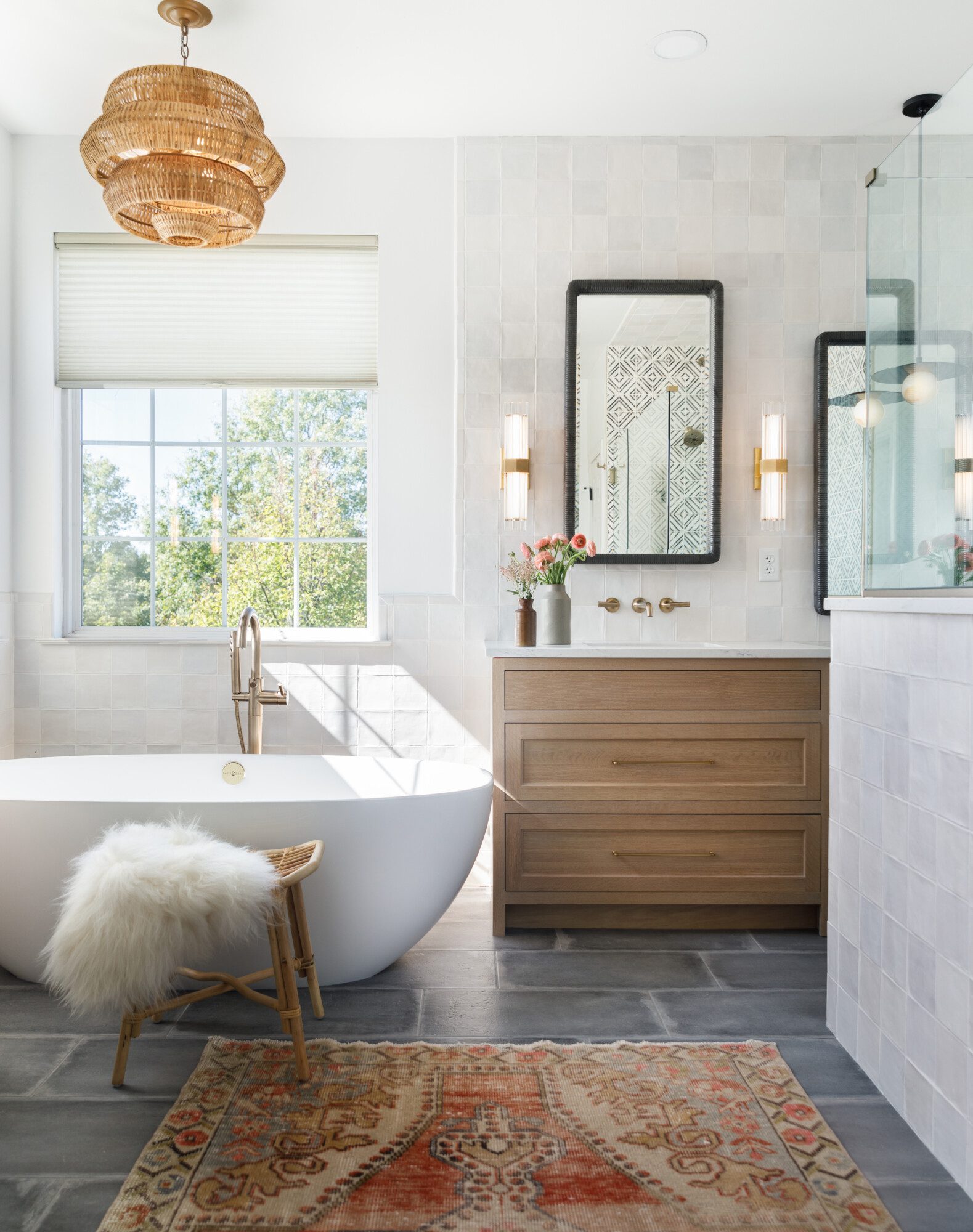
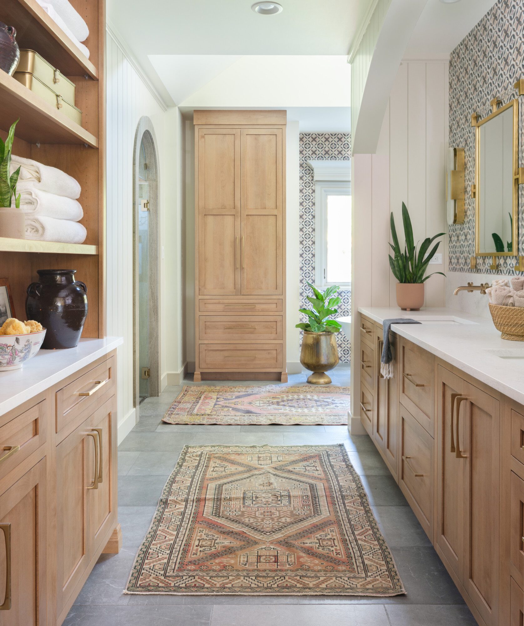
A colorful room doesn’t have to be overwhelming. Pair bold shades with soft neutrals like whites, beiges, and warm woods to create a harmonious look that feels both fresh and timeless. We love to use light wood tones in the cabinetry, while saturating the trim in bold color. We also love to keep walls neutral, then pop a colorful vanity or fun tile into a space. There is no right or wrong way to go. Both are a great way to add color.
- Wood and statement tile
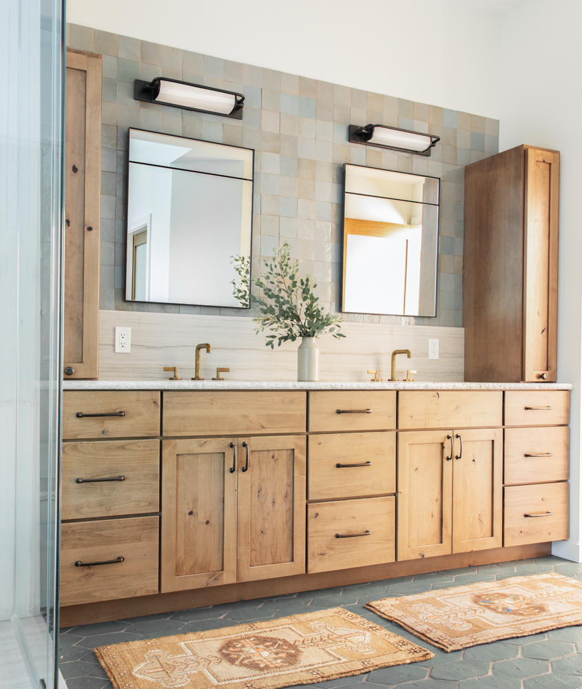
- Wood with colorful floor tile and sinks
- Wood with dark island and rugs
- Wood and colorful wall tile
- Wood with deep floor tile and accent rugs
- Wood with neutral walls and statement tile
5. Let Nature Inspire Your Palette
Nature provides endless inspiration when it comes to color. From earthy greens and ocean blues to sunset-inspired oranges and muted desert tones, drawing from nature ensures a palette that feels grounded and inviting. Examine what your favorite colors in nature are. What brings you the most happiness? That may be the perfect way to find your favorite shade for a room. Here are many more color examples, some a bit bolder.
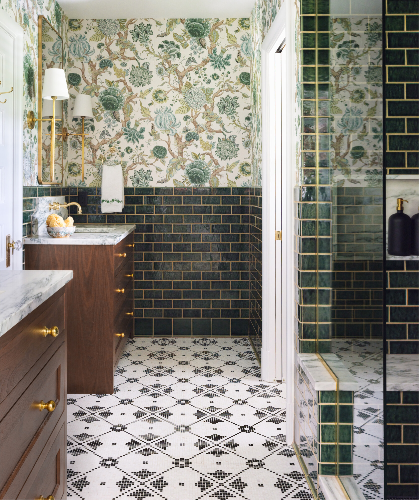
- Bold bathroom
- Accent in hot pink
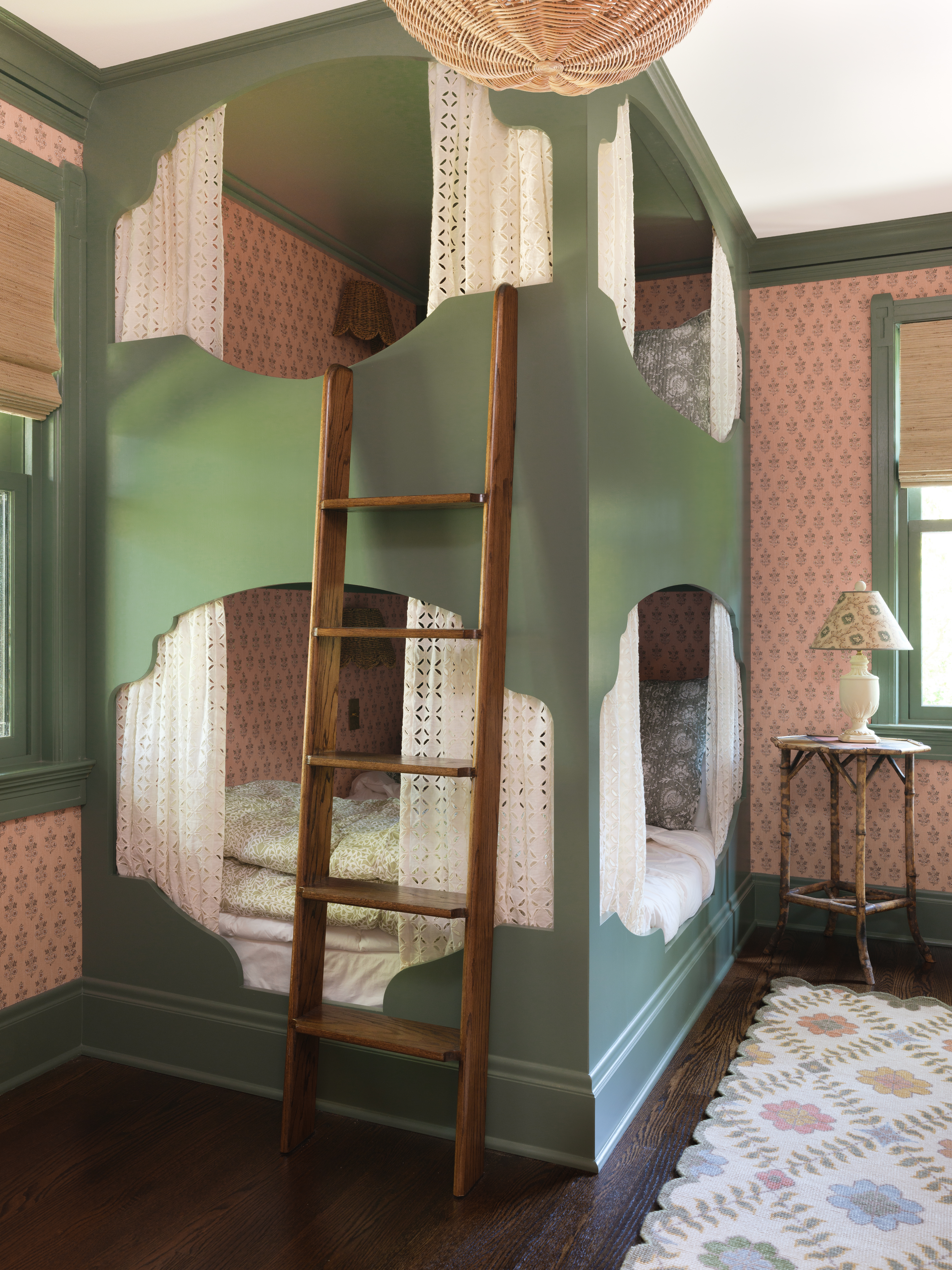
- Colorful bunk room
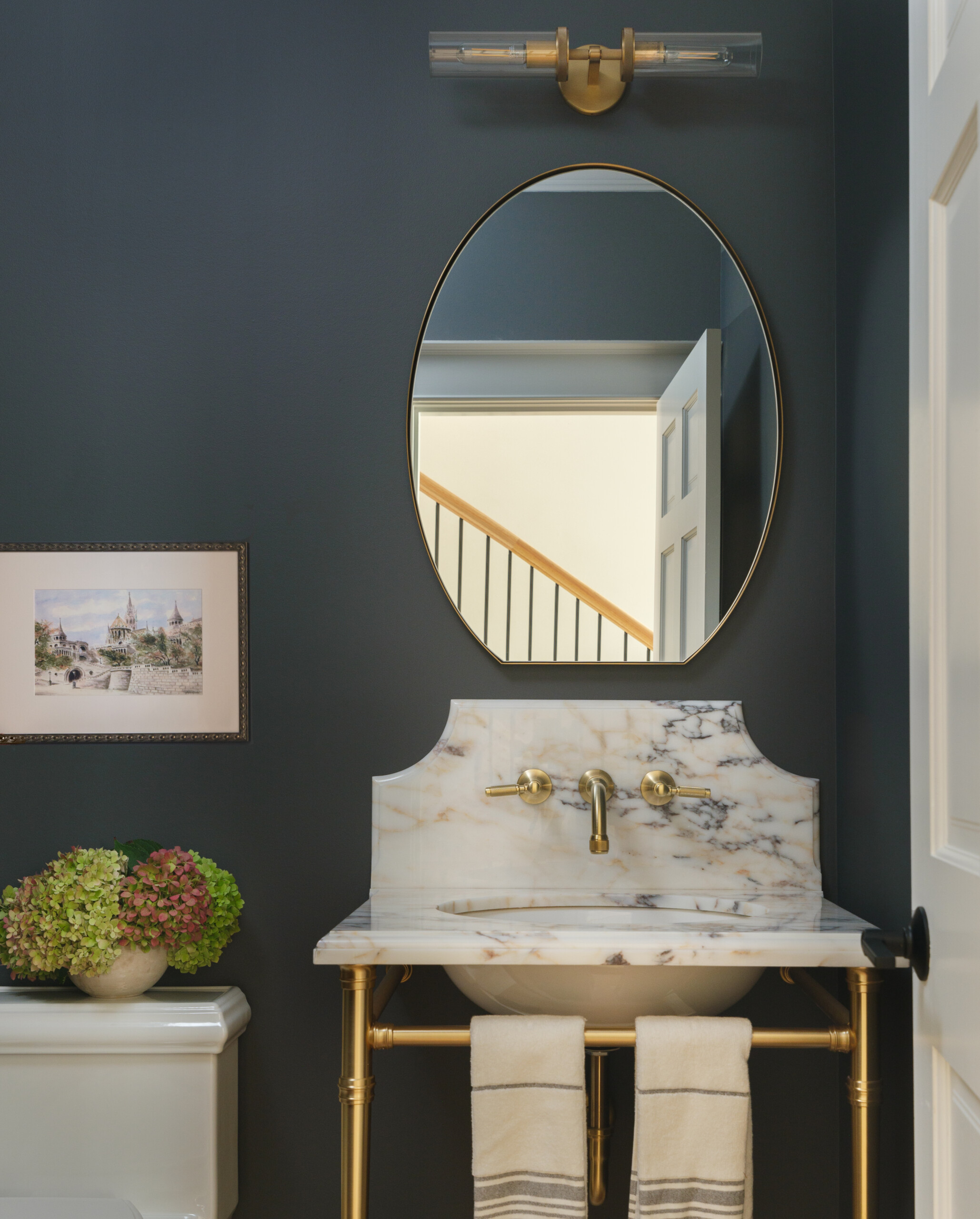
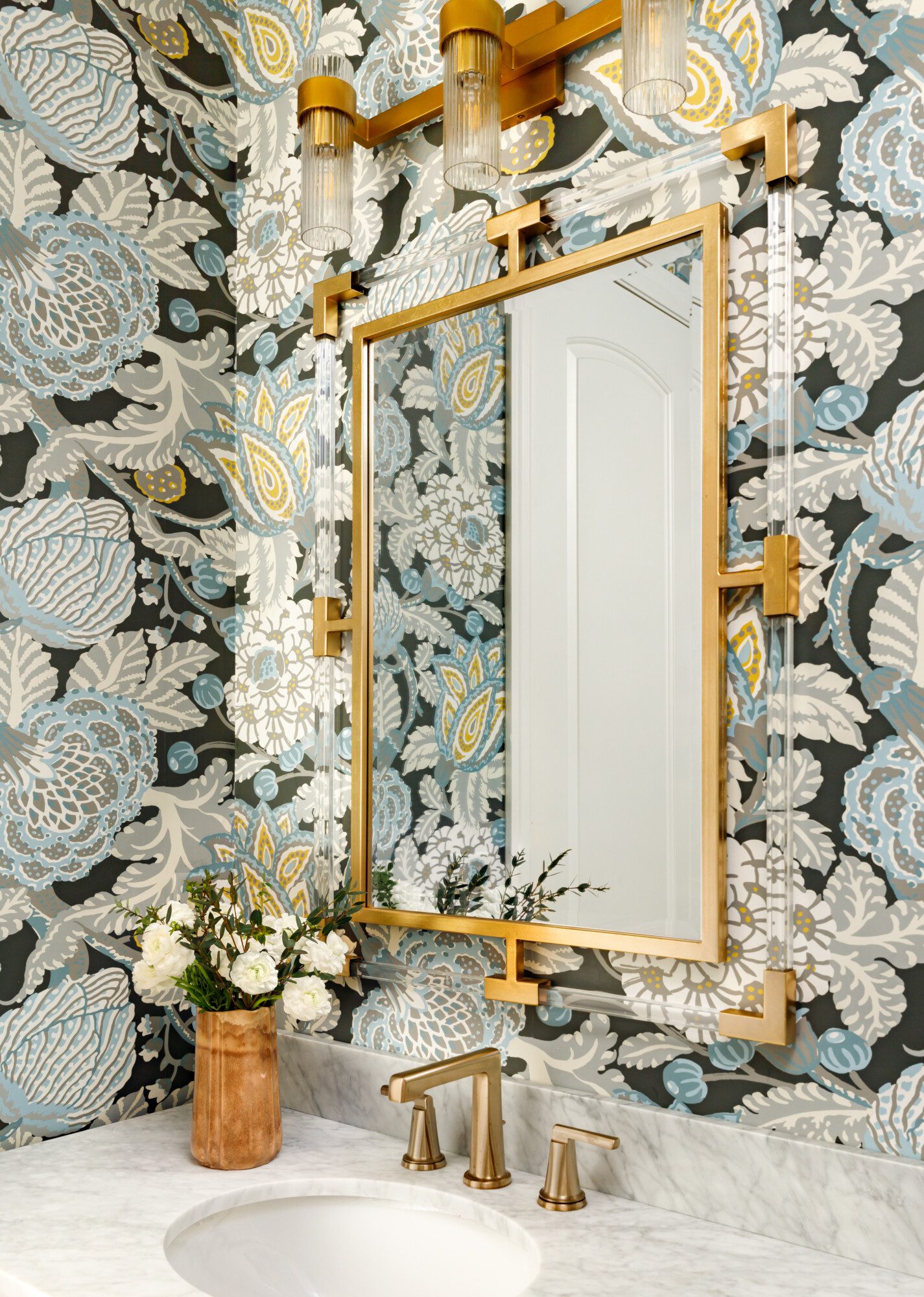
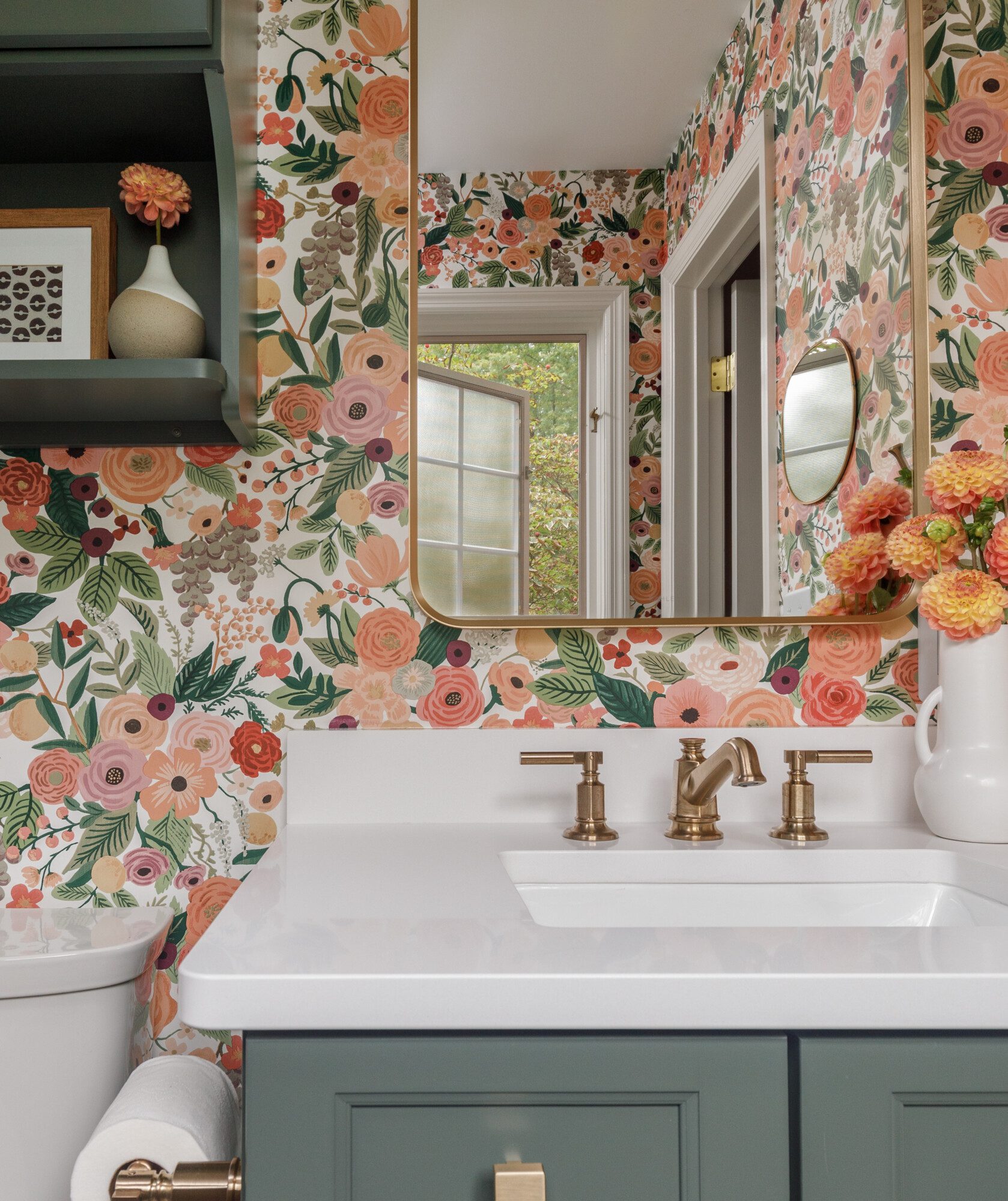
- Pretty powder
- Fun and bold shelves
- Powerful powder room
- Deep drama in the landing
- Amazing girl’s room
- Color saturation and two paper patterns
- Dining room in deep navy and accents
- Bold secondary bath
- Deeply saturated walls and paper
- Softer Primary with personality
- Colorful laundry
- Bold primary bath
- Blue saturated butler’s pantry
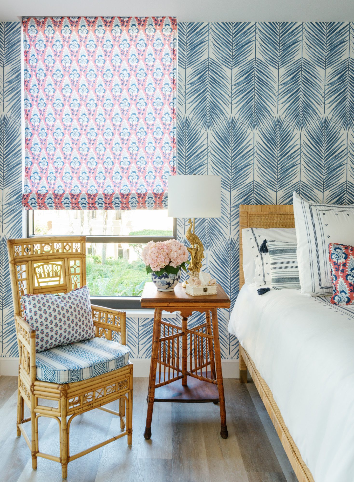
- Coastal bedroom
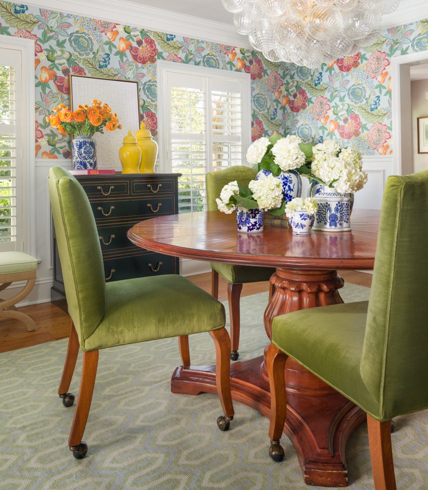
- Green velvet and bold floral
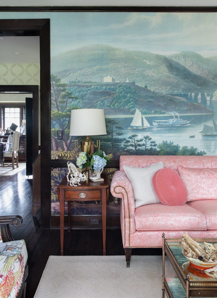
- Scenic living room
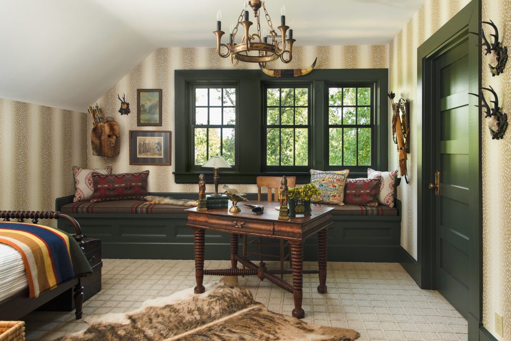
- Yellowstone guest room
Finding Your Comfort Level with Color
Not every space needs an explosion of color, and not every person feels comfortable with the same level of vibrancy. The key is to find what speaks to you and integrate color in a way that feels authentic to you. Whether you lean toward bold and eclectic or subtle and sophisticated, color can be used in countless ways to create a home that feels uniquely yours. But we promise you, you will be happier when you add a bit of color to your home. When we stay too neutral, rooms tend to feel sterile. Trends that we want to avoid are plentiful, but an example would be the all-white modern farmhouse style. Stark, sterile, zero personality. It’s why the trend is gone.
So, what do you think? Are you ready to embrace color? If you’ve been stuck in a sea of neutrals, now is the time to explore the power of adding that pop to your space. Whether it’s painting or papering that ceiling, adding a vibrant backsplash, or a beautifully upholstered chair, adding color to your home can bring so much character, and joy to your life. It can finally make each room feel like you. Don’t go for trendy, go for a space that is uniquely yours. We promise you won’t ever regret it.
Head to Karrbick.com now to explore all of the ways that we have used color for our clients and get inspired now!

