A Touch of Great Gatsby
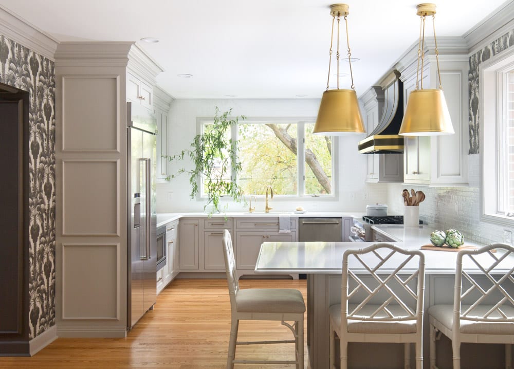
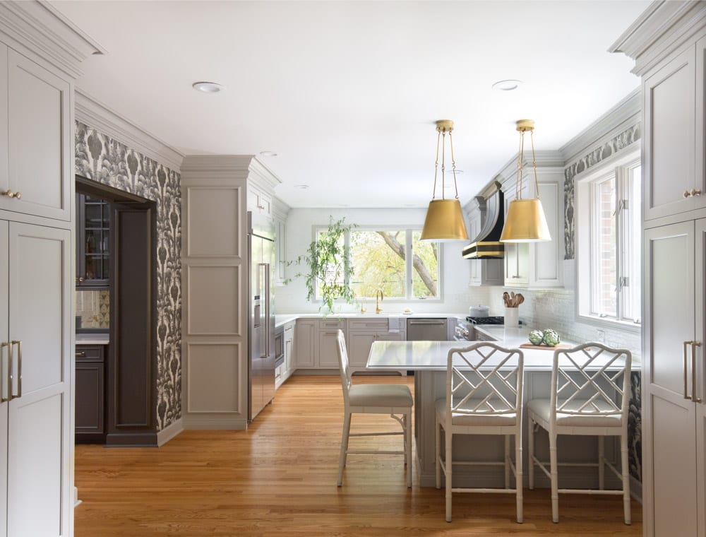
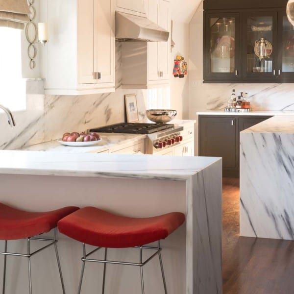
When combating this kitchen, the biggest challenge was fulfilling all the family’s desires and needs in a more compact space. Regardless of the size though, we’re firm believers that #NothingOrdinary is always possible. To ensure that the space had enough storage yet still felt open, the designer added wrap around countertop. The subtle hues of grey add a moodiness to the space without feeling too heavy.
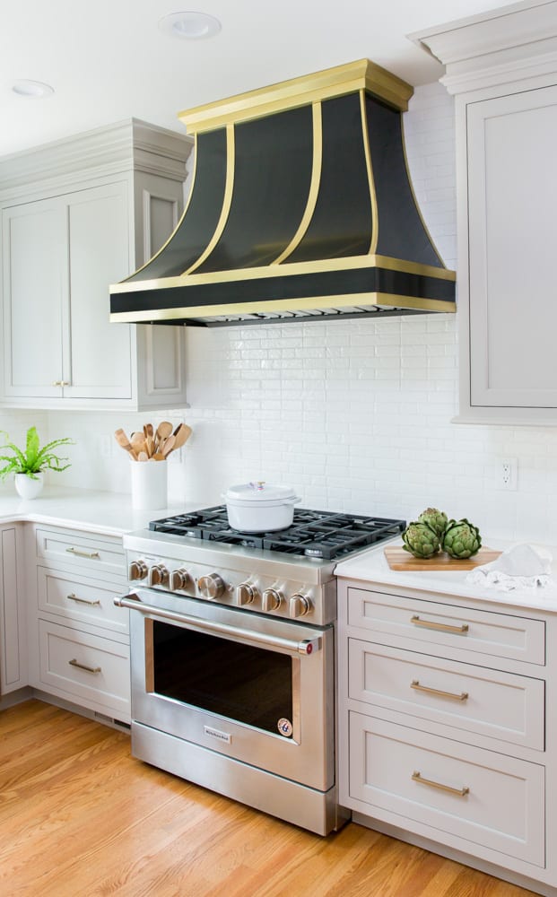
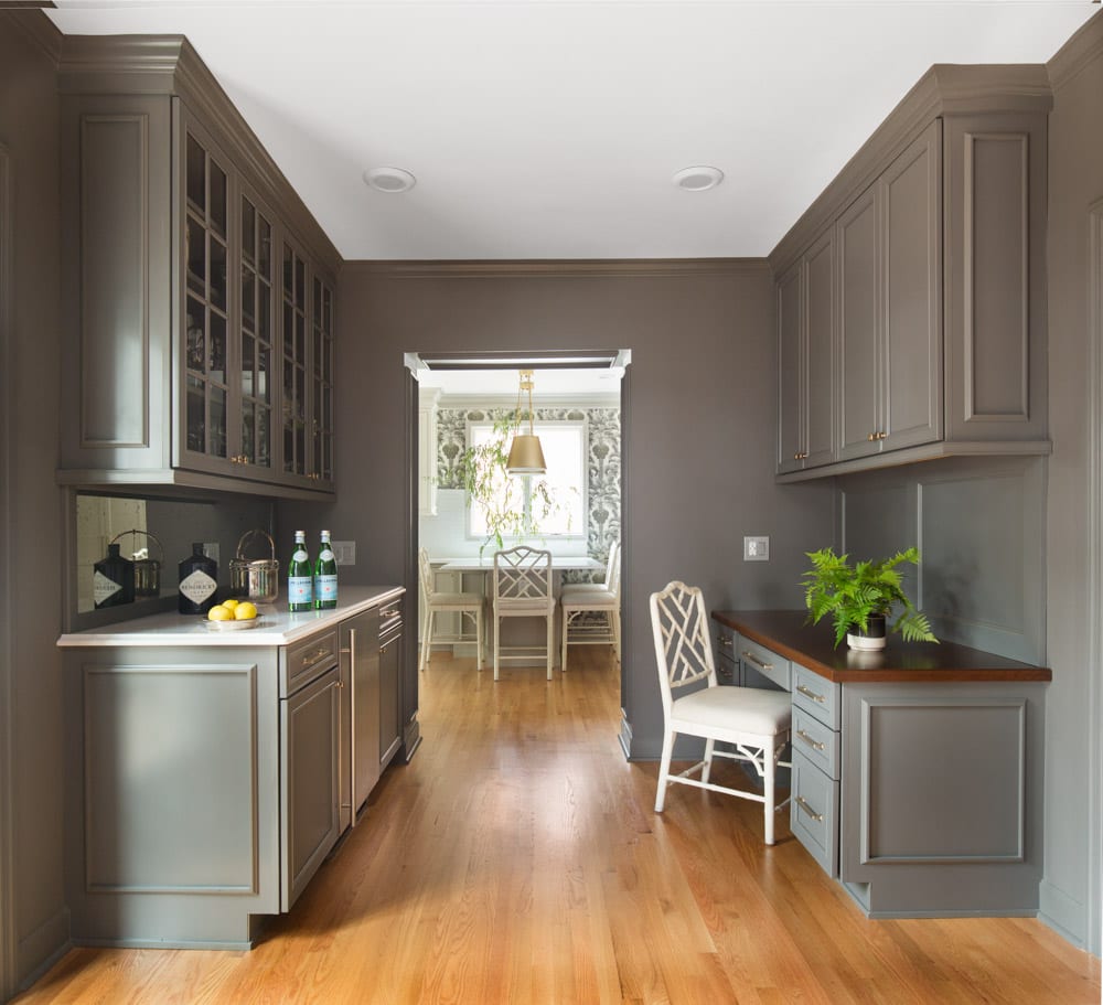
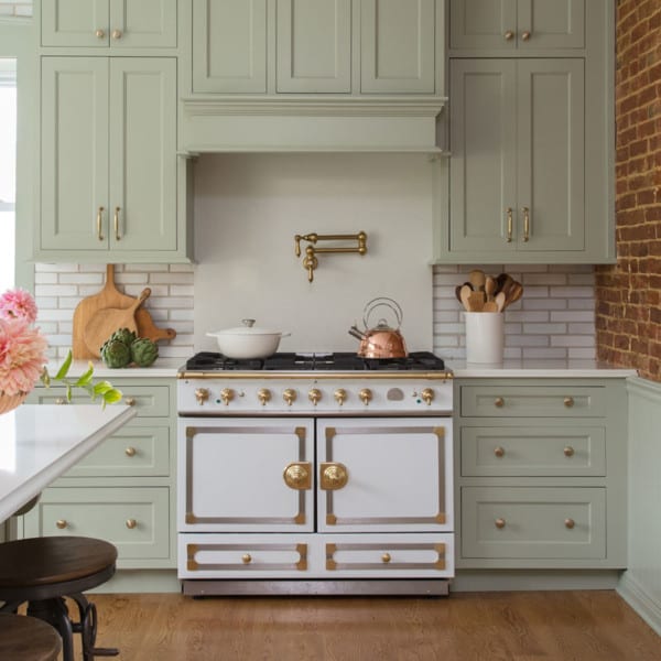
One of the most show stopping parts of the kitchen is the elegant wallpaper seen throughout. Not only does it make the space more dynamic, it helps balance out the simplicity of the kitchen. Polished gold, seen in the lighting fixtures and outlining the range hood, elevates the space. The big windows allow for a connection between the surrounding nature and the space indoors. Along with the kitchen space, the connecting hallway also got a facelift. With optimal desk space and a butlers pantry, the hallway is better fit than ever.
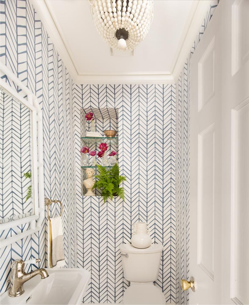
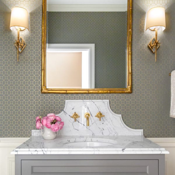
The powder room speaks for itself. Beautiful patterned wallpaper makes the space feel graceful and effortless. Built-in shelving allows for seamless storage without making the space feel cluttered. To finish off the space, the beaded chandelier is the cherry on top.
Subscribe to the Karr Bick YouTube channel for more before & after stories
If you’d like to start on your own transformation journey, use our plan now tool and visit our virtual showroom. We also have a blog with a step-by-step checklist to help you on your design adventure.

