Height of Luxury
Design Elements

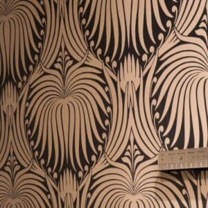

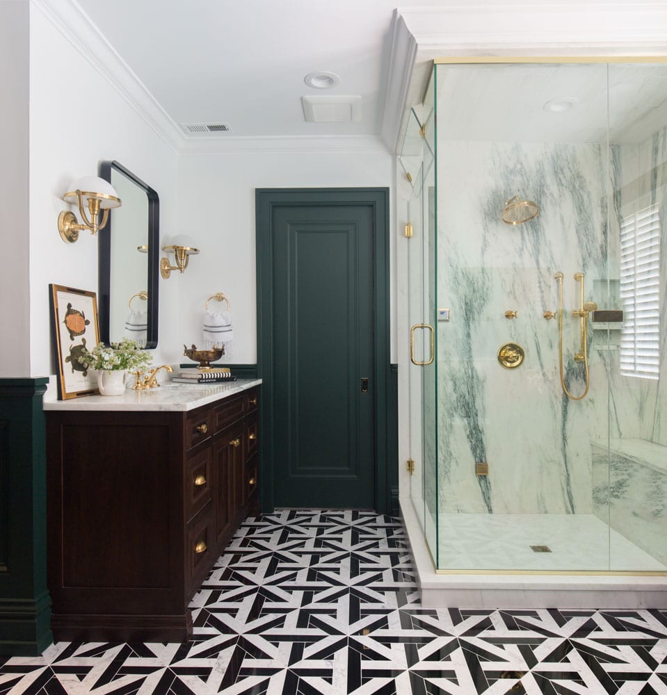
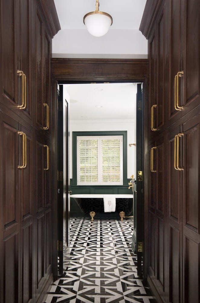
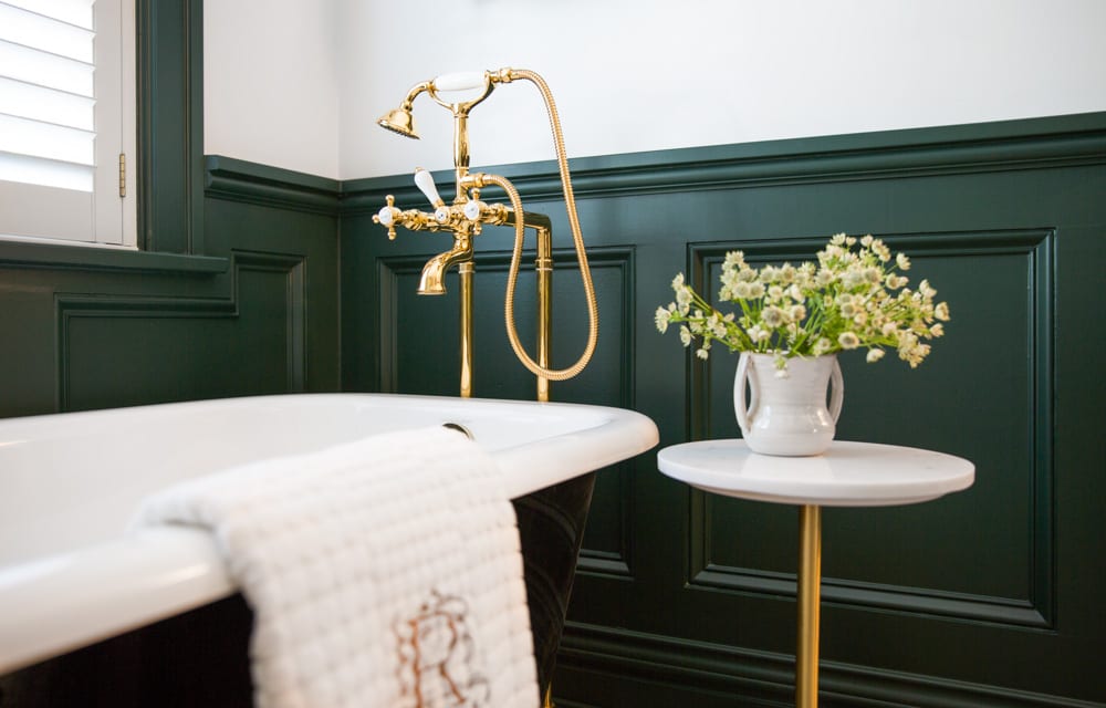
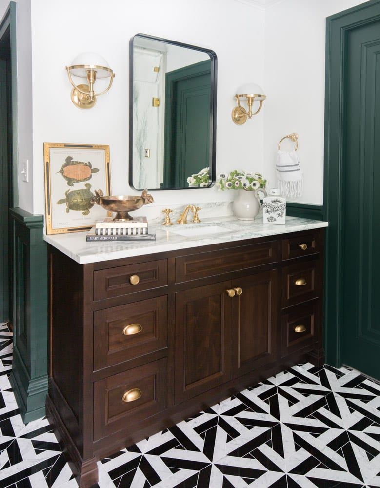
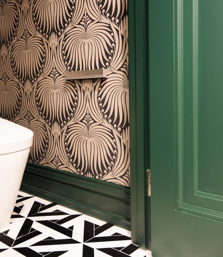
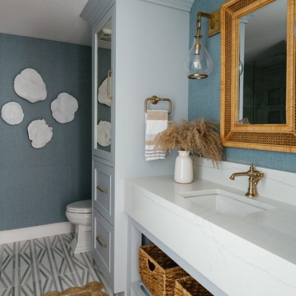
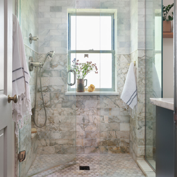
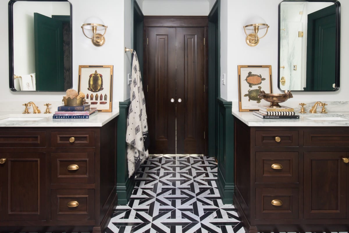
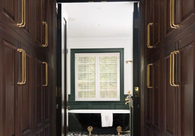
Before the master bath remodel, the space wasn’t satisfying the homeowner. The walls were covered in patterned blue wallpaper and beige tile. There was a large tub taking up most of the space and a long vanity down most of the wall. Since the bathroom style was far from what the homeowner liked, it was time for a new design journey. The biggest change was made to the entryway. Rather than walking right into the shower, you now get a stunning view of the tub. With a black glossy finish and brass accents, this bathtub speaks for itself. Geometric tile floor is seen throughout, which adds another design element to make the space dynamic. The beautiful deep green seen in the shower’s marble is reflected in the wainscot panelling. One of Owner Jenny’s favorite details is the patterned wallpaper. “It brings warmth into the black and white space,” Jenny said. “It takes someone who does this all the time, who sees these bathrooms and all the parts and pieces put together to help you make some of these bolder decisions.”
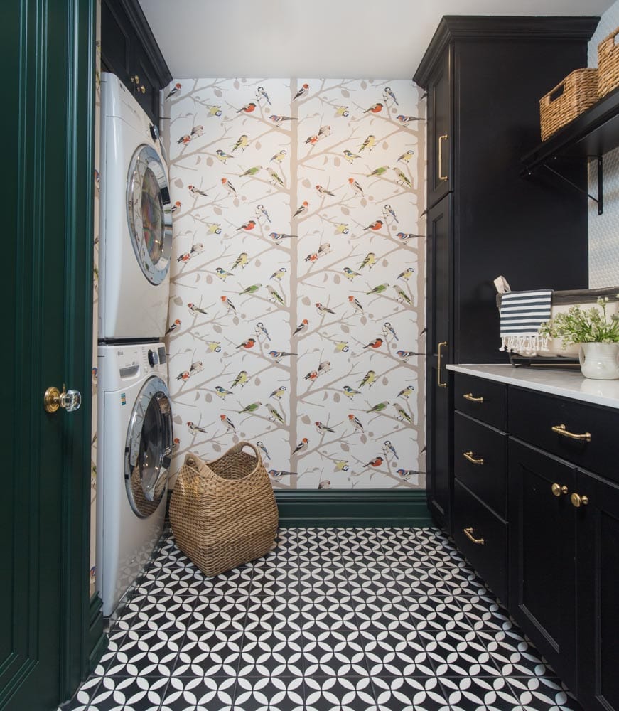
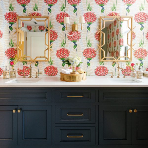
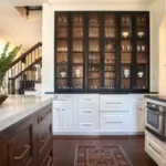
The laundry room was moved to where a previous closet was. Not only did this allow for more space overall, but it made the closets feel more connected. Though still conveying the same elegance found in the master bath, Schumacher’s A-Twitter wallpaper adds a playful touch. Black cabinetry reflects the color scheme found in the tiled floor.
2021 - Traditional Bath: more than 150 square feet
Design STL
watch the full renovation story
Subscribe to the Karr Bick YouTube channel for more before & after stories
If you’d like to start on your own transformation journey, use our plan now tool and visit our virtual showroom. We also have a blog with a step-by-step checklist to help you on your design adventure.

