Orchard Avenue Kitchen
Design Elements
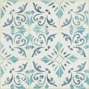

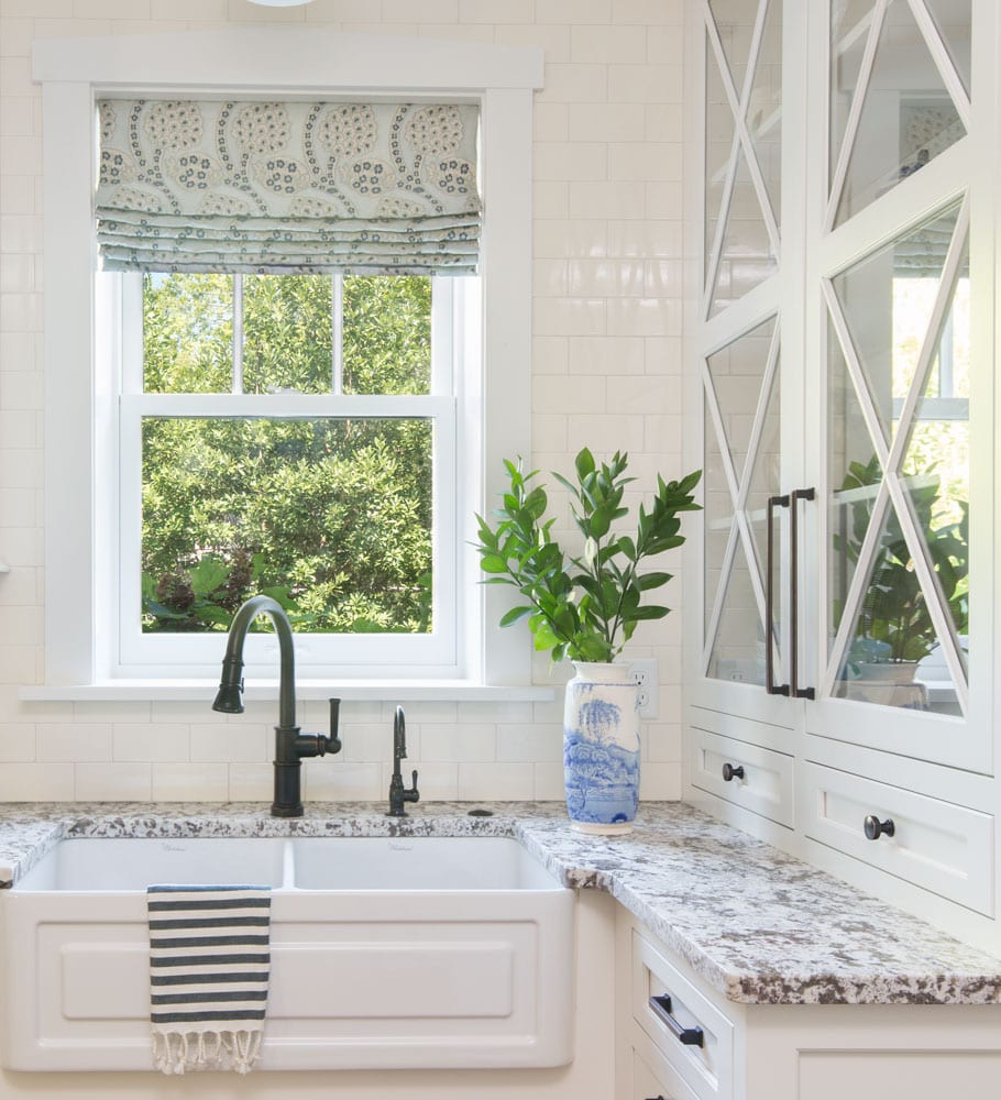
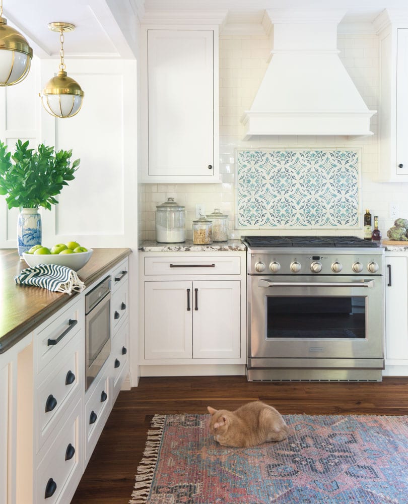
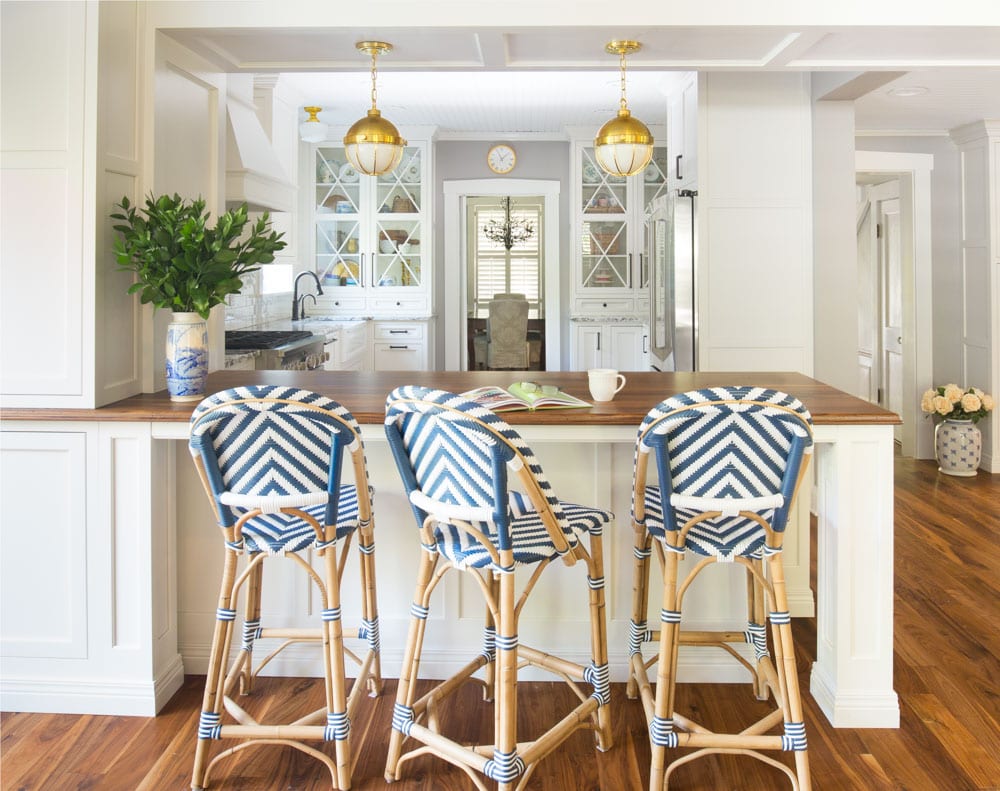
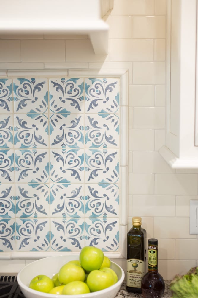
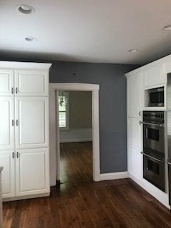
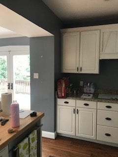
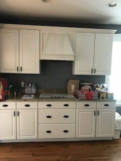
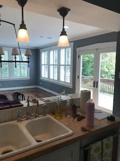
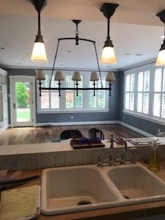
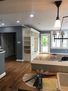
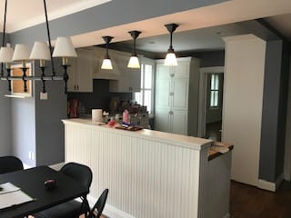
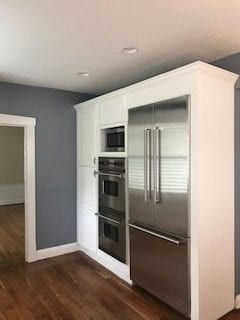
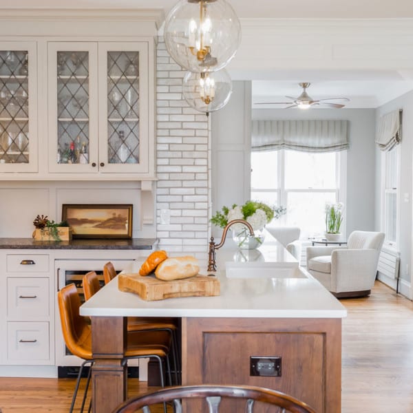
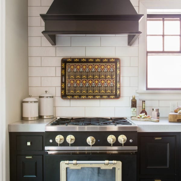
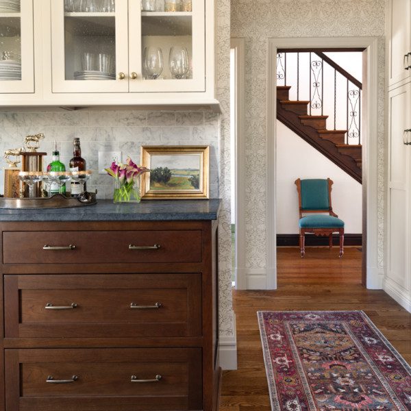
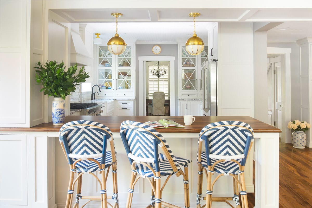
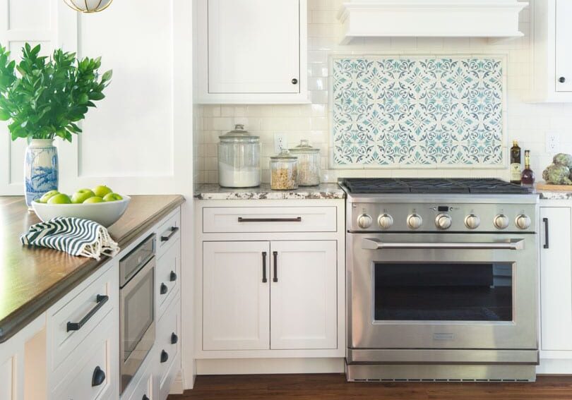
Webster Groves has so many beautiful homes and this historic home sits on a particularly stunning street. This kitchen needed a lot of work prior to the remodel; there was an addition which added square footage to the house but didn’t have a kitchen that flowed well or afforded much space for storage. The addition began with very thick walls that looked and felt cumbersome to the layout. The new design moved an old window up so that the perimeter could extend further and offer new sink placement under the window, instead of in the island. Two symmetrical cabinets that sit on the counters with glass X mullions were designed to showcase the homeowner’s beautiful dishes and offer an added layer of charm for the kitchen. The range tile is a Walker Zanger blue ceramic decorative tile which perfectly fits the charm of the homeowner. Wainscot woodwork was added to the thick addition walls and soffit to make them feel intentional and aesthetically pleasing, as well as a beadboard ceiling to echo the age and style of the history of the house. A peninsula was added to the kitchen with unique brass pendants that hang from the soffit and hang in perfect symmetry for line of sight into the kitchen. The cabinets are a soft white and the island has a distressed walnut thick top to accent the white farmhouse shaker sink. And who can forget the pop of color navy counter stools which are fun and youthful.
2020 - Kitchens of the Year: Platinum: Less than 250 square feet
St. Louis Homes and Lifestyles
watch the full renovation story
Subscribe to the Karr Bick YouTube channel for more before & after stories
If you’d like to start on your own transformation journey, use our plan now tool and visit our virtual showroom. We also have a blog with a step-by-step checklist to help you on your design adventure.

