A Breath of Fresh Air
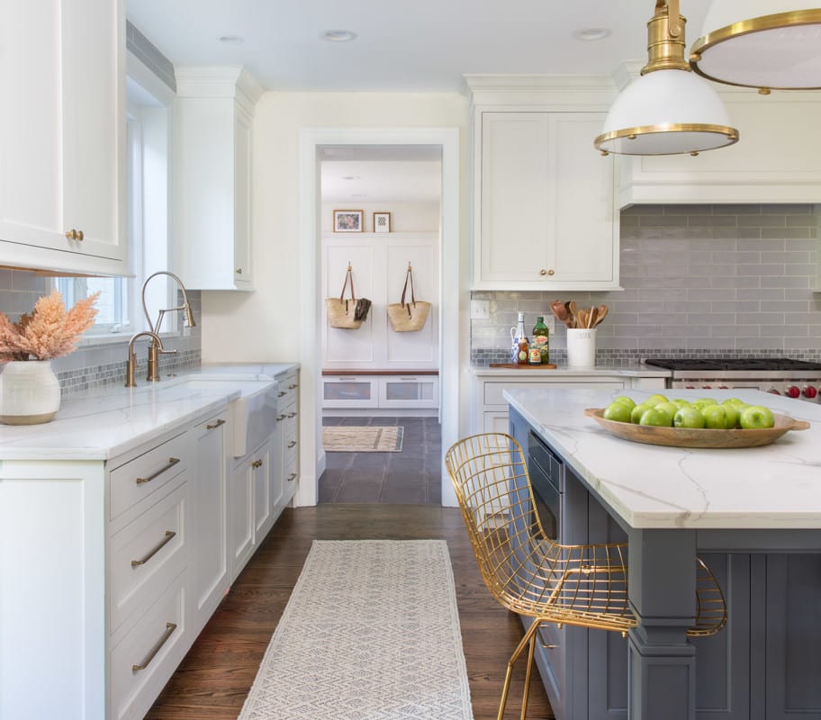
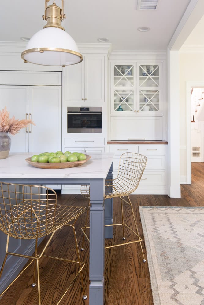
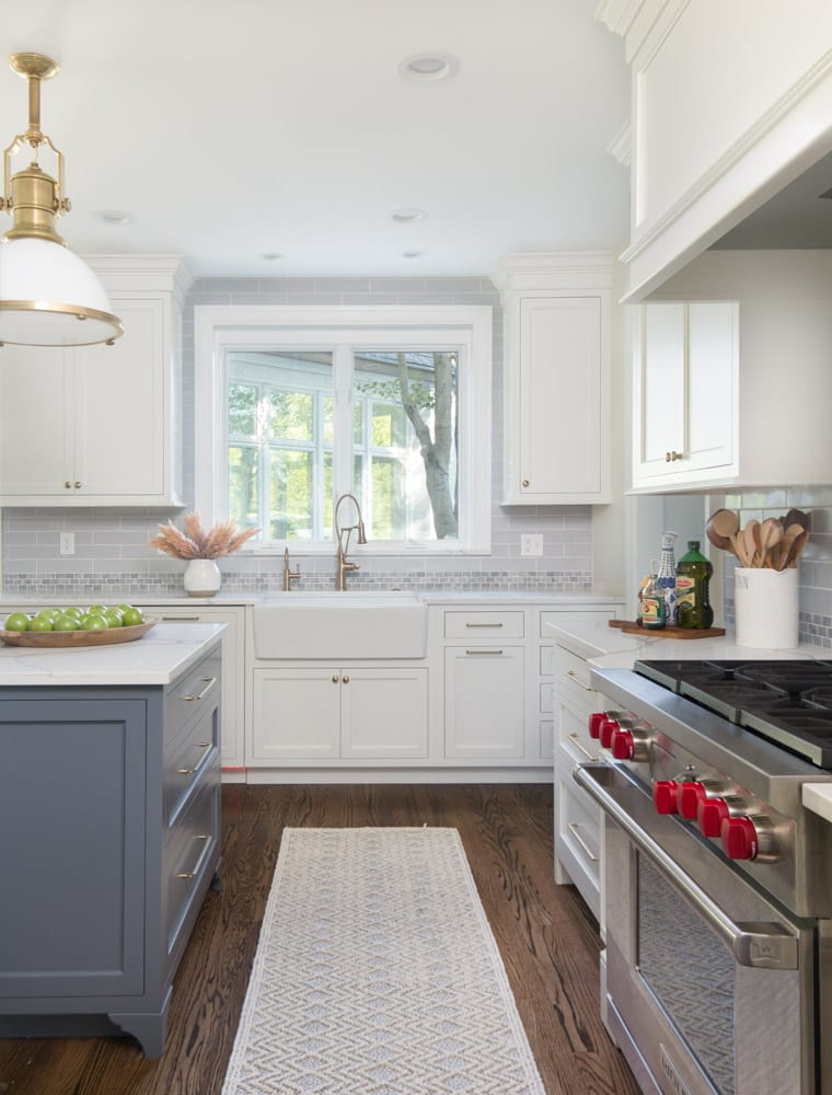
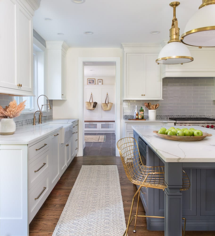
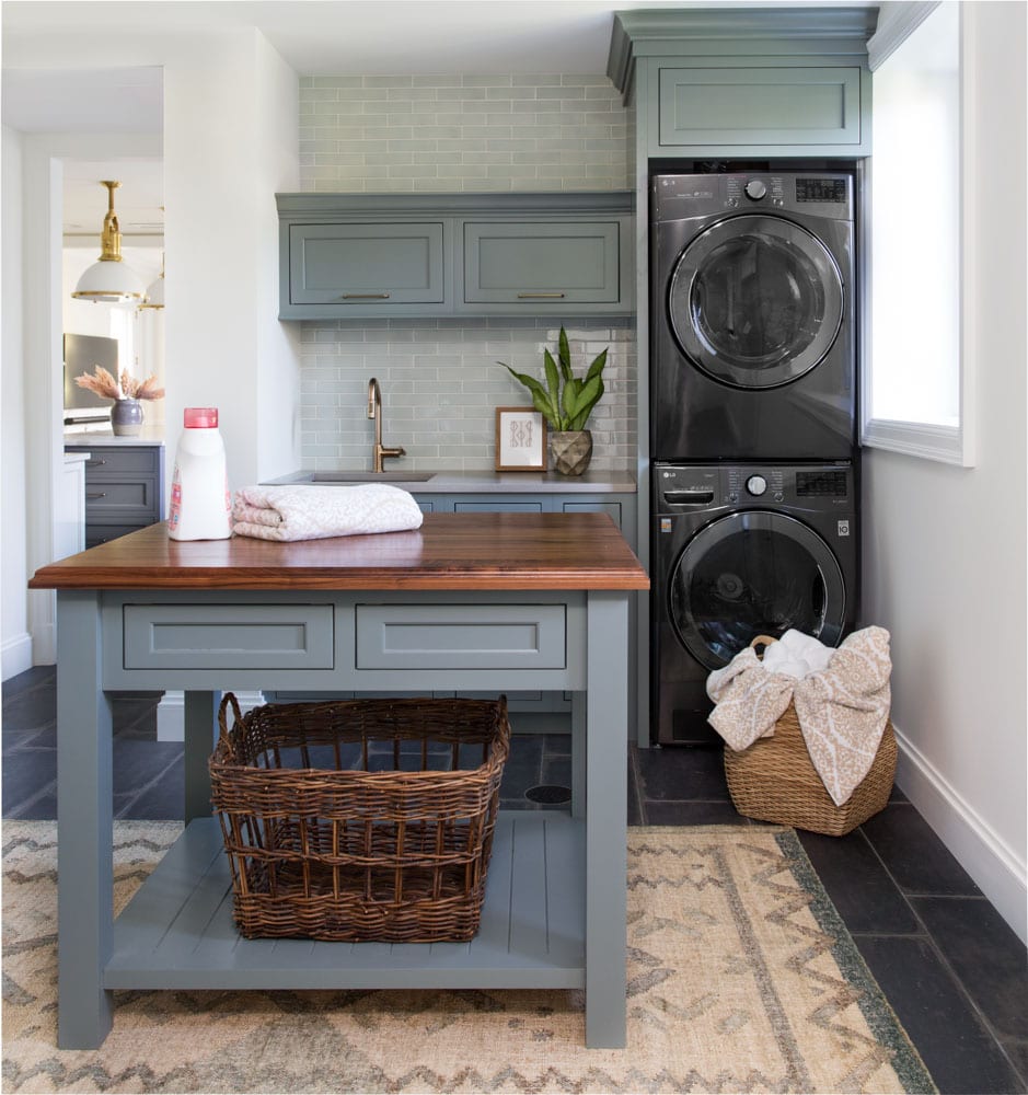
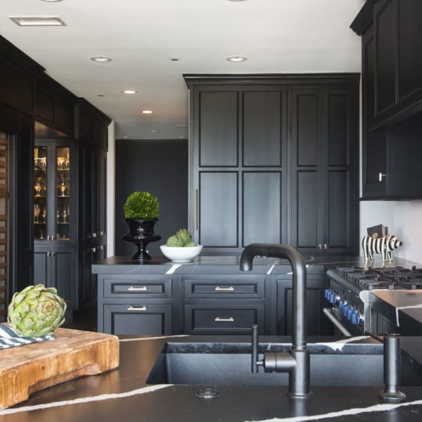
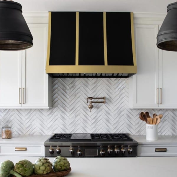
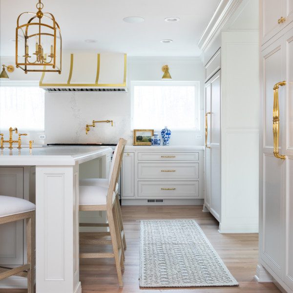
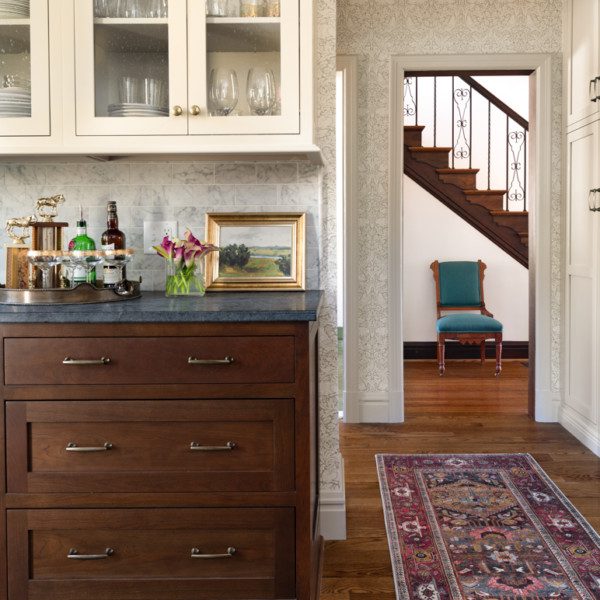
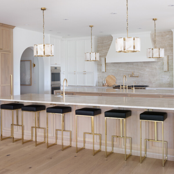
With a little toddler running around, the homeowners didn’t feel like their kitchen was suitable for their growing family. The main challenge was to open the space up and create a sense of simplicity. In efforts to do this, a wall was knocked down between the kitchen and dining room. The designer then closed off the hall to create a butler’s pantry, which not only speaks of sophistication, but is also practical for the growing family. The kitchen, itself, represents the refined and mature nature of the family. Gold fixtures are seen throughout and are even seen on the lighting details. The island, which has marble countertops, allows for a greater surface area for cooking crafts with their child. Touches of blue are seen in elements, such as the backsplash and island. Adjacent to the kitchen, you’ll find a mudroom which was in much need of updates. What used to be made of industrial cement tile from the 1930’s was crafted into a polished space with subtle hints of color. This space is also home to a bench seat, laundry essentials, and wainscot, which serve as focal points from the kitchen.
Subscribe to the Karr Bick YouTube channel for more before & after stories
If you’d like to start on your own transformation journey, use our plan now tool and visit our virtual showroom. We also have a blog with a step-by-step checklist to help you on your design adventure.


