A Designer’s Dream: Before and After
February 28, 2024
What fun it is to do what we do. As a designer for Karr Bick Kitchen and Bath, there is nothing like being able to walk into a space and get the ideas flowing on how to transform our clients’ homes.
This project began with a beautiful home that had great bones. The problem was, like many older homes, it was somewhat compartmentalized. Our clients wanted us to create a kitchen that seamlessly blended style and functionality, but was also perfect for entertaining, and day-to-day living for the family.
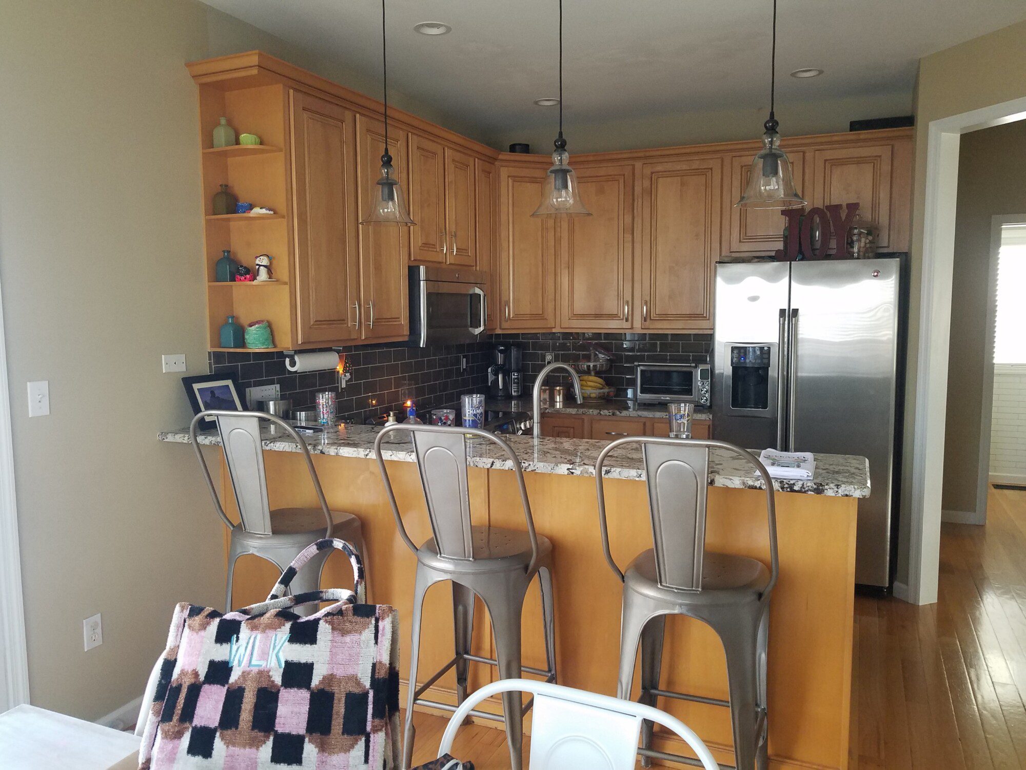
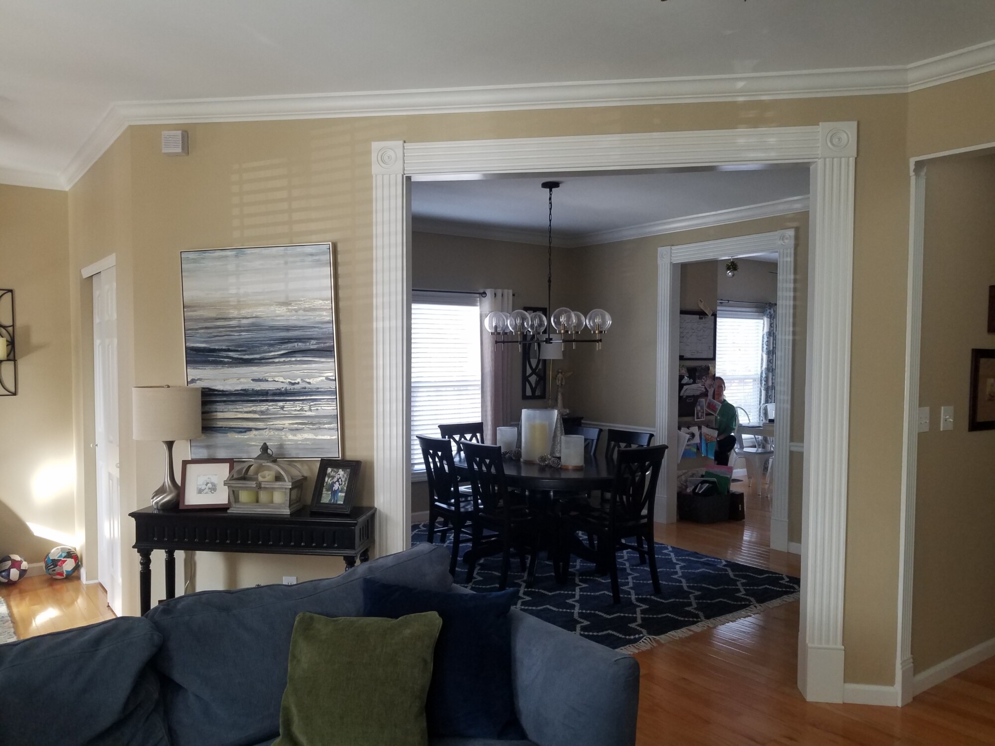
We started by dreaming up the perfect floor plan to remove some walls and open everything up. This is where we started.
- The kitchen before
- The adjoining dining room
Combining these two smaller rooms was a strategic move to maximize space and create a more open and inviting environment. This involved structural changes and careful planning to ensure seamless integration.
The next step was to make sure that we took our clients wants and needs into careful consideration. One thing that was very important was to give them a desk area under the bar. It is hidden away when entertaining, but for day-to-day work and other tasks it can be accessed easily.
The center doors open and slide back to allow our clients to sit in this area and work. The two lower drawers on the right also provide file storage.
Another thing that we focused on was choosing beautiful finishes. This particular client has a design background and impeccable taste. This certainly contributed to the success of the project, ensuring attention to detail and a cohesive vision throughout.
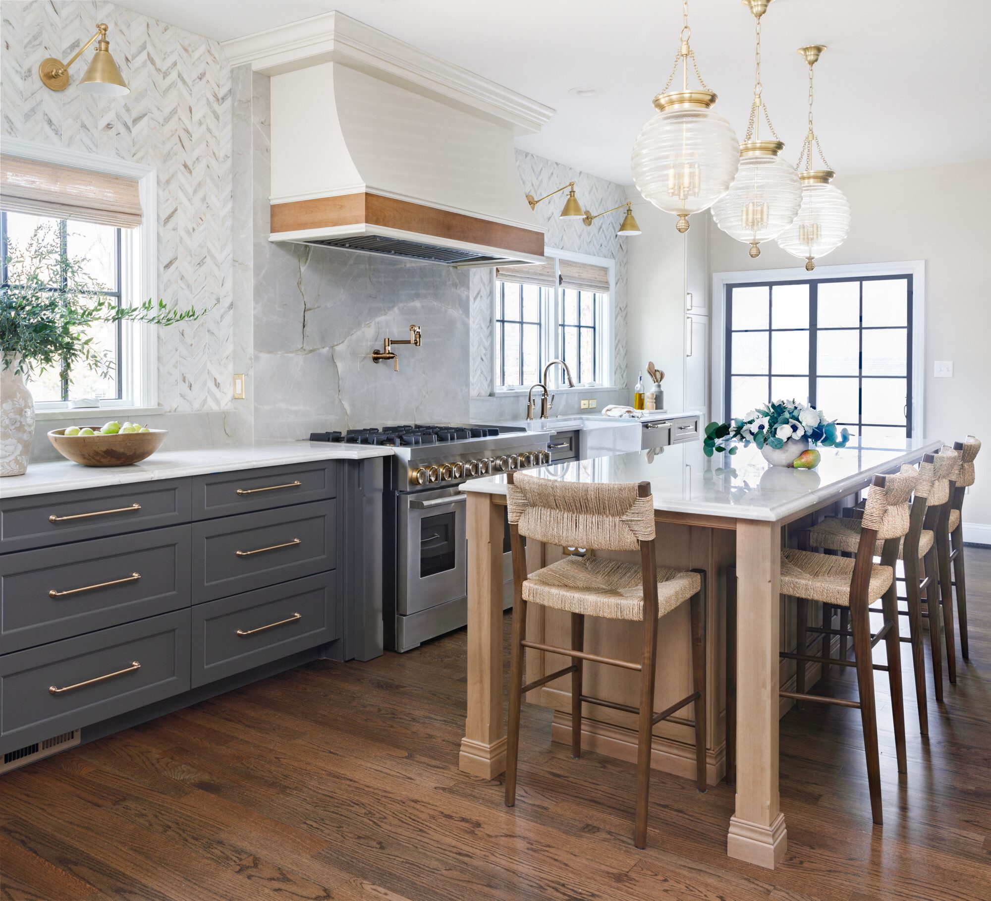
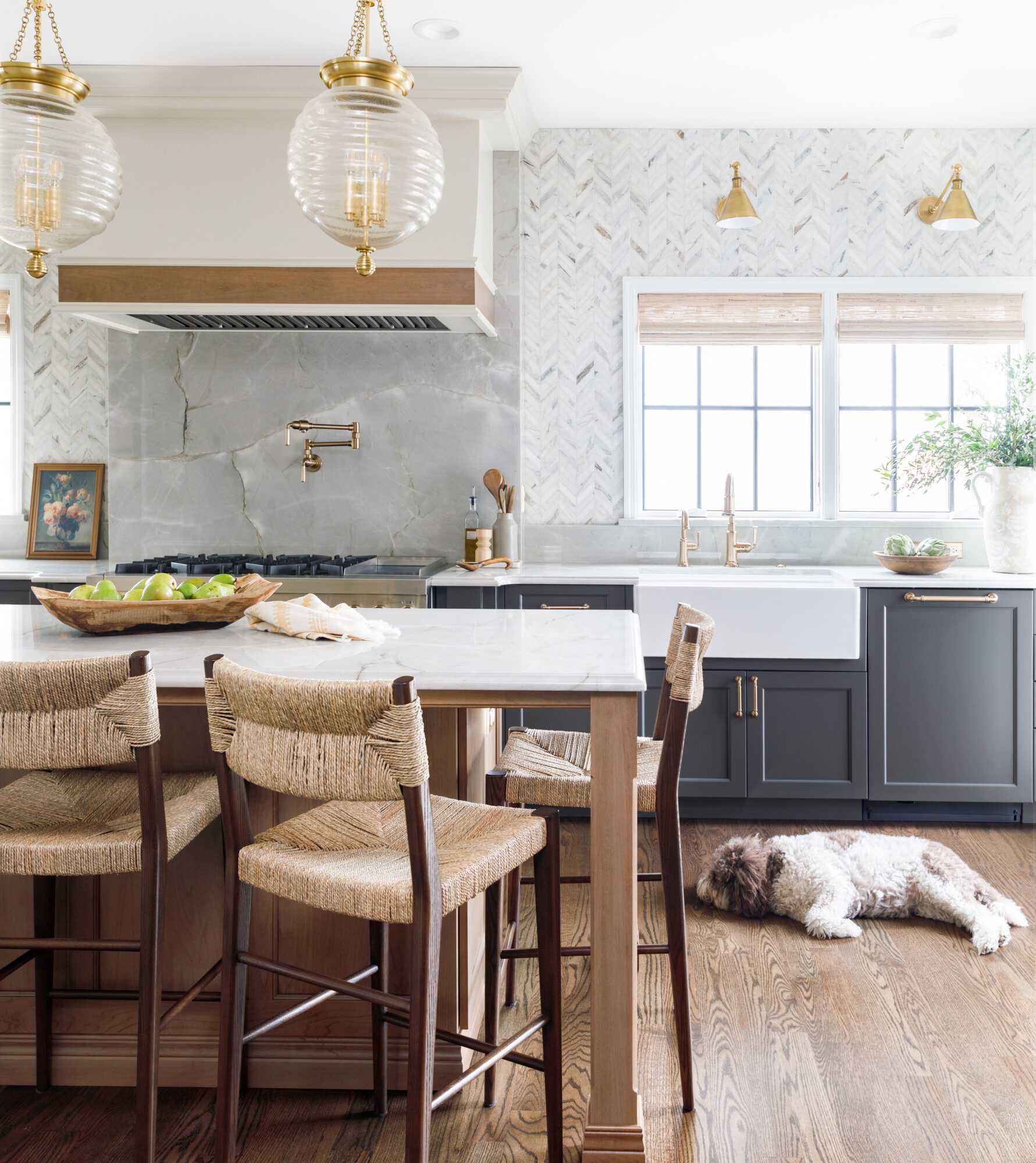
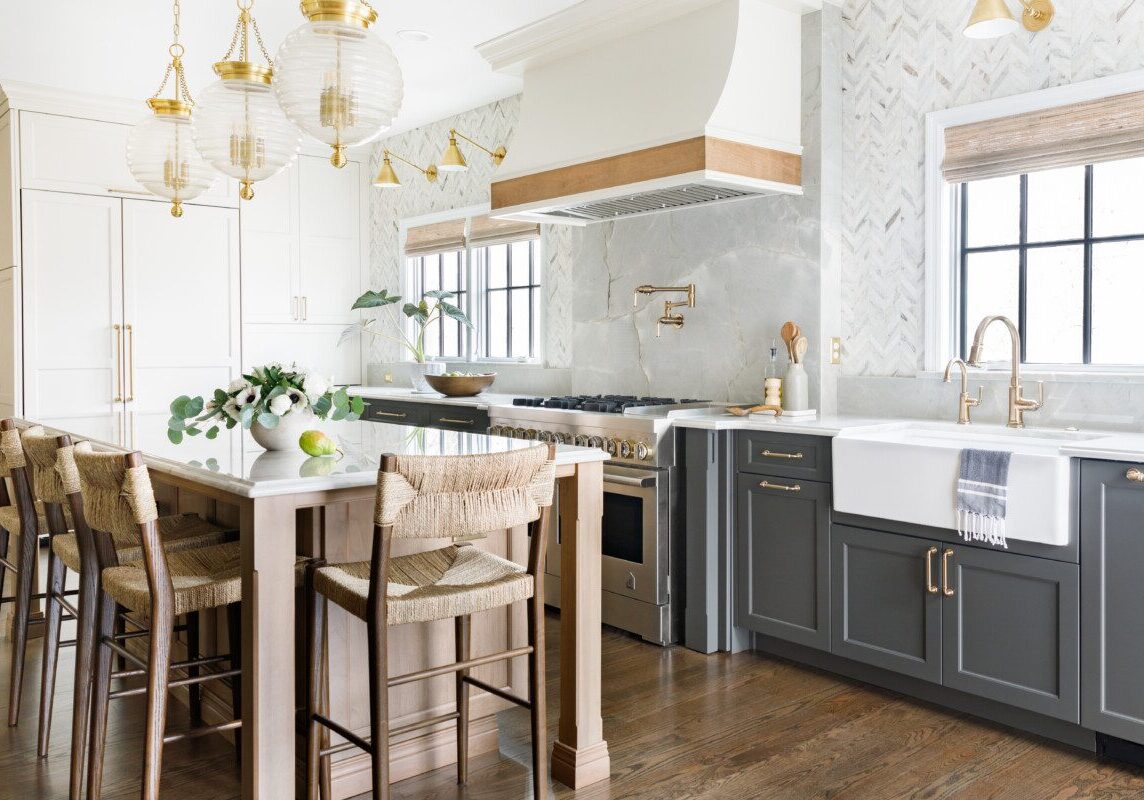
Color is always an extremely important factor in any design. This remodel was no exception. Choosing gray for the lower cabinets provides a modern and sophisticated contrast to the white tall cabinets, adding depth and dimension.
Also, never underestimate the power of wood tones. The floor and island add a sense of warmth and coziness to the space, anchoring the overall aesthetic. We love when clients add wood to any space, it really makes a huge difference.
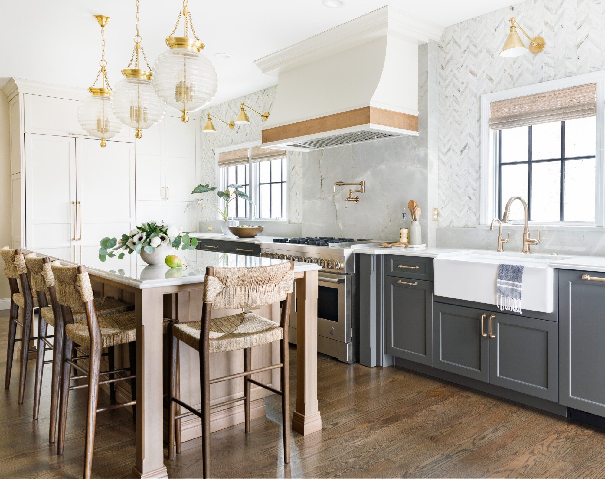
The light wood and contrasting floor stain adds both warmth and dimension.
Next was creating the “wow” factor! The backsplash tile and stunning stone behind the range serve as focal points. Not only do they add visual interest, but they also add a touch of drama. The use of the herringbone pattern is really special and draws the eye up immediately.
Space planning and function is always our number one goal in any design, but we also want all of the pretty things as well. From the beautiful lighting, to the counter stools, each element was thoughtfully chosen with the help of our clients to reflect their taste, style, and vision. Here are a few more views.
- Such a lovely and functional space.
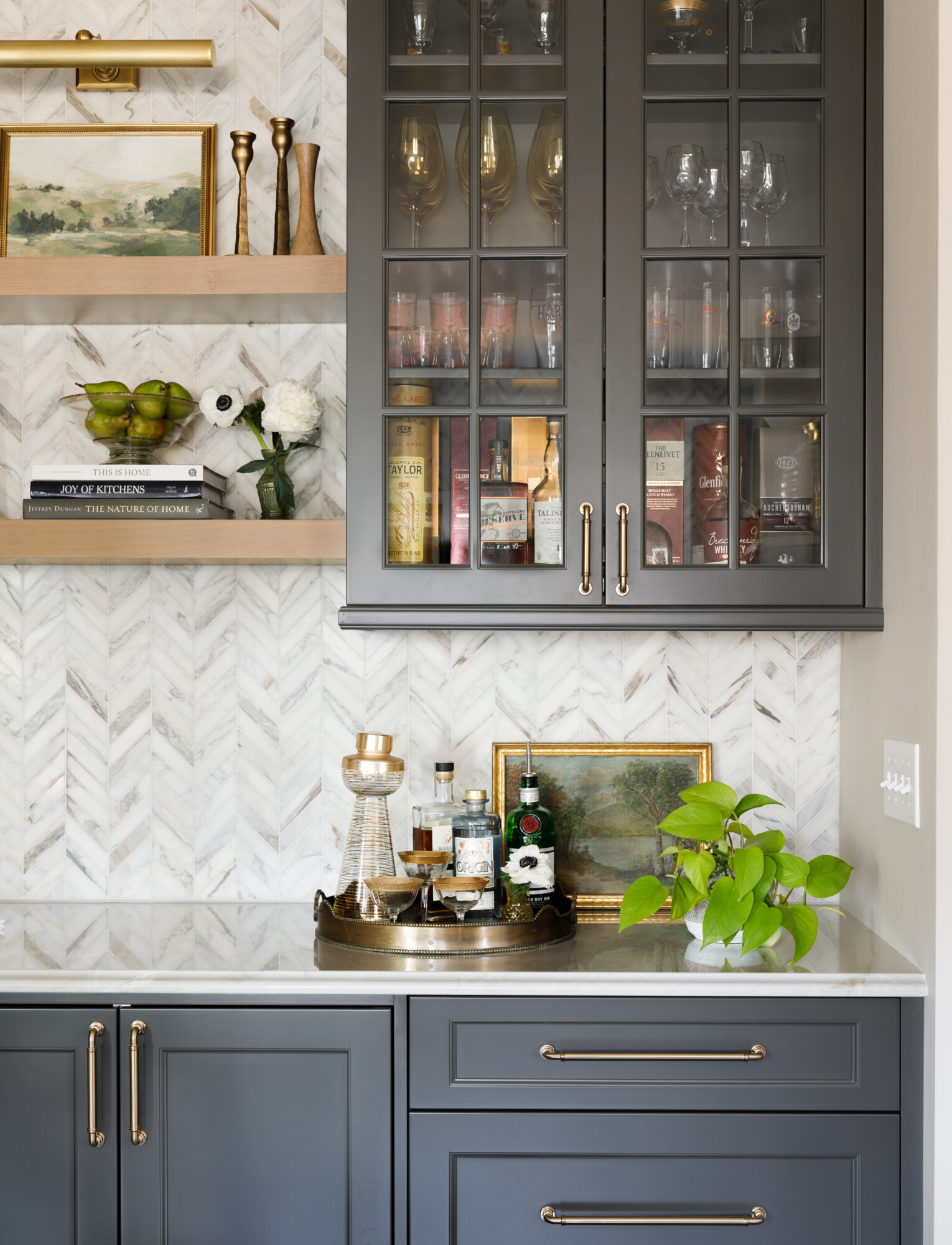
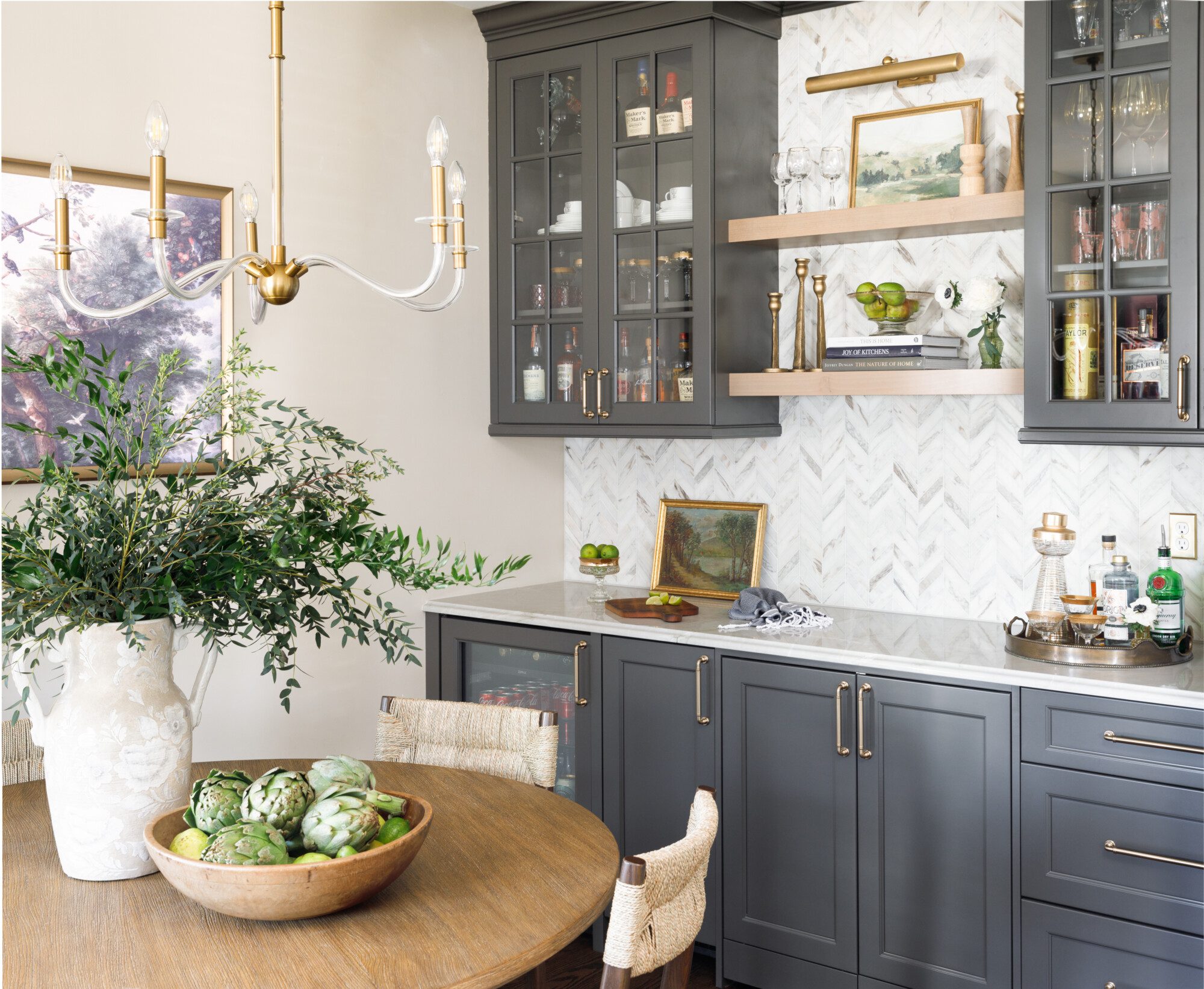
- A close up on the bar area where they entertain.
- Sweet pup Vera helped us out on the photo shoot.
There is nothing like a great before and after. This project is truly a favorite. Head to karrbick.com to see so much more and let’s get your project started.

