Archives
Before + After
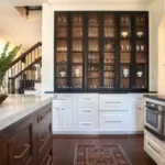
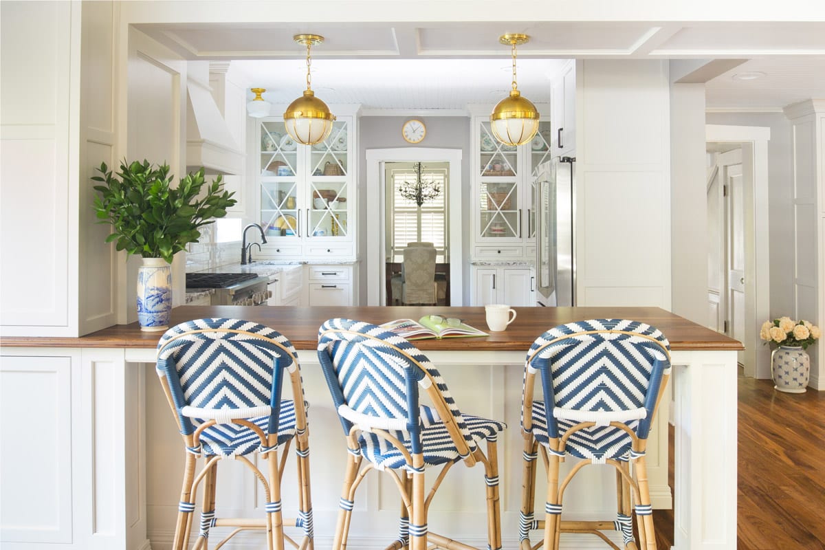
After years of living with a kitchen that felt gloomy and heavy with its overblown Tuscan theme, the client’s wanted to transition to a space that felt light and bright with elements of texture. A wall was removed between the adjacent bar and kitchen to allow the space room to breathe. The enlarged kitchen window…
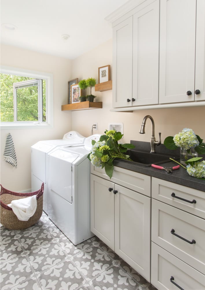
When your laundry room is dark and stuffy, laundry is a chore. Once it underwent its transformation, doing laundry in this space became a peaceful activity. Beforehand, the room just felt blah. After its remodel, the space had a charming cottage feel. Natural lighting and light cabinetry brightened the room up, while also bringing a…
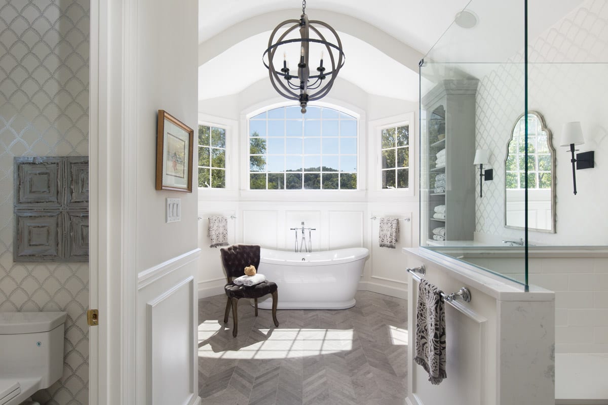
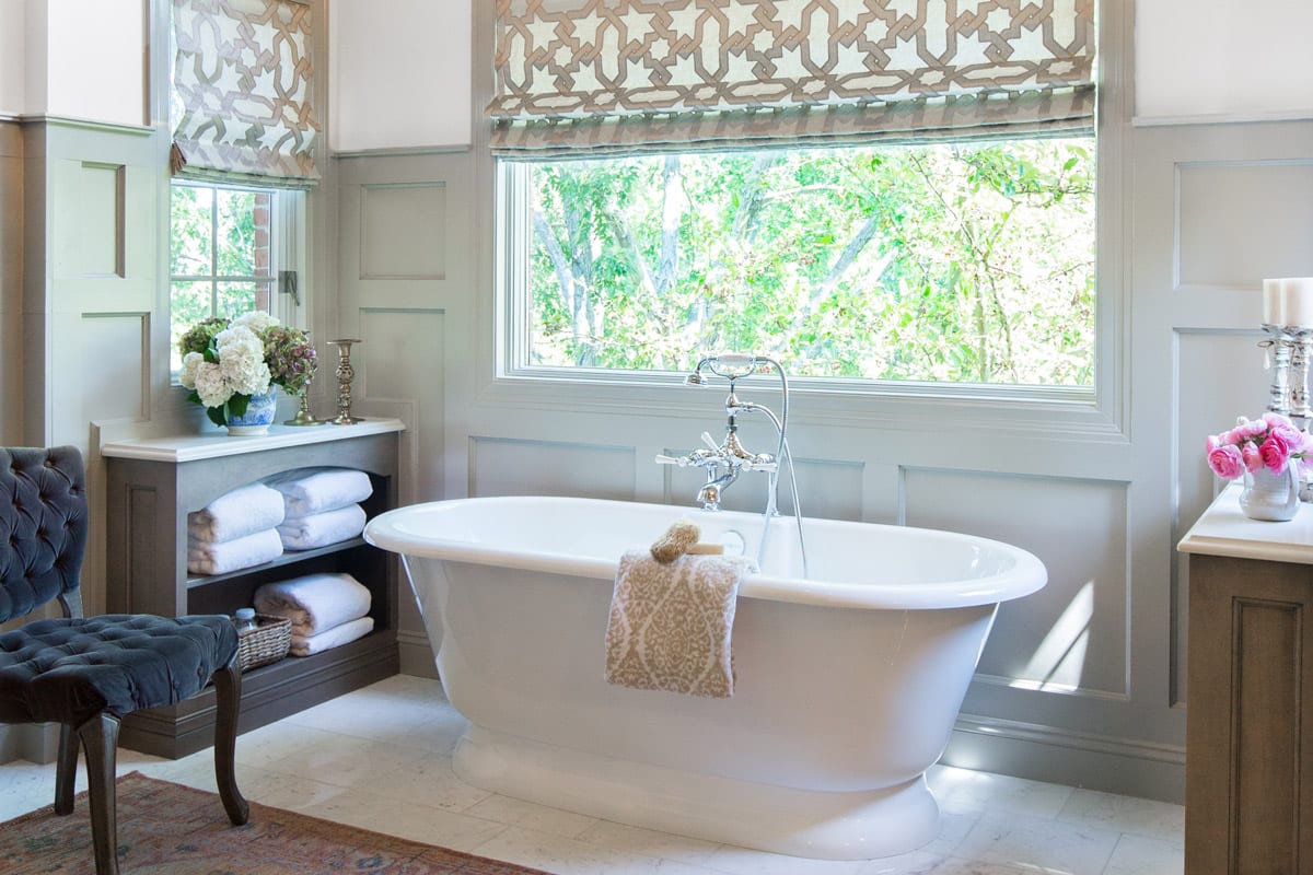
Everything about this space speaks to the homeowners classic style. Since the homeowner always looked forward to a bubble bath in the evening, the bathtub was made one of the highlights of the room. By giving the tub its own special place, it makes the room feel like a professional at-home spa. The homeowners traditional…
Before it’s makeover, this kitchen was filled with slightly yellow tinted wood. From the ceiling to the floor, you were greeted with a single color. The green countertops attempted to break up this effect but was unsuccessful in its mission. Everything felt very dated. As you can see, things have changed for the better. Now,…
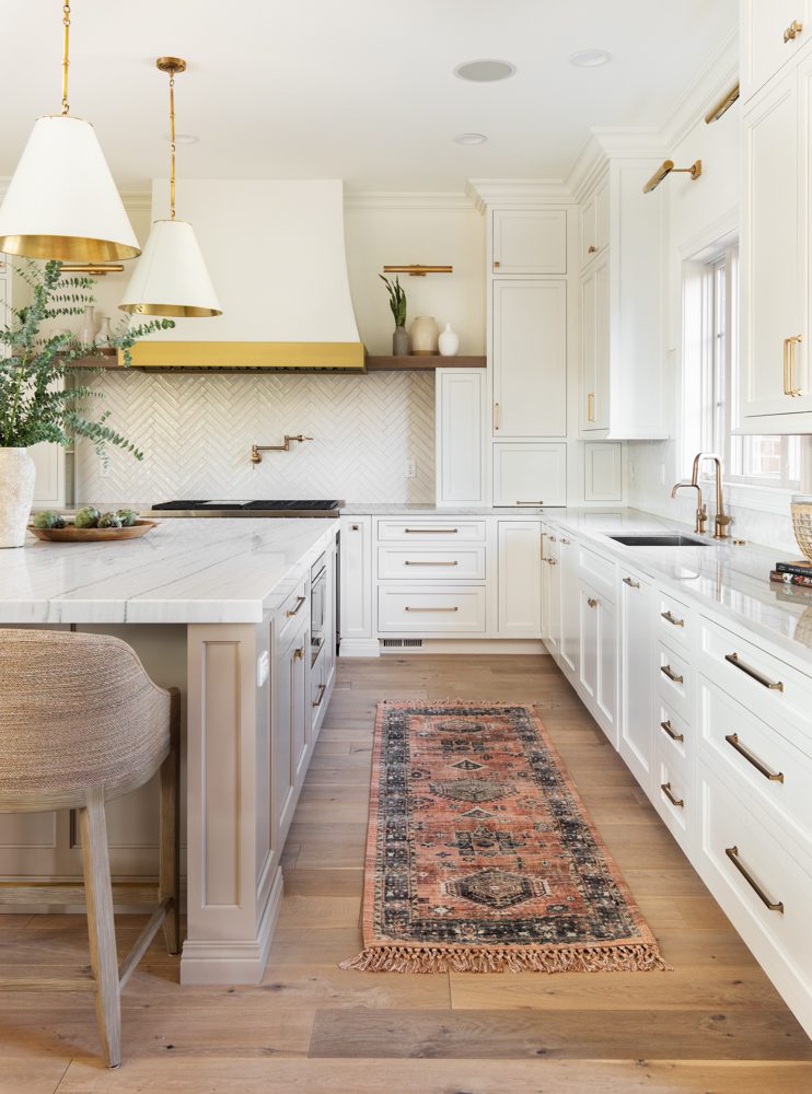
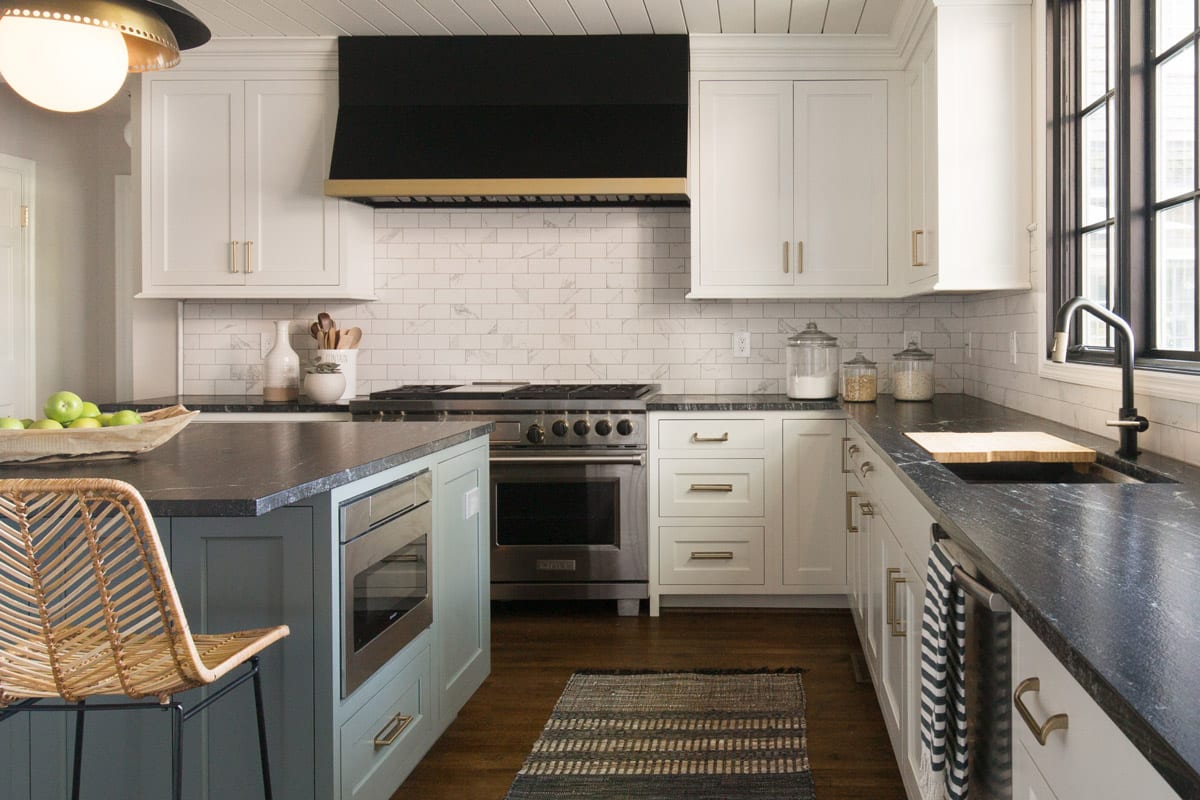
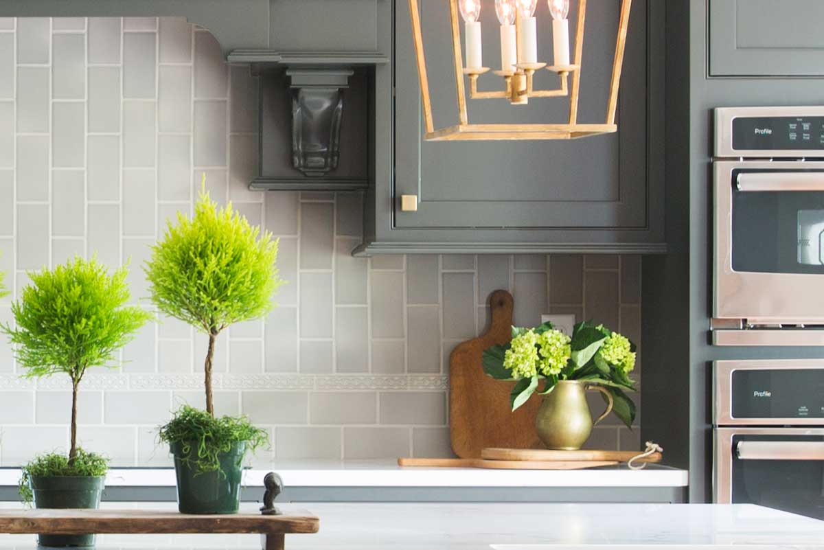
The soft, warm hues coming from the beautiful wood in this kitchen find balance with sleek black and white lines. Beautiful wood grain draws the eye in this large and bright light-filled space, while the sleek white perimeter cabinetry and black accents keep everything looking crisp. Grey glass subway tiles serve as the backdrop for…
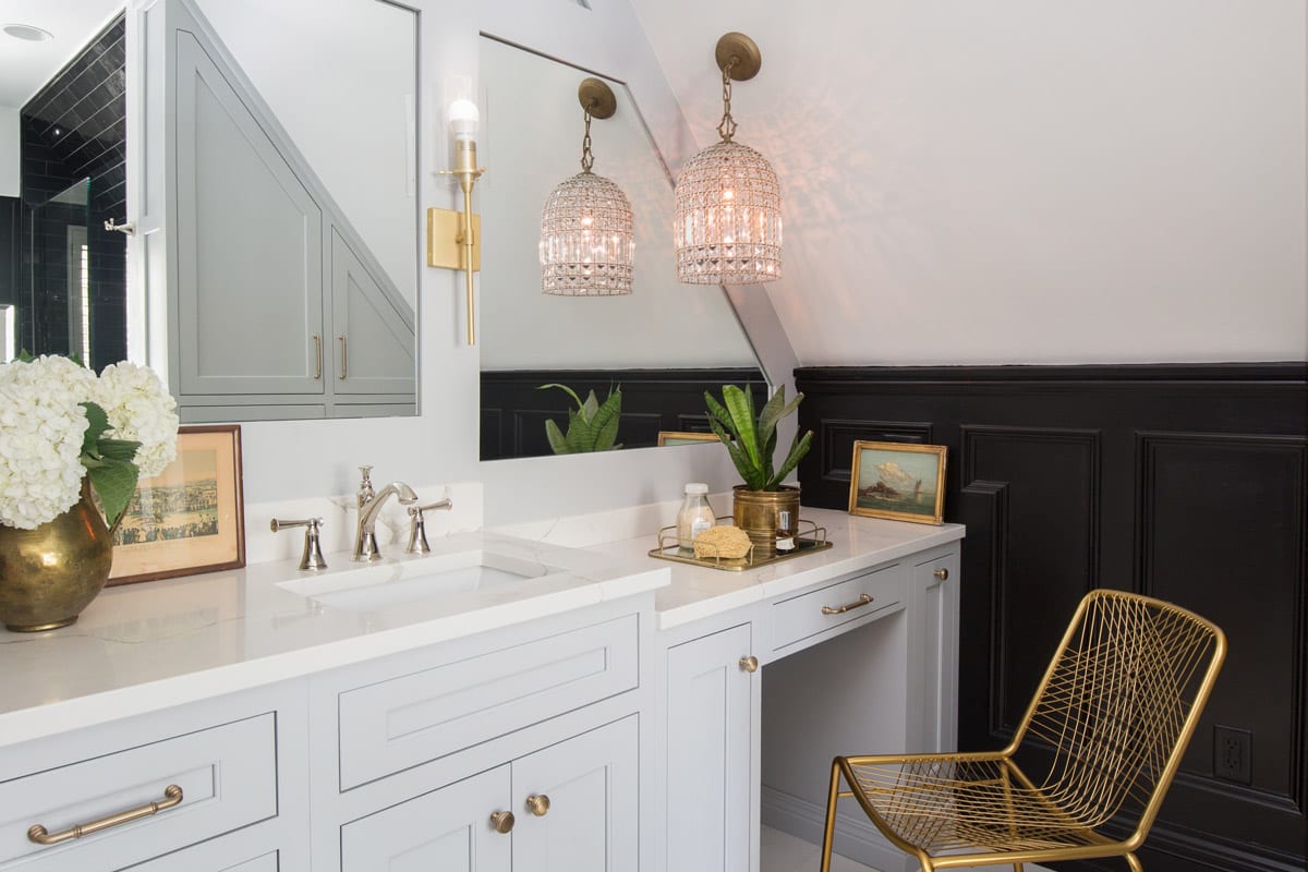
Before it’s remodel, this space had orange walls, painted furniture, and smaller sized appliances. While this space was practical when originally built, it no longer fit the growing girl that used it. Now, the bathroom speaks of a truly #NothingOrdinary space. The mirrored wall makes the unique ceiling space feel meant to be rather than…
This master bathroom is a sanctuary, as stylish as it is soothing. The light wood stained cabinets have an airy note; slender silhouettes, and glass and mirrored designs incorporated within. The decorative mullion mirrors in the tall vanity cabinet are perfect for reflecting light and opening-up the space. Juxtaposing the smooth wood tones with the…
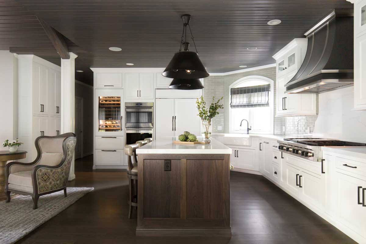
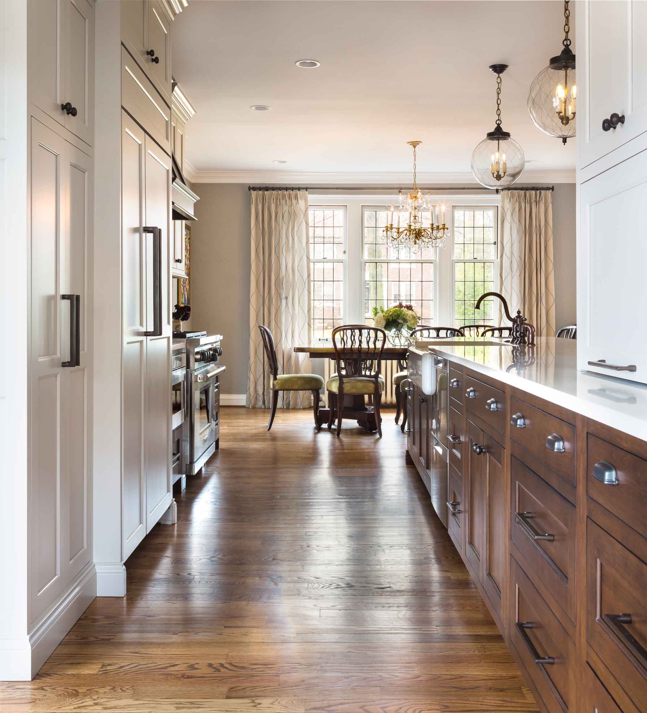
Webster Groves has so many beautiful homes and this historic home sits on a particularly stunning street. This kitchen needed a lot of work prior to the remodel; there was an addition which added square footage to the house but didn’t have a kitchen that flowed well or afforded much space for storage. The addition…
Before its stunning transformation, this kitchen felt awkwardly cut off and dated. Even with optimal natural light, the room still felt gloomy. With wallpaper featuring ivy vines, dark wood cabinetry, and countertop splitting the space in half, this space wasn’t making the homeowners happy. That is, of course, until it underwent its own facelift. Now…
Everyone ooohs and awwws when they see this finished kitchen. Can you believe it’s even more stunning in person? With so much natural light the spaces take on a different character between day and night. Prior to this remodel the homeowners had a challenging design dilemma as the home had been updated by the…
- « Previous
- 1
- 2
- 3
- 4
- Next »